Overview
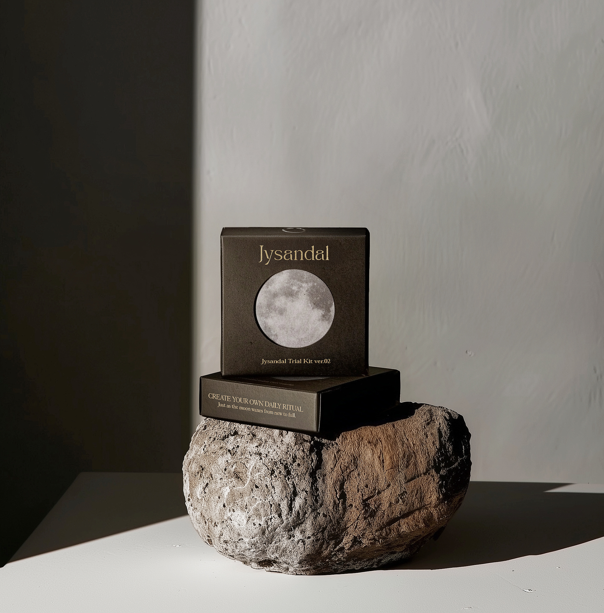
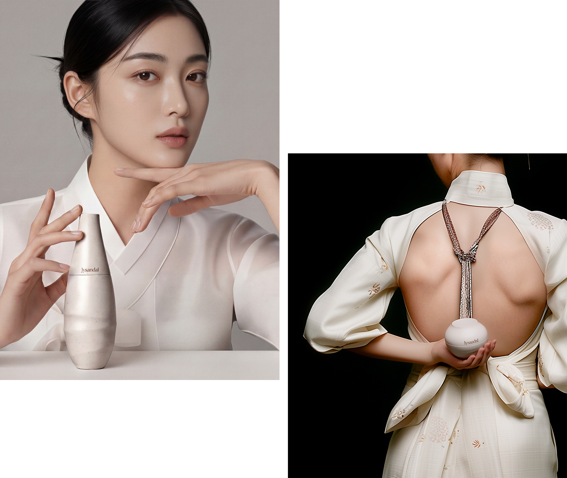
Jysandal is a premium anti-aging skincare brand inspired by the striking similarity between the moon’s 27.3-day orbit around the Earth and the skin’s 28-day complete regeneration cycle. Jysandal proposes a special Aging-Care Ritual that reflects beauty deepened over time. The branding and packaging design embody the philosophy and concept of G-Sandal, expressing a premium skincare image that feels both traditional and contemporary.
Brand Name
The meaning of ‘Jysandal’ is that after a long night, when the sun has risen, you can sometimes still see the moon in the western sky, which is known as the ‘waning moon’ or the ‘waxing moon.’ This coexistence of the moon which remains visible from dawn, when our skin’s regeneration is most active, to the morning, when we start our day, inspired us to convey the concept of the moon-skin cycle in the name of the product.
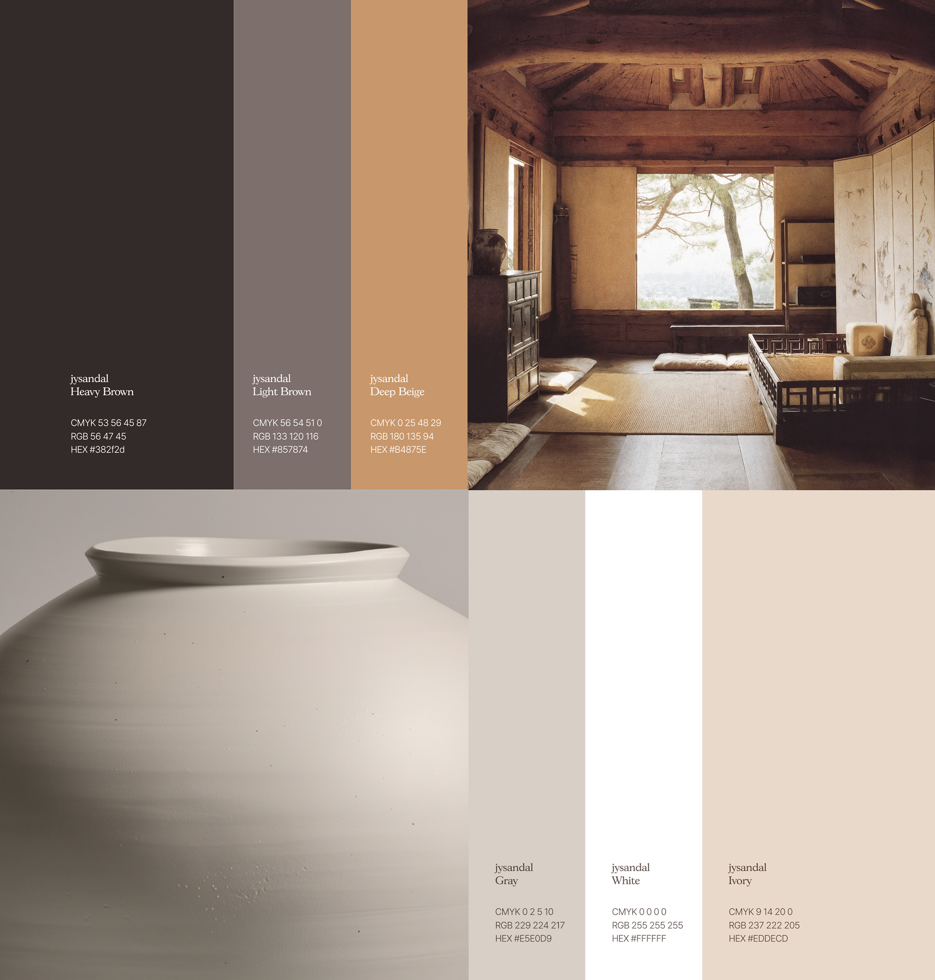
Brand Core Value
The core values of Jysandal include a nature-inspired philosophy that aligns with the brand’s concept; a focus on beauty that lasts over time rather than fleeting beauty; and the appearance, curves, and spacing of the package, which take into account Korean tradition.
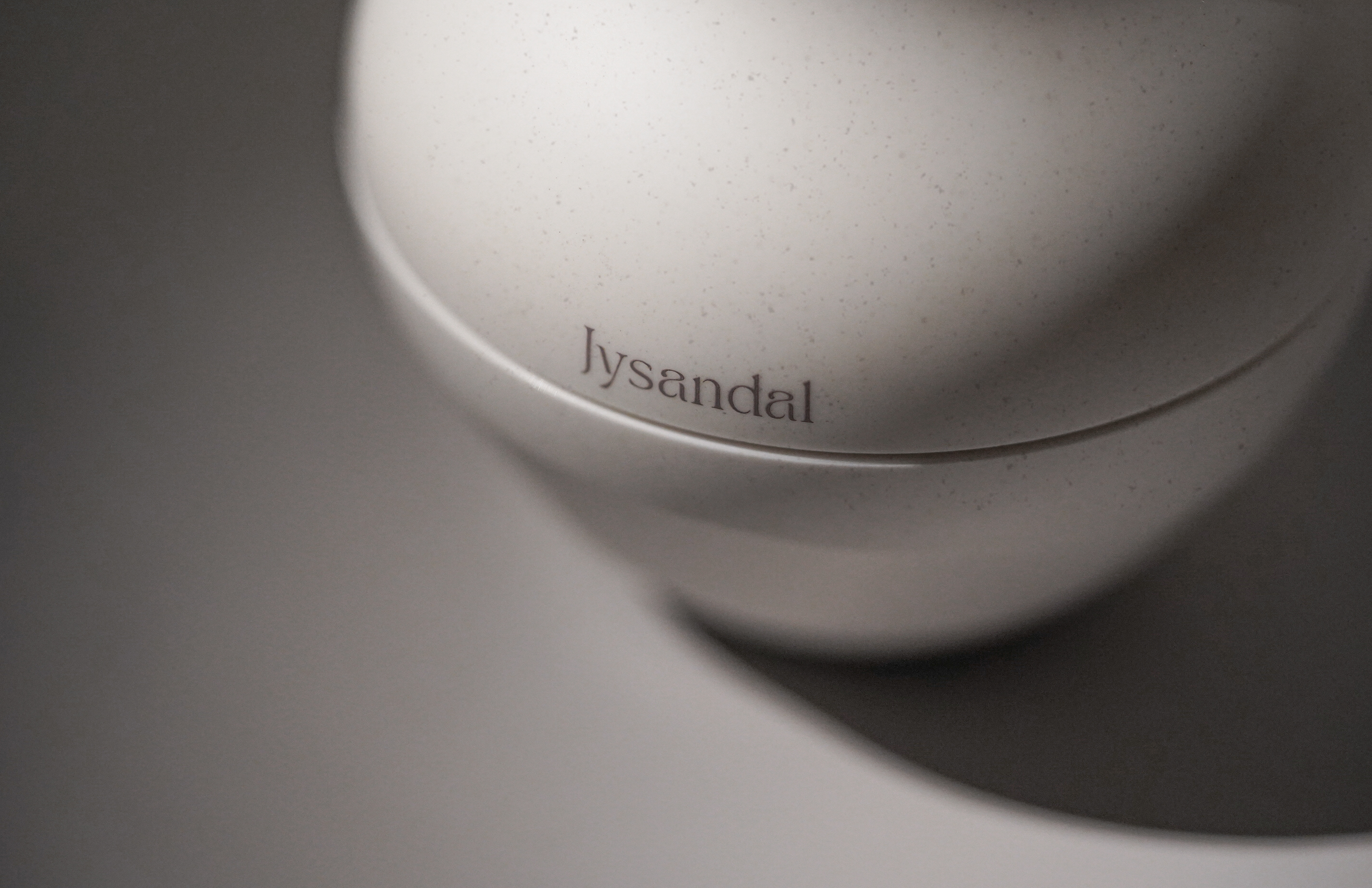
Brand Logo
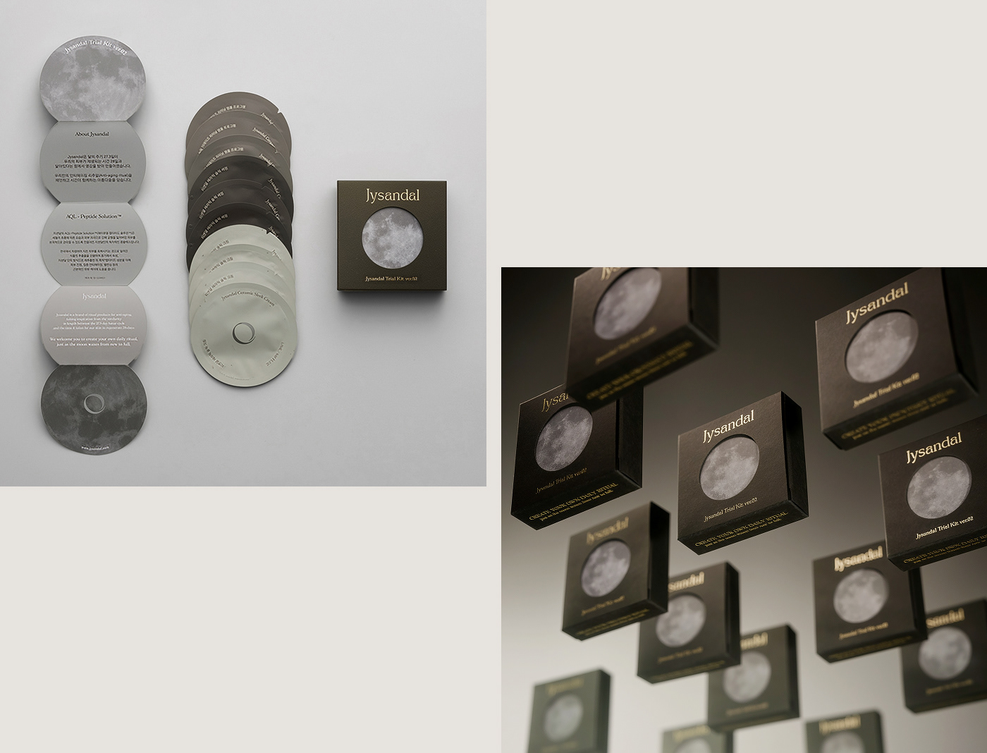
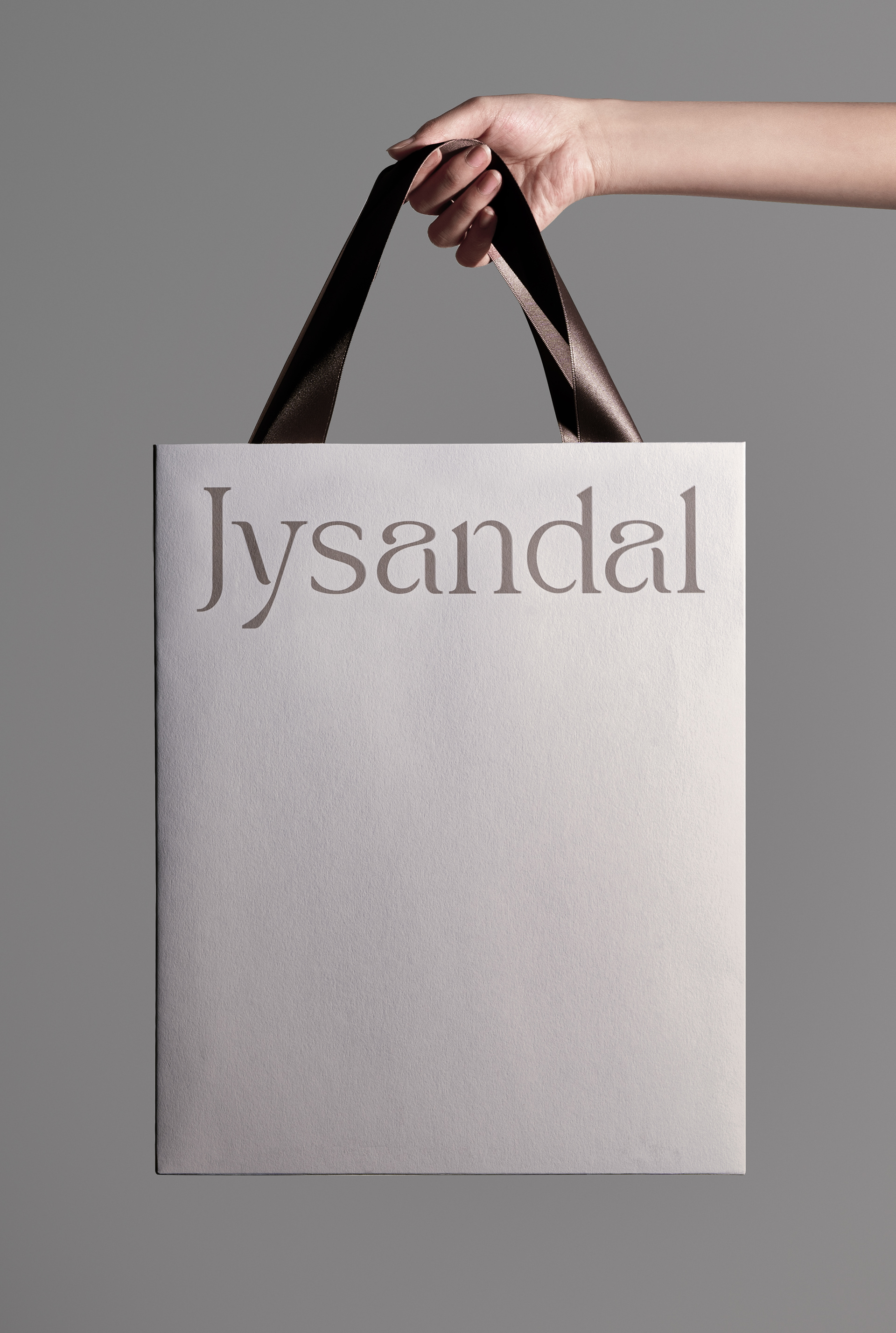
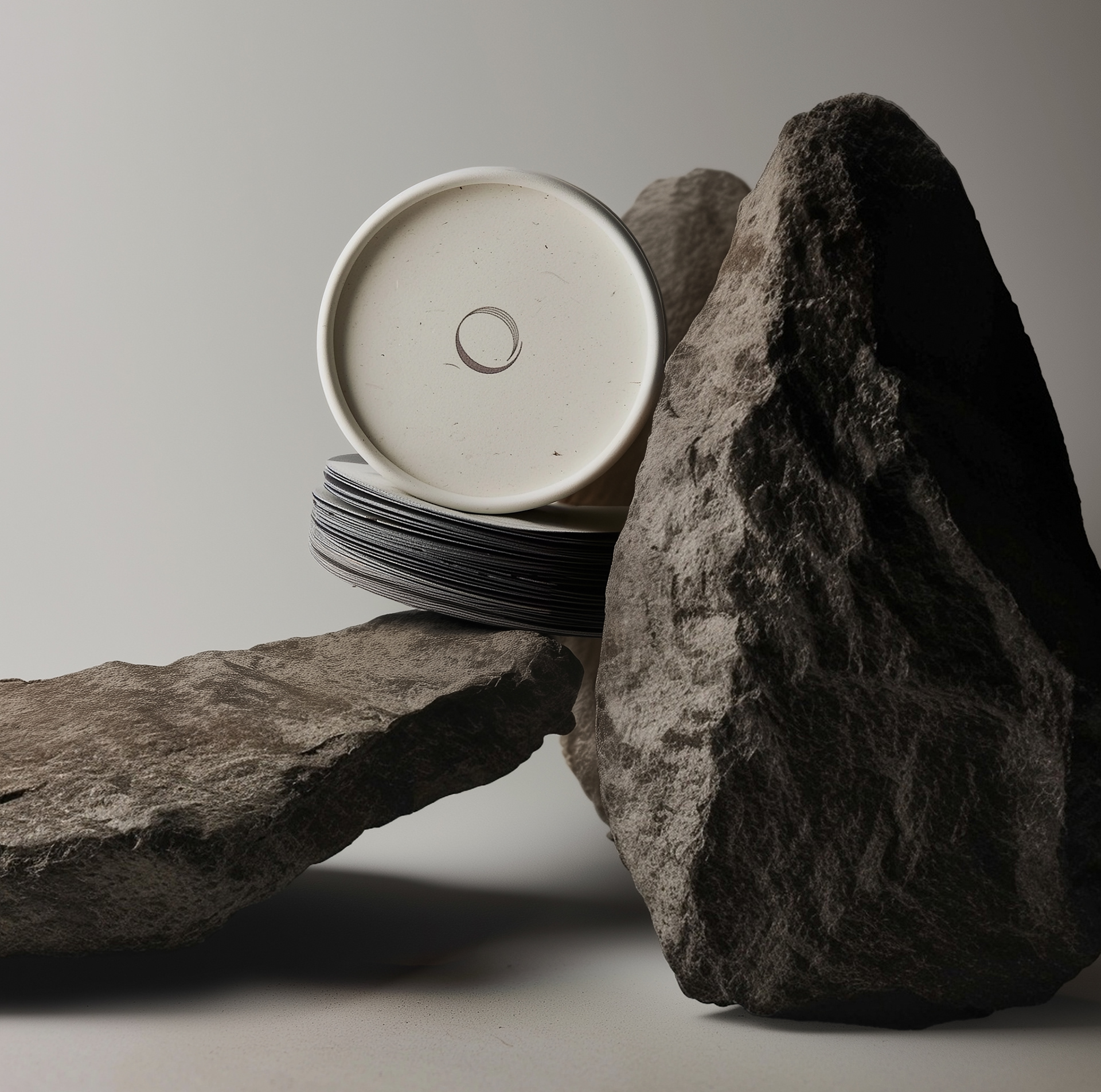
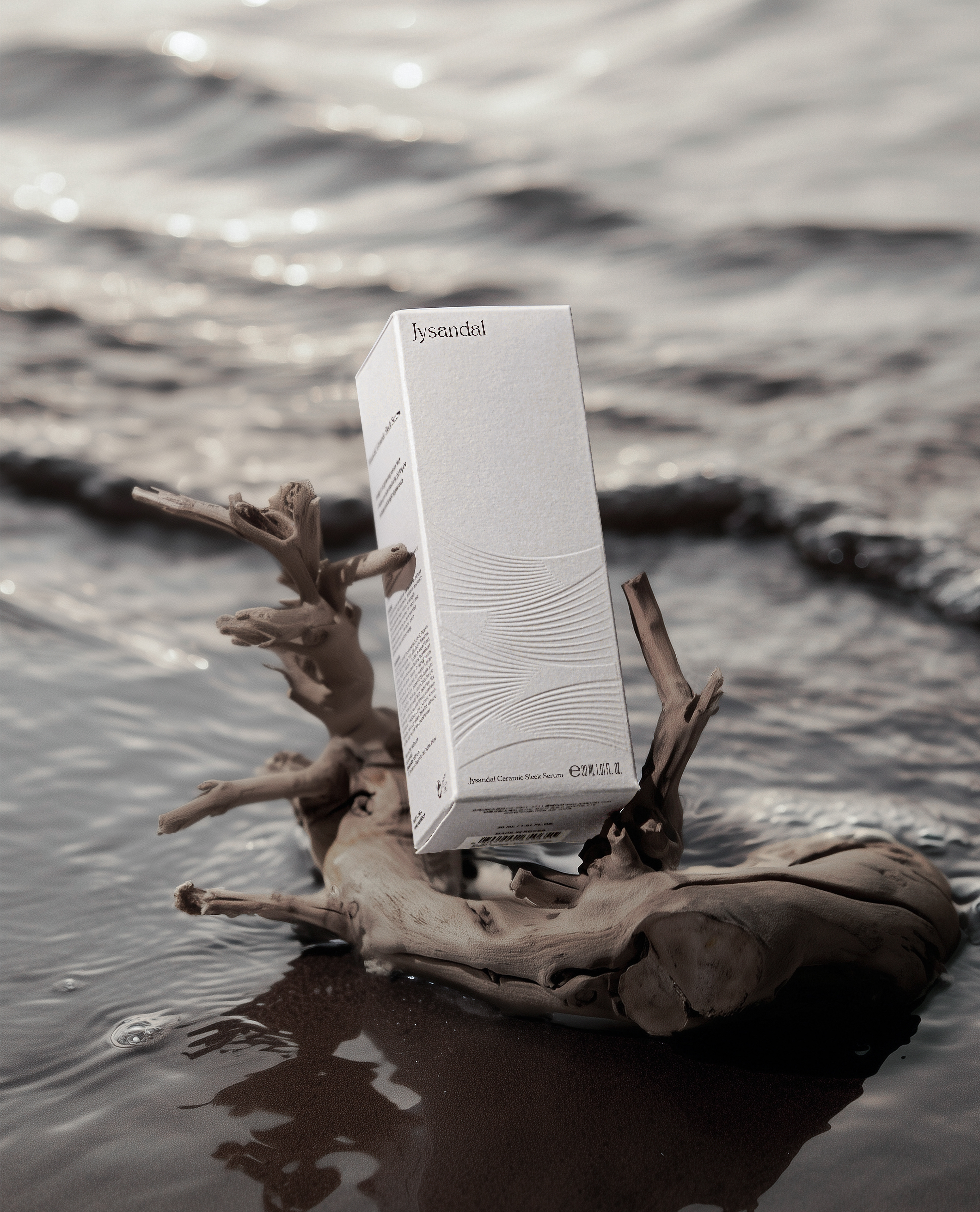
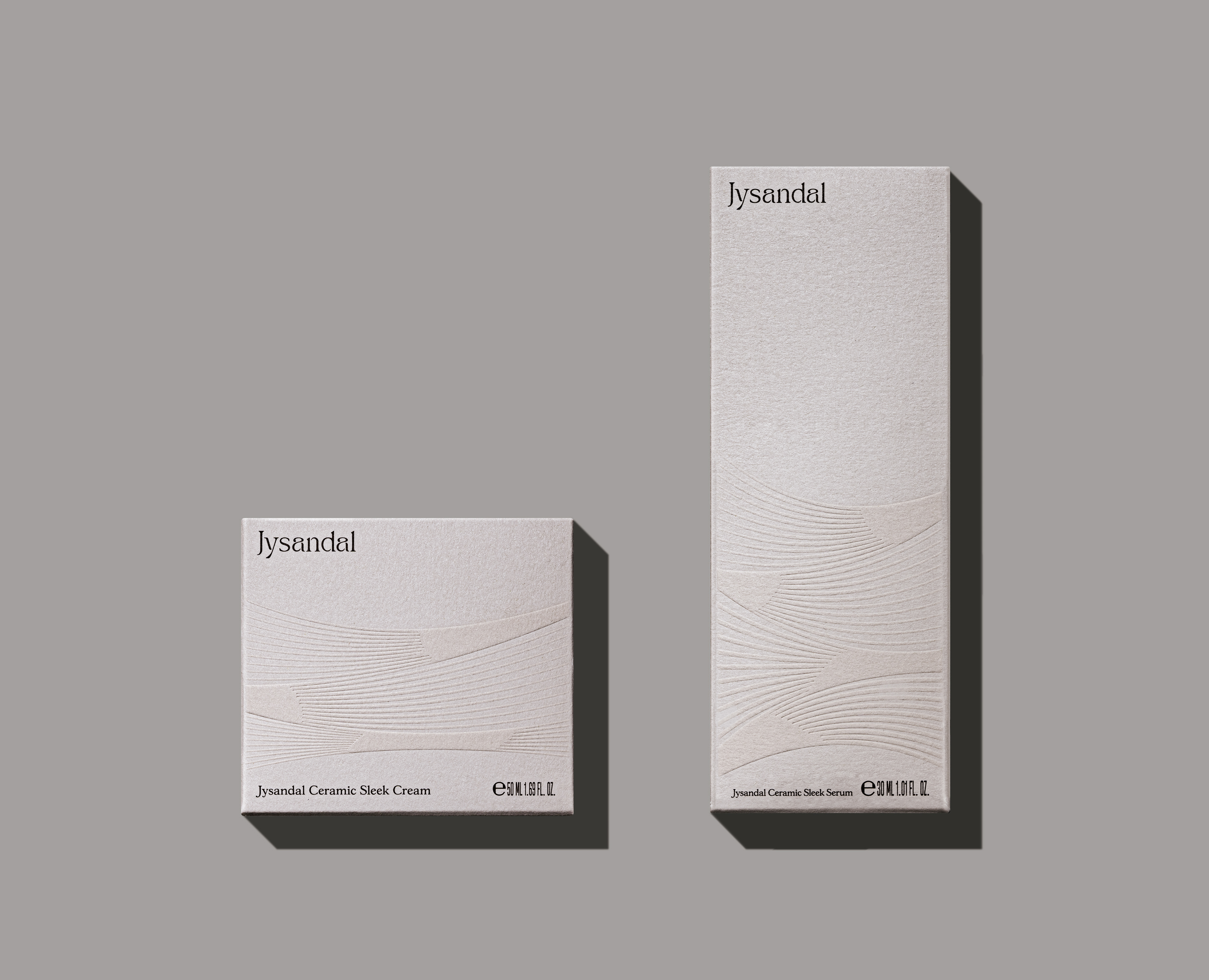
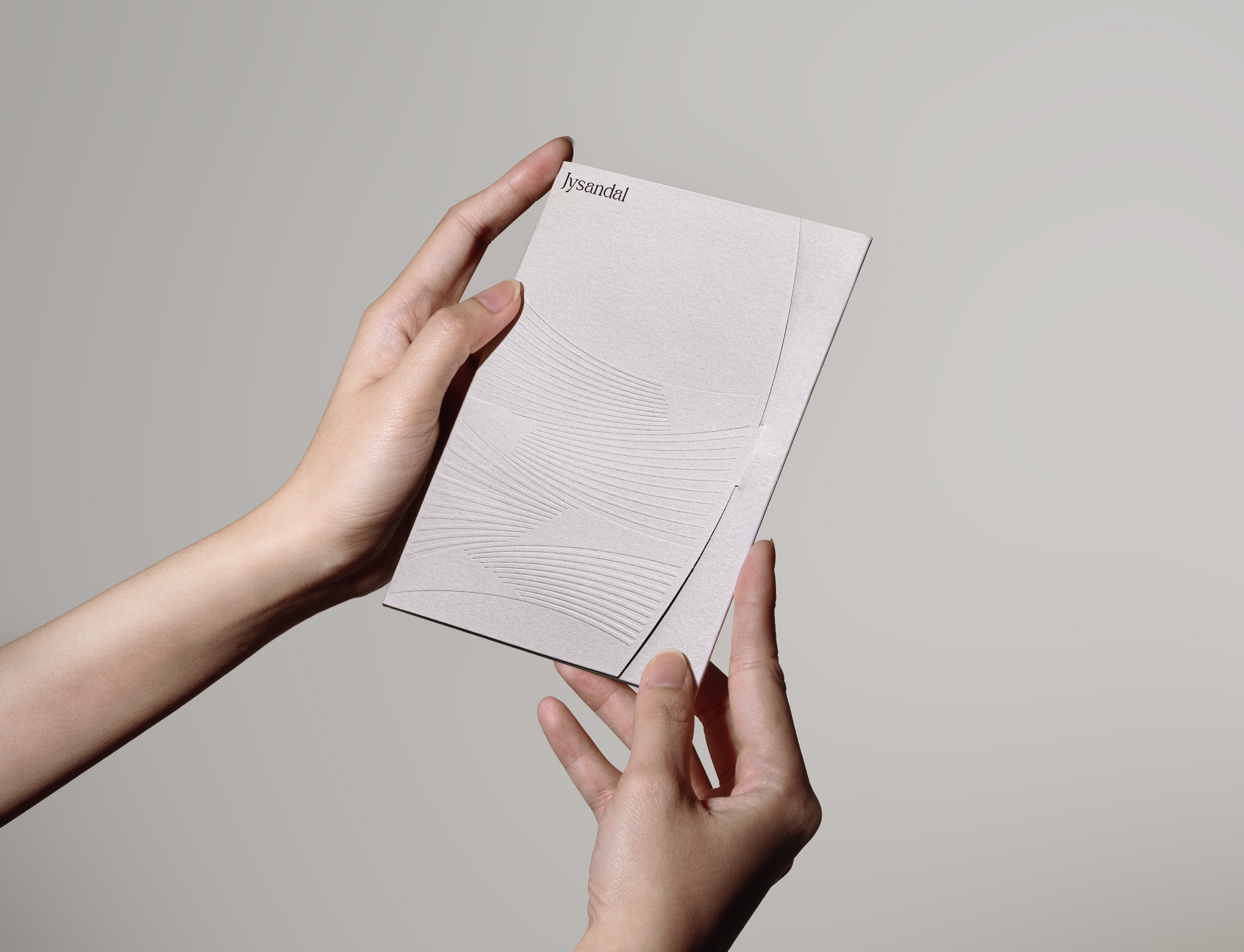
The logo for 'Jysandal' is consistent with the brand’s concept, core values, and name, using an intuitive moon-shaped symbol and the soft flow and curves of ocean waves as motifs in the wordmark to intuitively communicate the regeneration of the skin in relation to the lunar cycle.
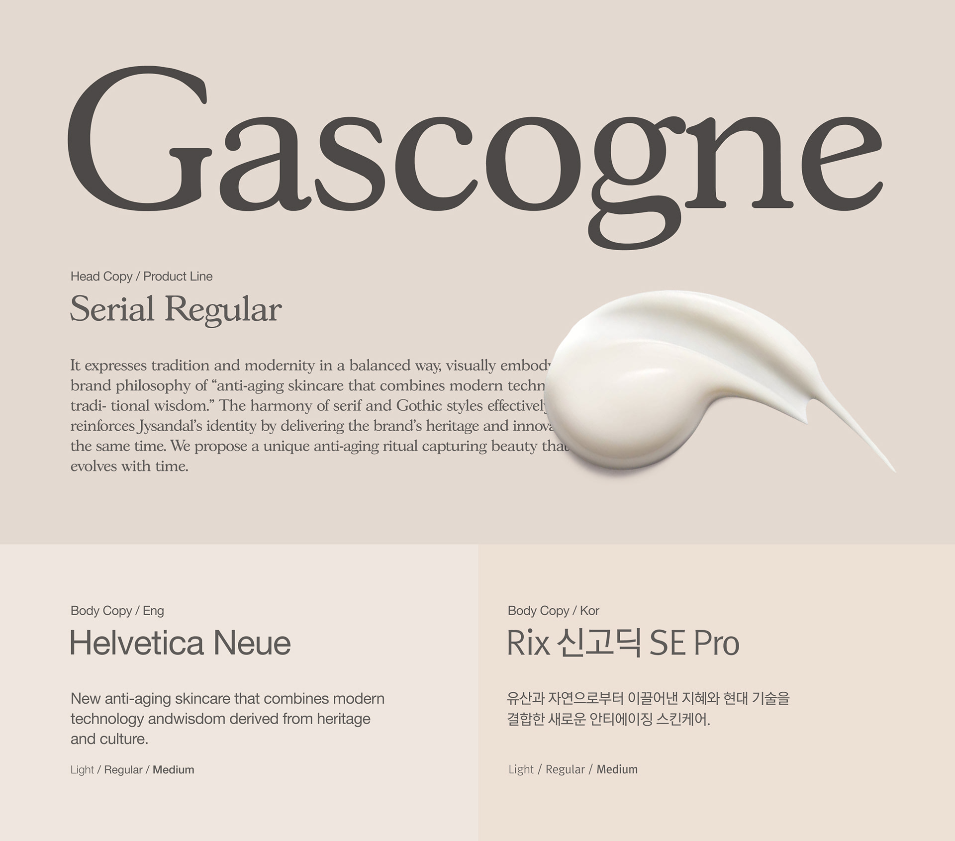
Typography & Color
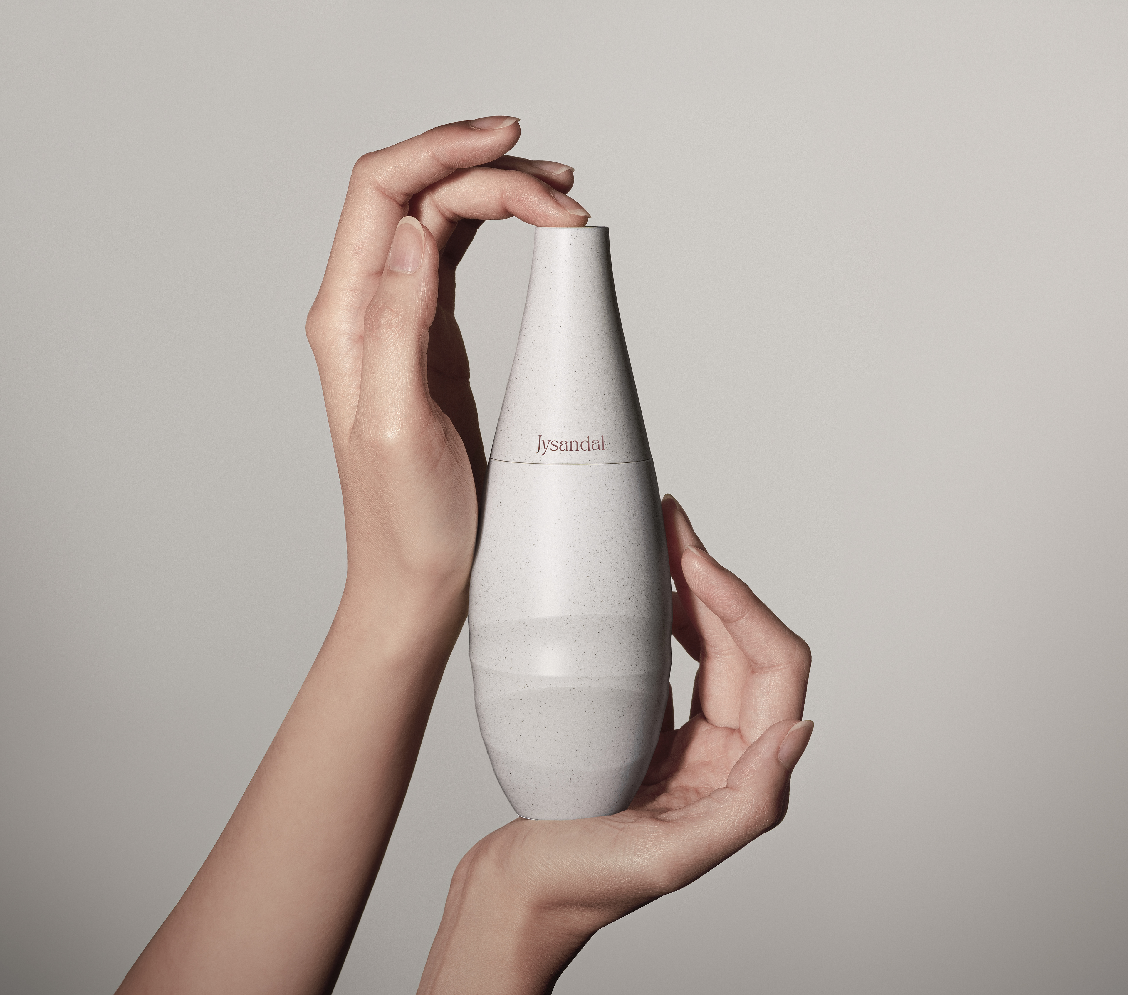
We chose a combination of the English typeface ‘Gascogne Serial Regular’ and the Korean typeface ‘Rix Neo-Gothic SE Pro’, as we felt it balanced tradition and modernity while conveying the brand’s philosophy of “anti-ageing skincare that combines modern technology with traditional wisdom.” The combination of Ming and Gothic styles also effectively reinforces the 'Jysandal' identity, conveying a sense of heritage and innovation at the same time.
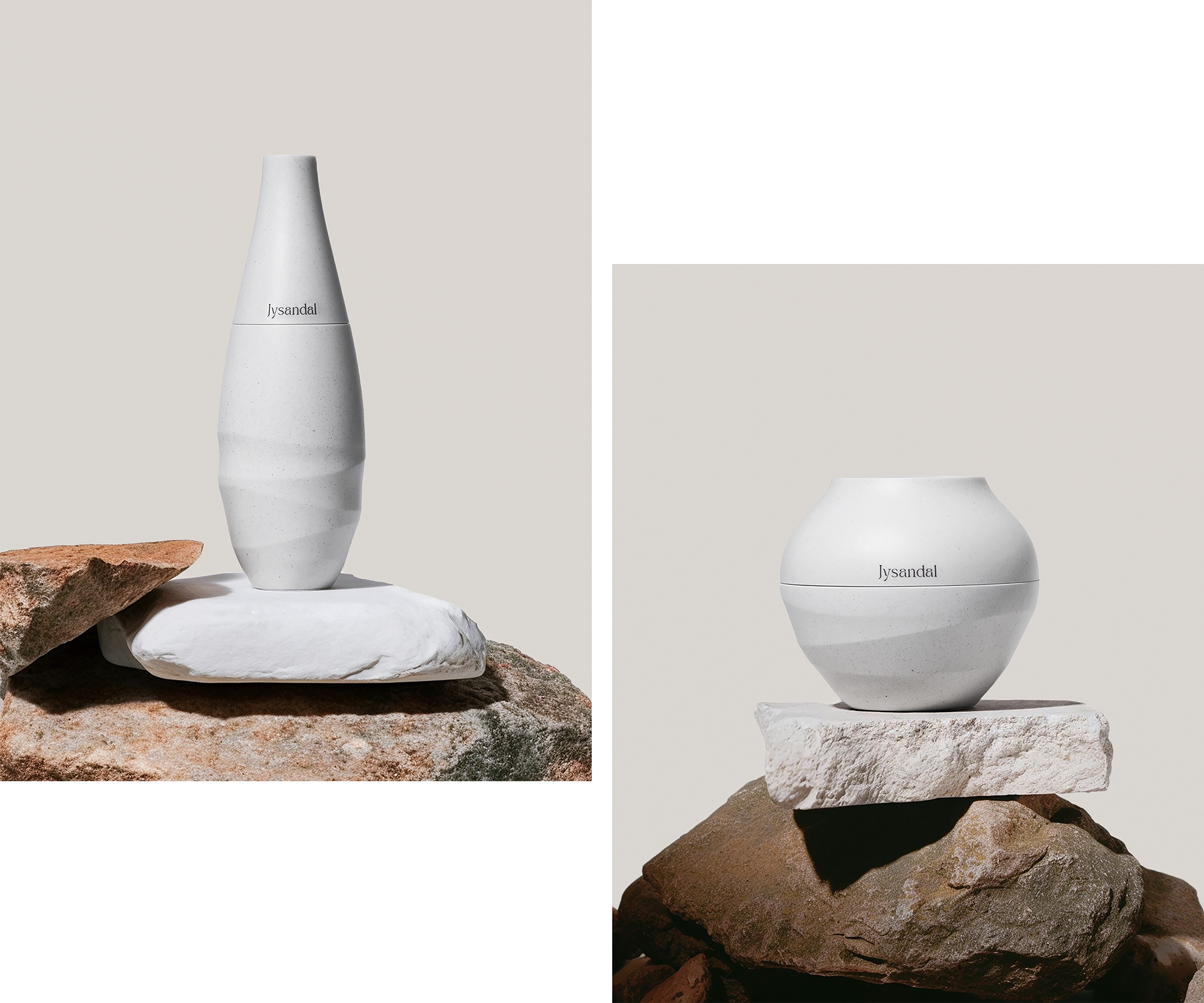
Package Design
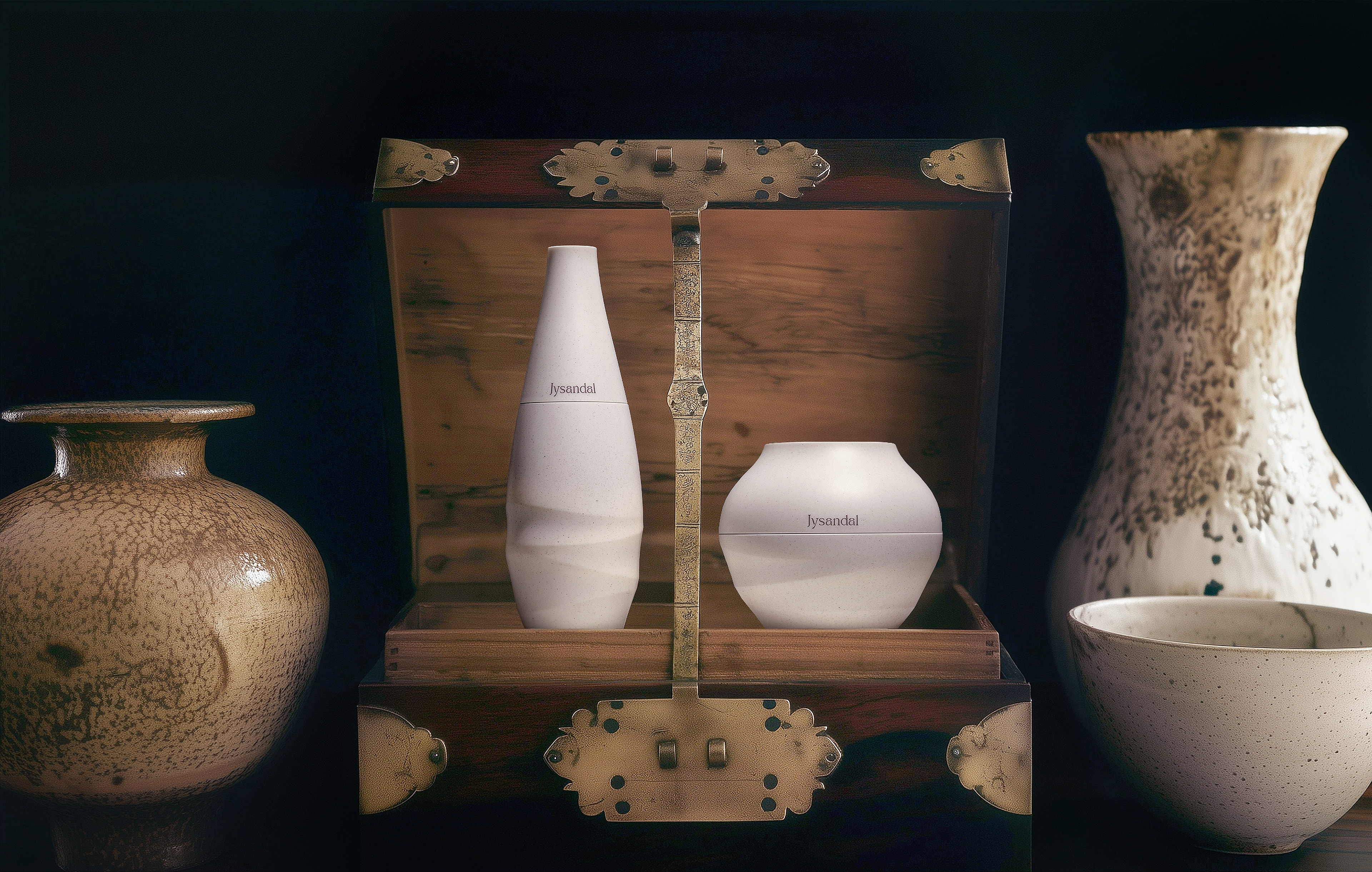
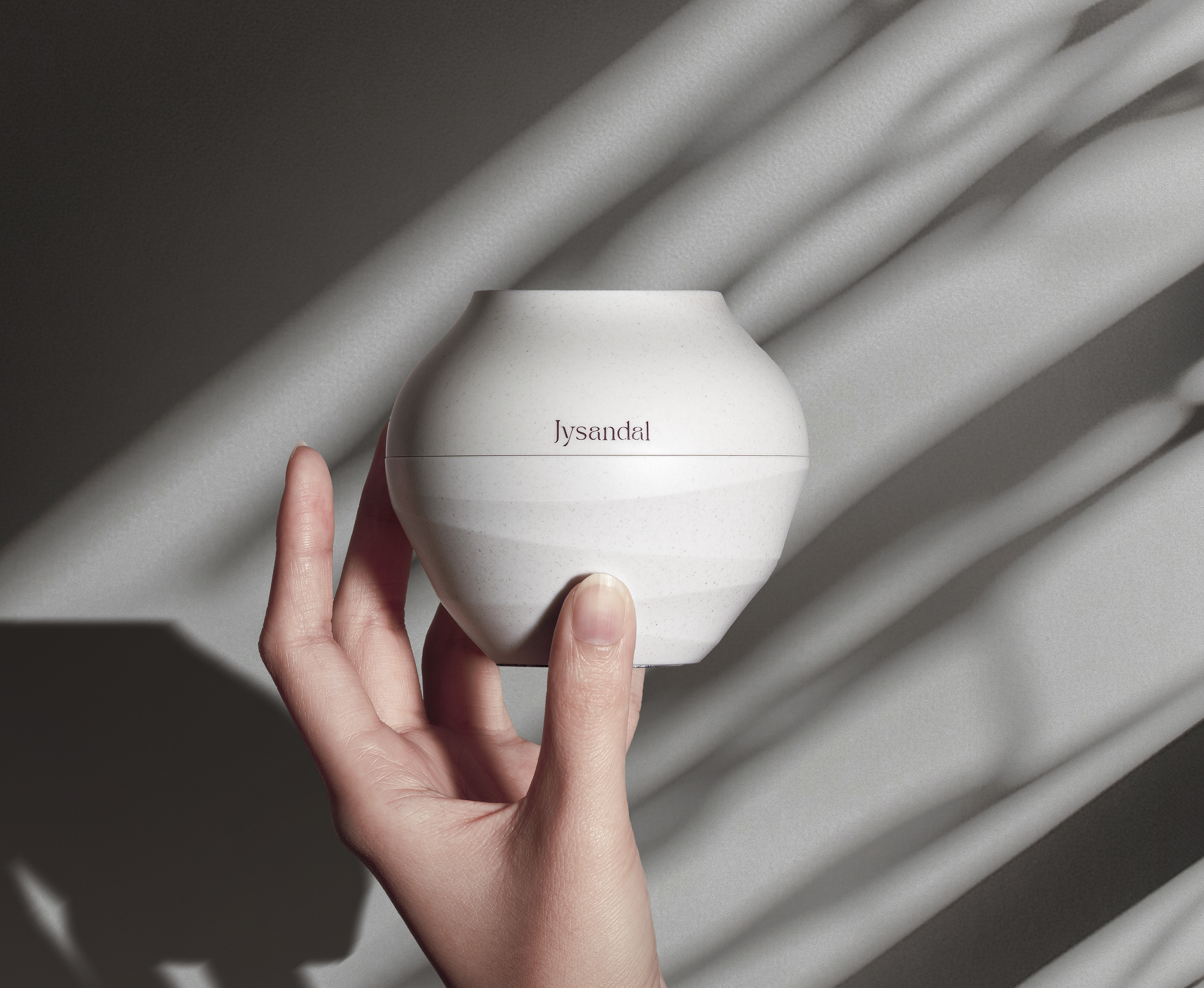
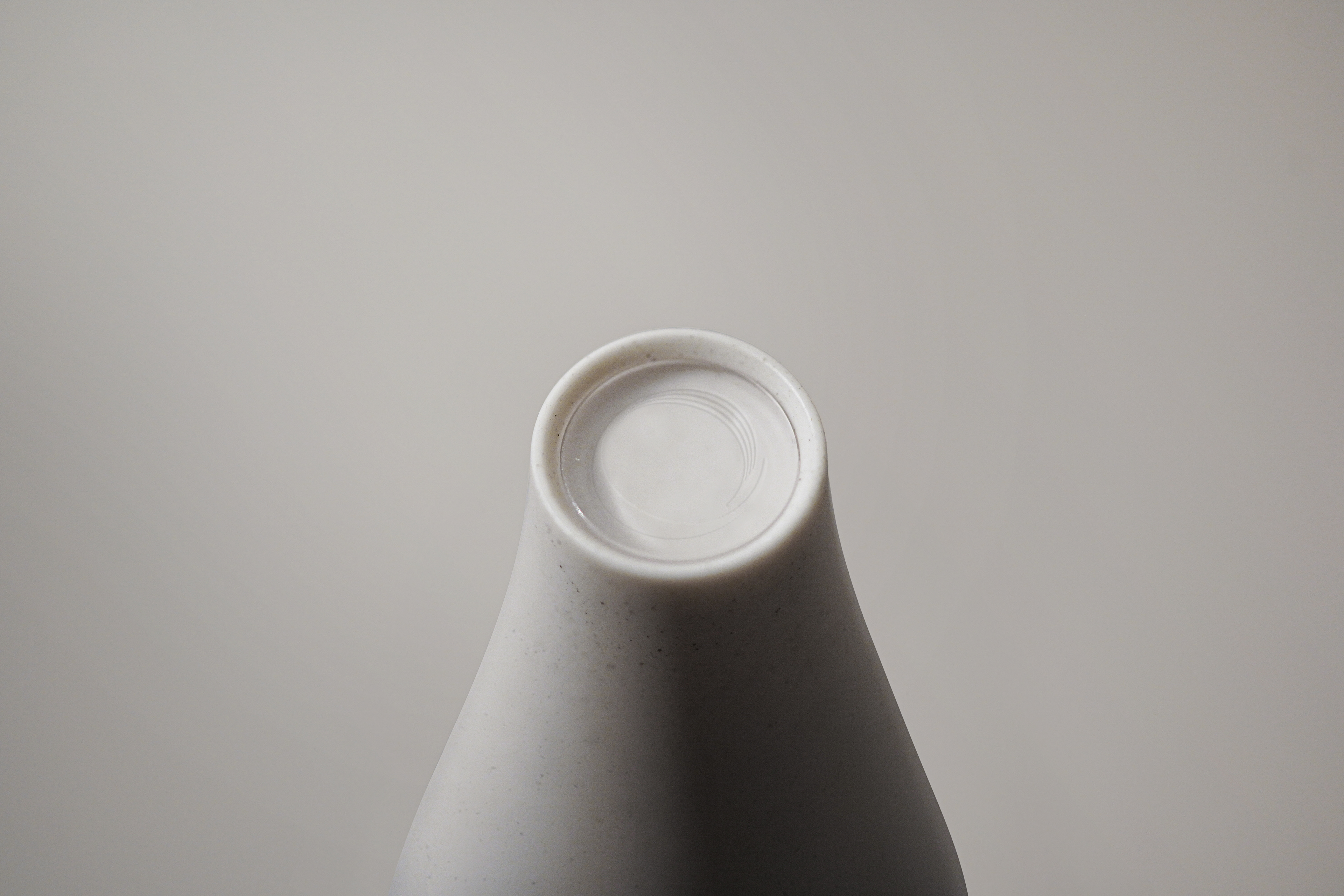
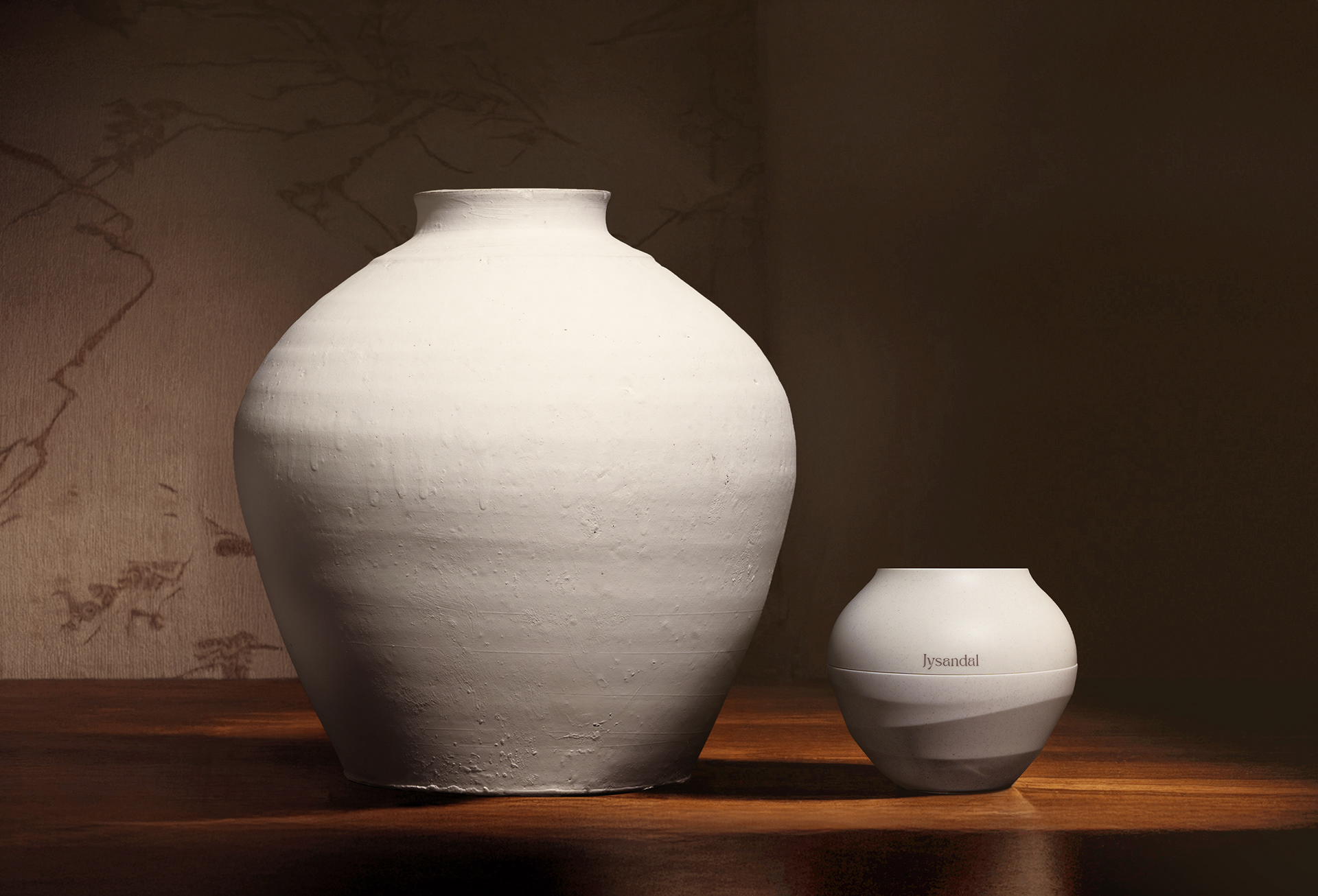
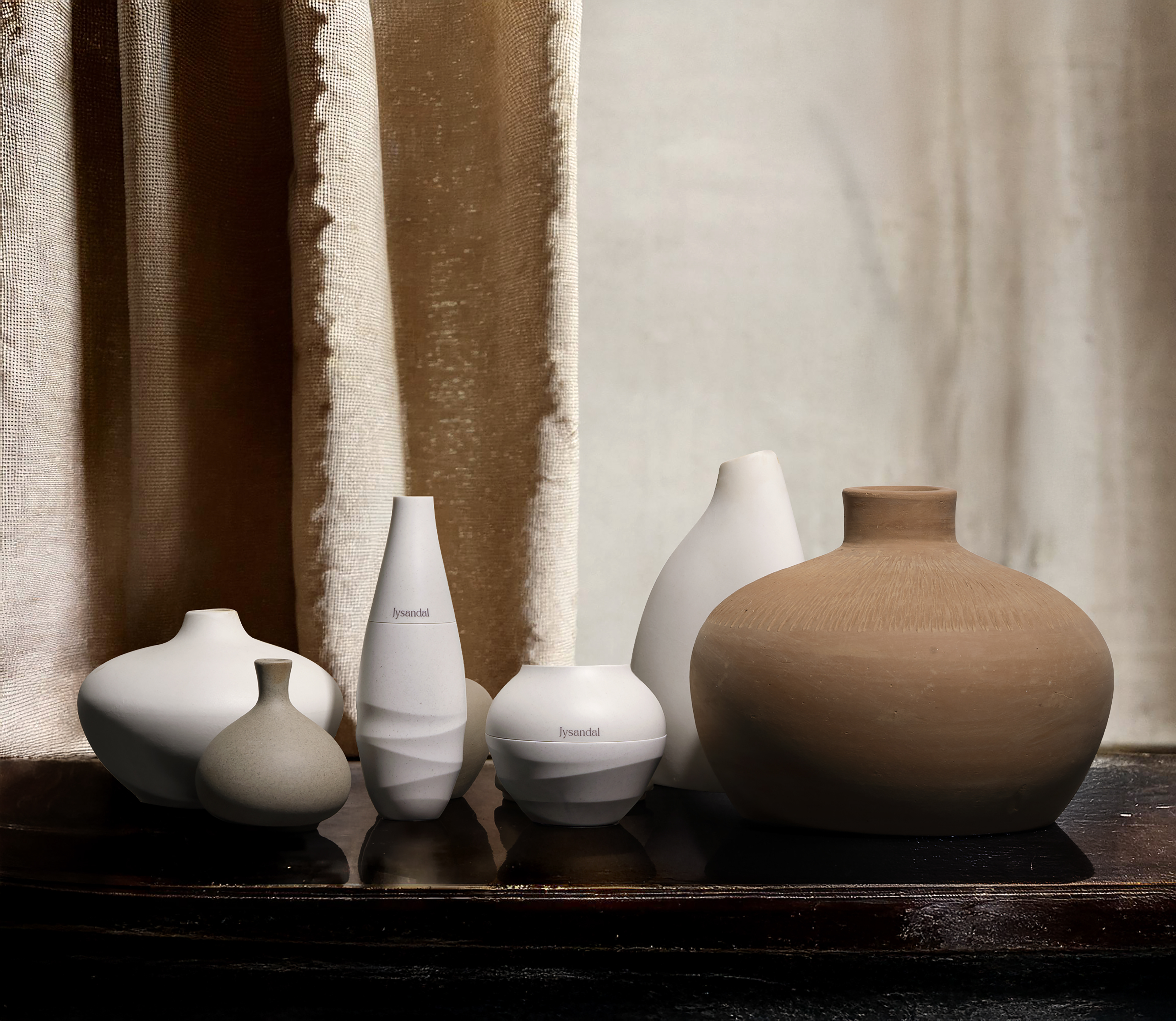
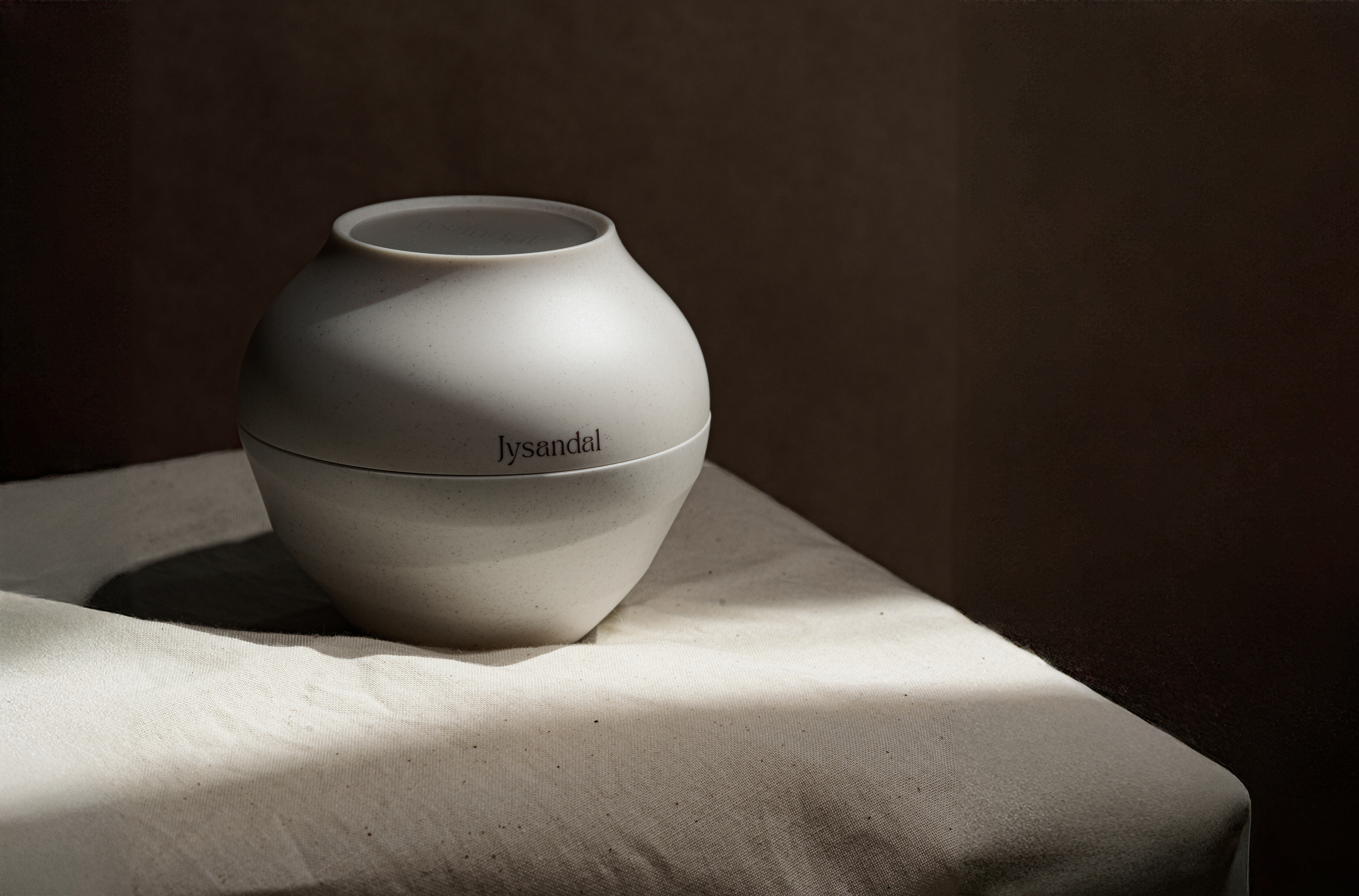
We based the package design on the Korean moon jar, reflecting both its form and the ocean tides influenced by the moon’s gravity. The curved pattern graphic at the bottom symbolizes these changing tides, reinforcing the brand’s core concept of “the deep connection between the moon and the skin” through an intuitive and visually appealing design.
JYSANDAL
2025
Client / NBLK ( Blank Corp. )
Project Team
PM / Blank Corp CP Team
Design / GRAFY.
GRAFY.
Art Direction / Kim Eung Seok
BI Design System / Kim Eung Seok, Hong Yeaji, Han Dong Woo
Design Application / Han Dong Woo, Seo Myeong Cheol
Portfolio Shooting / Seo Myeong Cheol, Huynh Phuong Duyen