Geworin Soft Brand Identity Development
Client / Samjin Pharm.
Services / Strategy, Identity, Basic System, Package Design
© 2022 GRAFY.

Project Overview
1977년 출시되어 빠르고 우수한 효능으로 진통제 시장에 성공적으로 진입한 게보린은 40여 년 동안 소비자와 함께하며 대한민국 대표 진통제로 자리매김했습니다. '게보린 정'에 이어 출시된 '게보린 소프트'는 변화하는 트렌드와 소비자 니즈에 맞춰 '여성 건강'에 초점을 맞춘 제품으로, 제품에 대한 차별화된 브랜드 아이덴티티와 키 비주얼이 필요했습니다.
Launched in 1977 and successfully entered the analgesic market with rapid and excellent efficacy, Geworin has been with consumers for over 40 years and has established itself as Korea's representative pain reliever. Geworin Soft, released after Geworin Jeong, is a product that focuses on 'woman wellness' in line with changing trends and consumer needs, and it needed a unique brand identity and key visual for the product.

Project Goal
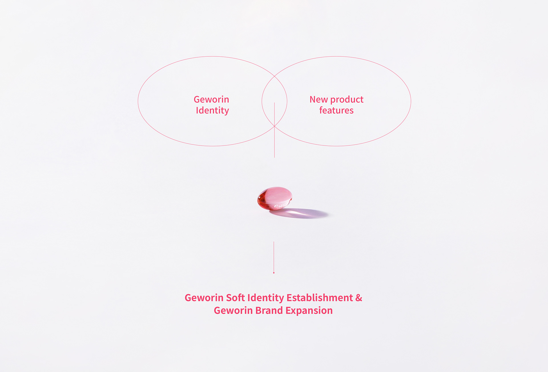
2019년부터 시작된 이번 프로젝트는 기존 게보린 브랜드 가치를 기반으로 게보린 소프트의 아이덴티티를 확립하고, 소비자 친화적인 패키지 디자인 및 시스템을 구축하는 것을 목표로 시작되었습니다. '속효성 진통제'라는 게보린의 소비자 인지도를 고려하고, 자산 연계를 통한 브랜드의 '안티에이징'을 목표로 프로젝트를 진행했습니다.
Starting in 2019, this project was started to establish the identity of Geworin Soft based on the existing Geworin brand value and establish a consumer-friendly package design and system. The project was carried out considering the consumer awareness of Geworin as a 'fast-acting analgesic' and aiming for the 'anti-aging' of the brand through asset linkage.
Brand Core Value
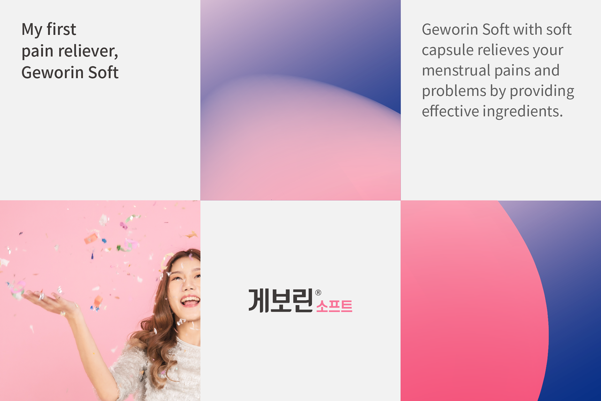
기존 게보린이 소비자에게 전달하는 신뢰와 게보린 연질캡슐의 특징, 핵심 효능 등을 고려해 게보린 소프트의 브랜드 가치와 방향성을 정립했습니다. 특히, 11세 여아부터 복용할 수 있는 순한 성분으로 구성된 제품인 만큼 '내 생애 첫 생리 진통제'라는 콘셉트로 제작했습니다.
The brand value and direction of Geworin Soft were established by considering the trust that the existing Geworin delivers to consumers, the features of Geworin soft capsules, and core efficacy. In particular, we made the concept of 'My first menstrual analgesic', as the product is composed of mild ingredients that can be taken from 11-year-old girls.
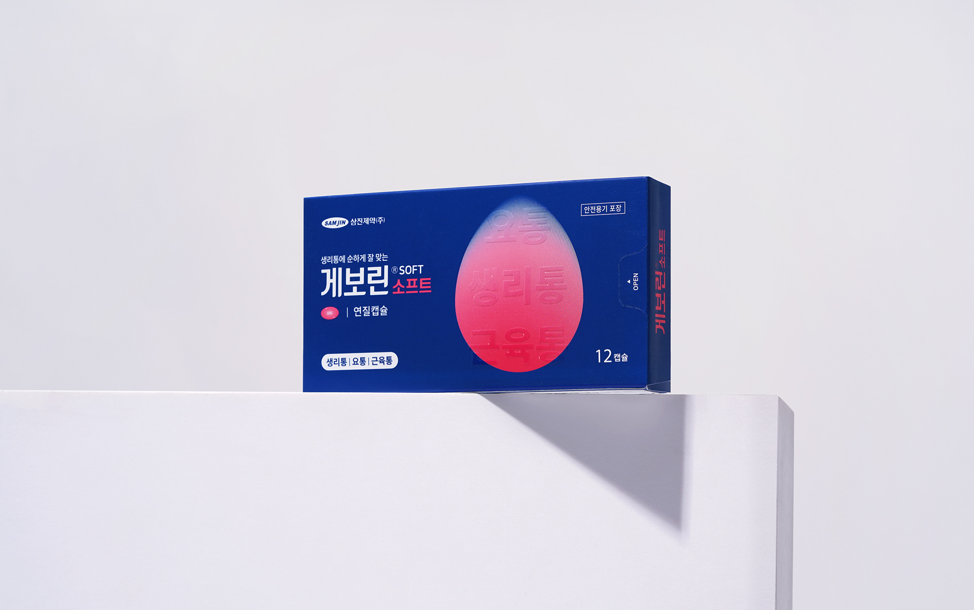
Graphic Motif
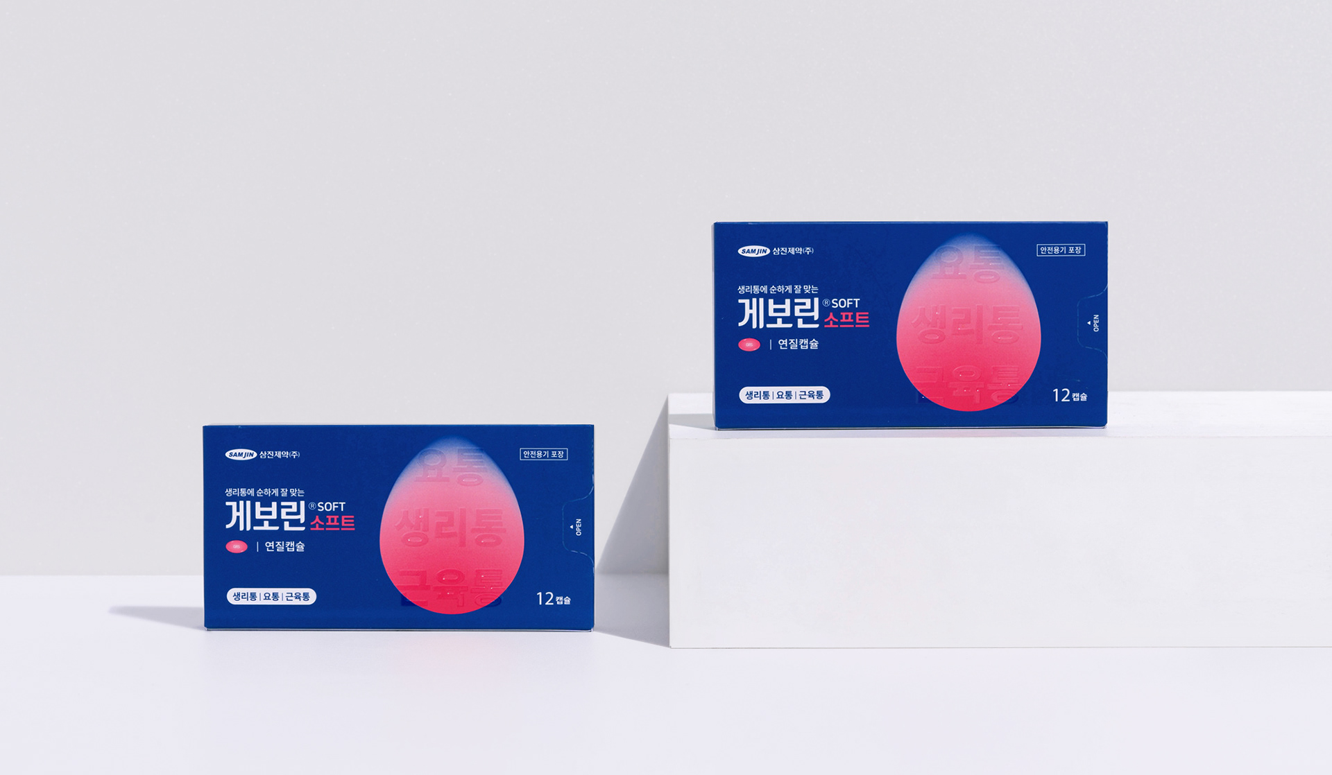
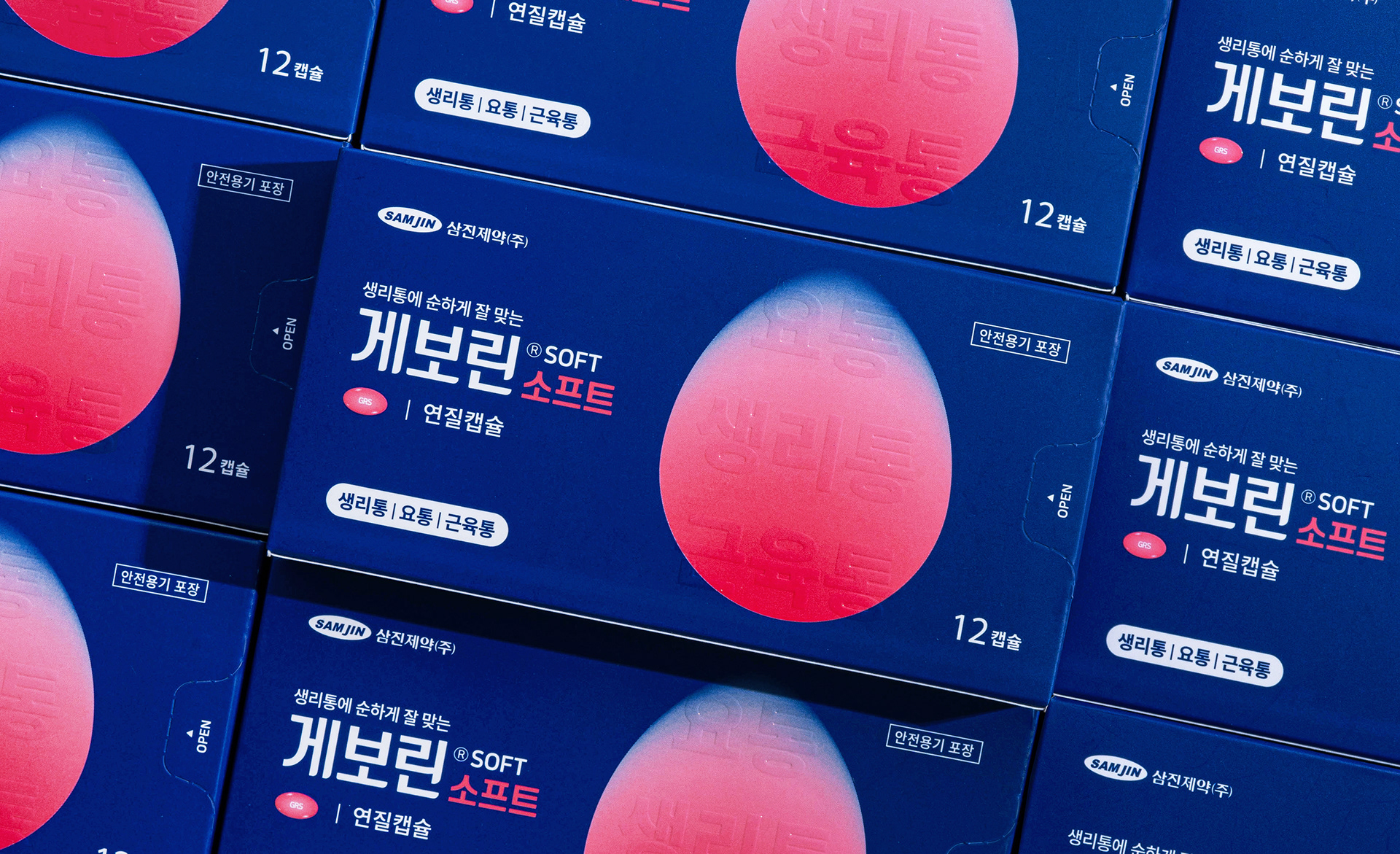
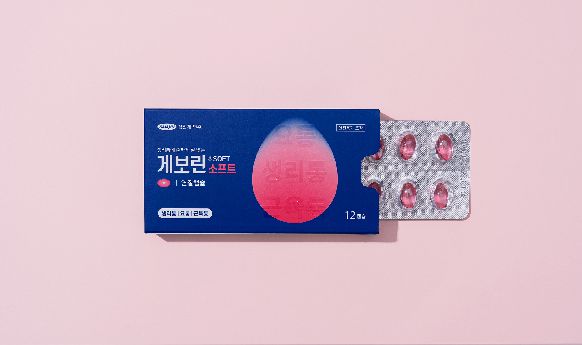
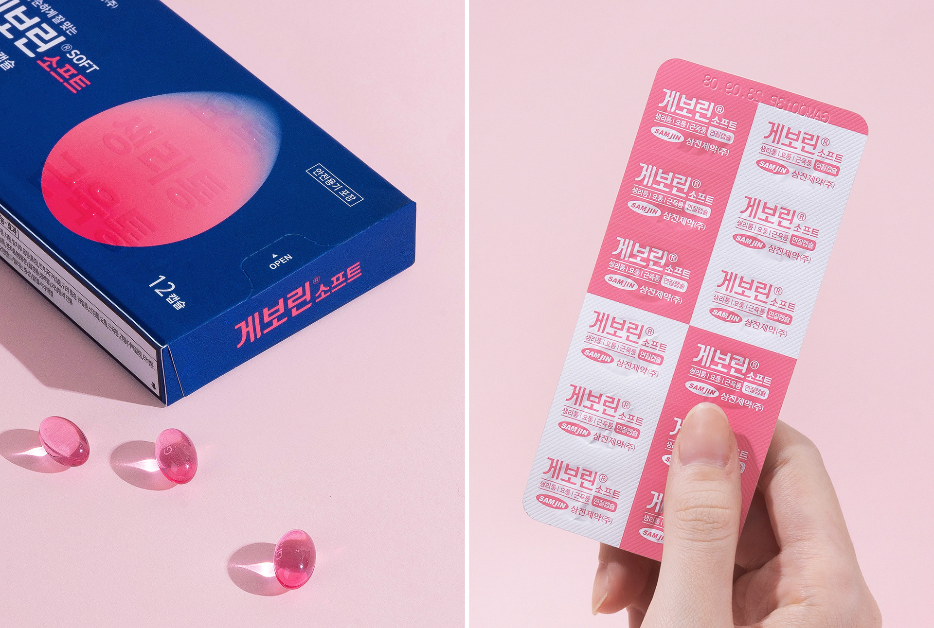
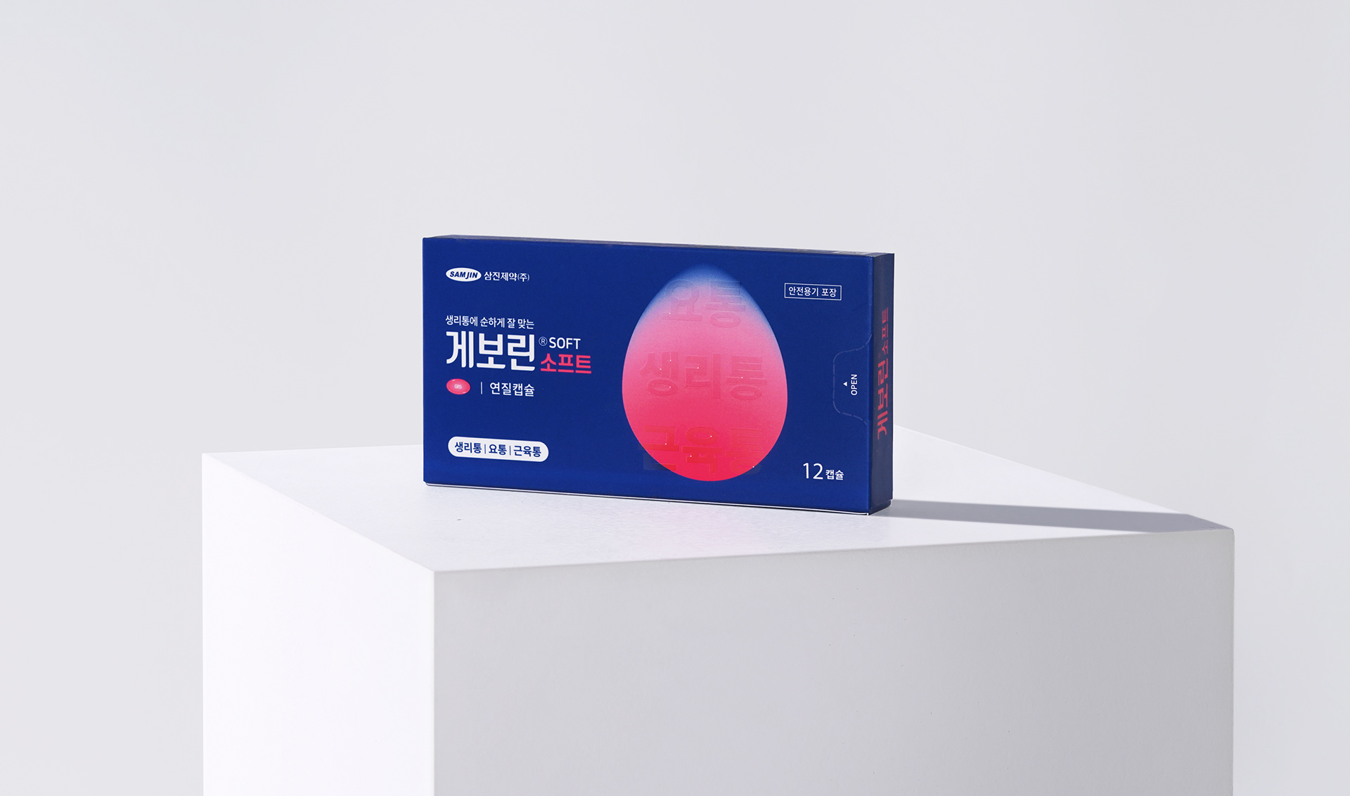
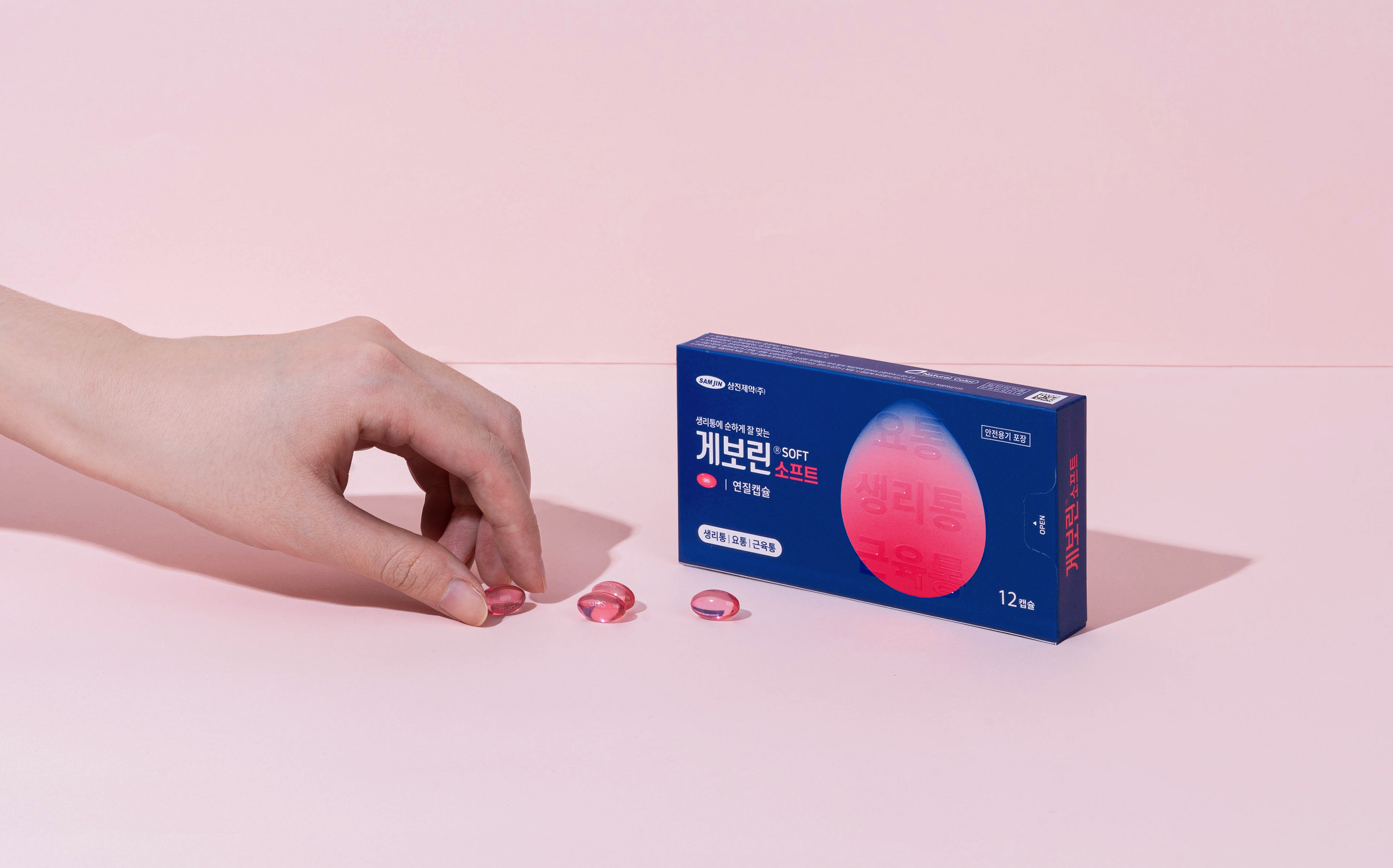
제품의 제형과 적응증을 패키지에 보다 쉽고 직관적으로 전달하기 위해 게우린소프트만의 새로운 그래픽 아트워크를 개발했습니다. 약물이 녹아내리는 모습을 시각화하고 그라데이션 효과를 적용하여 '부드러우면서도 빠르게 침투하는' 제품 특징을 강조하는 상징적인 요소를 만들었습니다.
To convey the formulation and indications of the product on the package more easily and intuitively, we developed a new graphic artwork unique to Geworin Soft. By visualizing the shape of the drug dissolving and applying a gradient effect, we created a symbolic element to emphasize the 'soft but quickly permeable' product features.
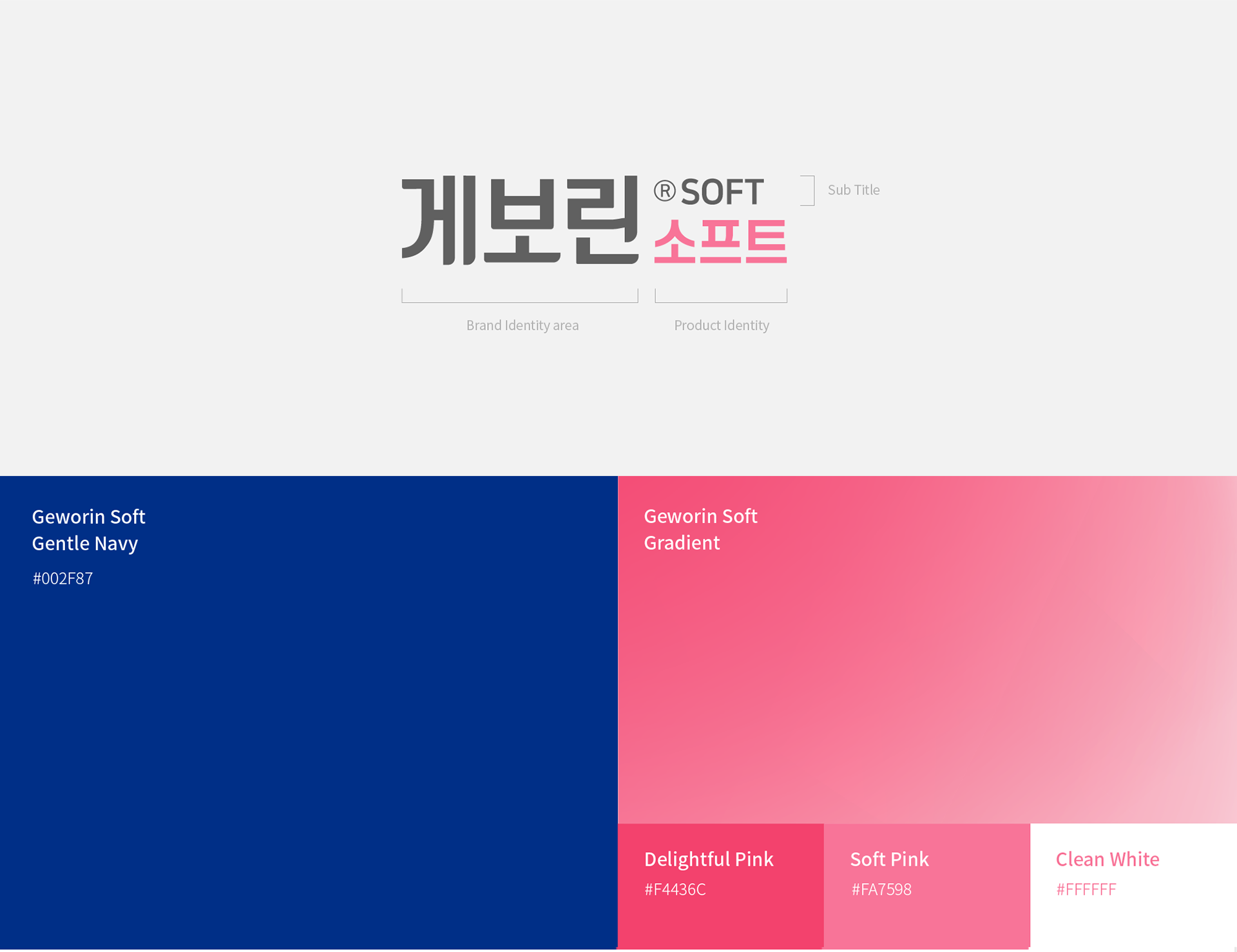
Brand Logo / Color System
기존 게보린 로고 체계 내에서 게보린 브랜드 영역은 유지하면서 제품 아이덴티티 영역에 부드러운 로고타입과 브랜드 컬러를 적용하여 통일된 BI를 제작했습니다. 대담한 고딕 로고 타입으로 신뢰감 있는 게우린의 브랜드 이미지를 강화하고, 타입의 끝을 둥글게 처리하여 소비자 친화적인 특유의 분위기를 살렸습니다.
Within the established Geworin logo system, we created a unified BI by maintaining the Geworin brand area while applying the soft logotype and brand color to the product identity area. The bold gothic logo type strengthens the trustworthy brand image of Geworin, and we rounded the end of the type to bring out a unique consumer-friendly mood.

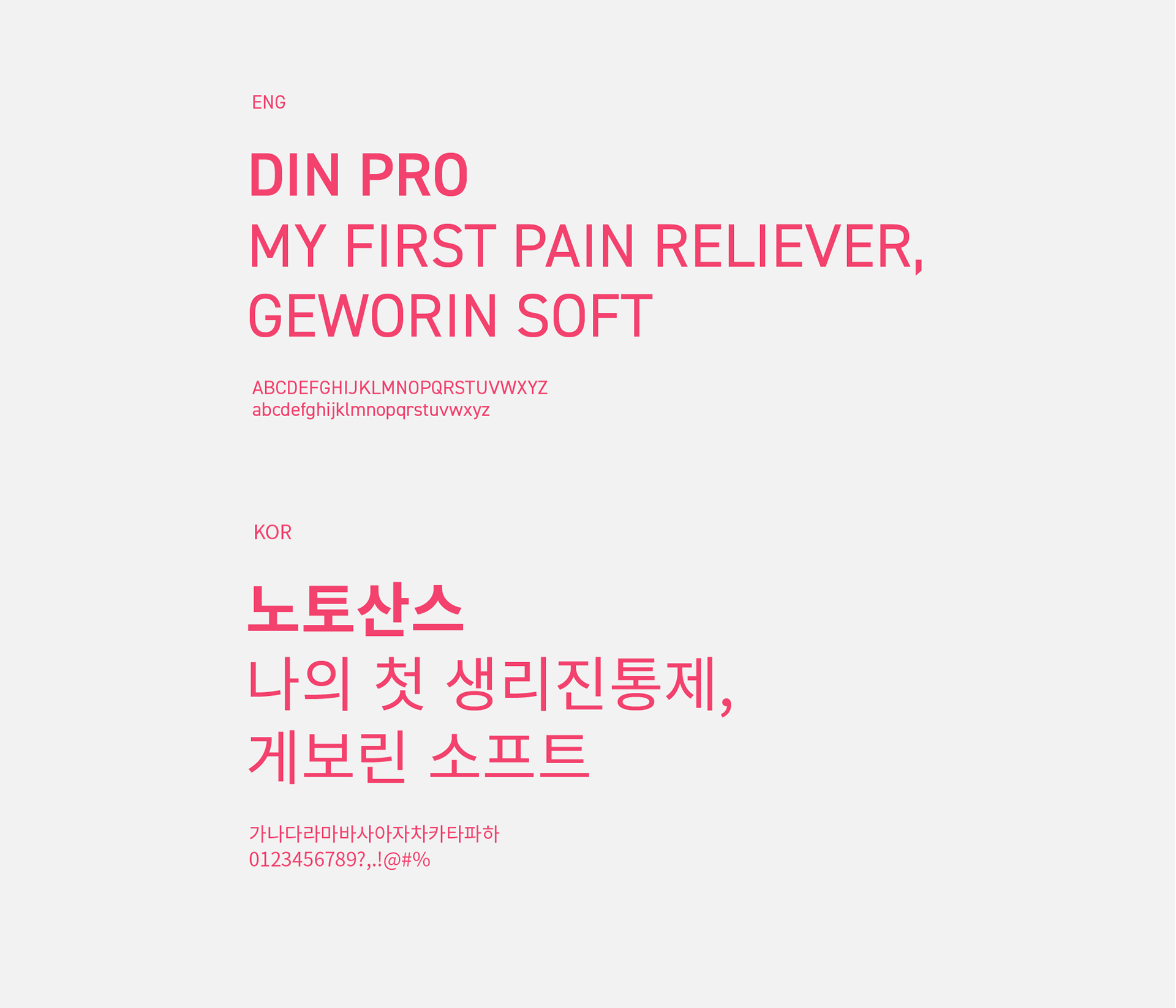
Typography
게보린 소프트의 핵심 그래픽 모티브를 바탕으로 온-오프라인에서 브랜드 커뮤니케이션 수단으로 활용할 수 있는 핵심 시각적 요소를 정리했습니다. 게보린 소프트는 브랜드 로고의 조형적 구성과 유사한 DIN 프로와 노토 산스 서체를 사용했습니다. 노토 산스 서체 중 패키지나 어플리케이션에 최적화되고 브랜드에 일관된 느낌을 줄 수 있는 레귤러와 볼드 사이의 서체를 사용했습니다.
Based on Geworin Soft's core graphic motif, we have compiled key visual elements that can be used as a means of brand communication both online and offline. For Geworin Soft, DIN pro and noto sans typefaces similar to the formative composition of the brand logo were used. Among the noto sans fonts, I used a font between Regular and bold, which is optimal for package or application and can give a consistent feeling to the brand.
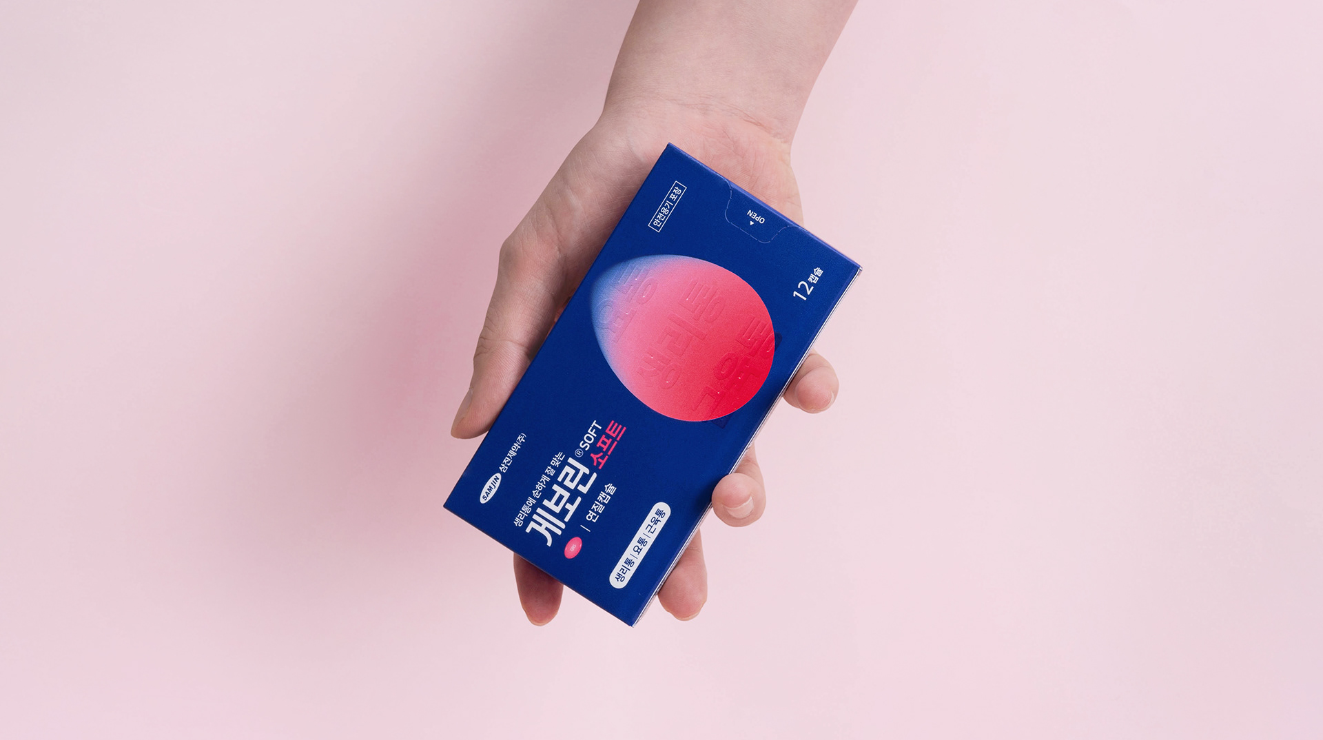
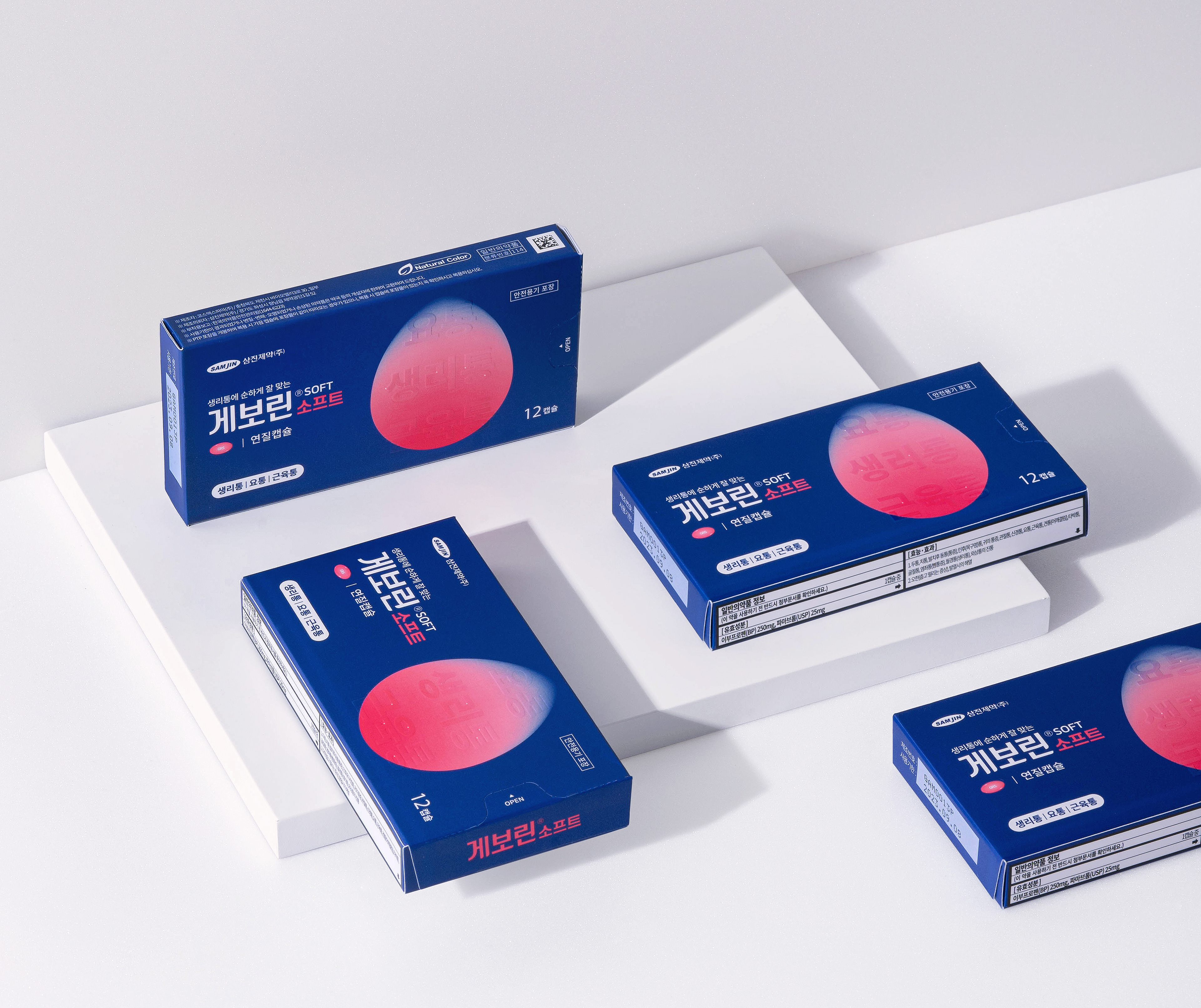
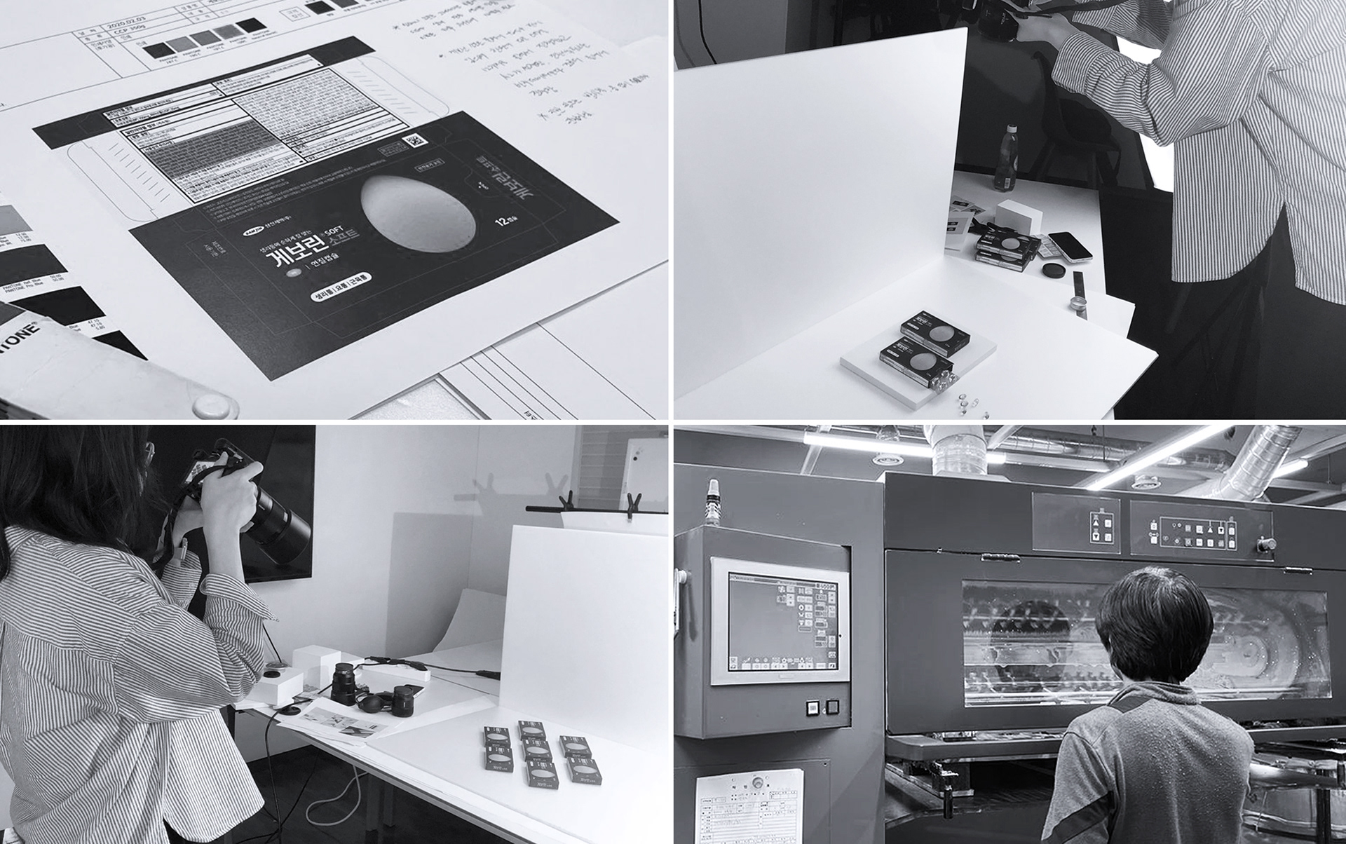
Package Design Strategy
브랜드 아이덴티티뿐만 아니라 의약품의 신뢰성 있고 전문적인 이미지를 전달하기 위해 브랜드 영역과 커뮤니케이션 영역을 구분하여 패키지 디자인이 정확한 정보를 전달할 수 있도록 노력했습니다. 브랜드 영역에는 아트웍과 BI를, 커뮤니케이션 영역에는 제품 효능 및 기타 정보를 배치하고, 향후 게보린 브랜드 확장 및 신제품에 유연하게 적용할 수 있도록 디자인을 체계화했습니다.
In order to deliver not only the brand identity but also the reliable and professional image of pharmaceuticals, we tried to make the package design deliver accurate information by dividing the brand and communication areas. We placed the artwork and BI in the brand area, product efficacy and other information in the communication area, and then systematized the design so that it can be flexibly applied to the Geworin brand extension and new products.

© 2024 GRAFY.
GRAFY B/D 2-3F, 350, Dongil-ro, Gwangjin-gu, Seoul, Republic of Korea
contact / info@grafydesign.com / +82 70 8633 7222
-
If you want to see more projects, click on the links below