Geworin Tablet Package Design
Client / Samjin Pharm
Services / Strategy, Identity, Basic System, Package Design
© 2022 GRAFY.

Project Overview
게보린 정은 1977년 출시되어 40여 년간 효과 빠른 진통제로 명성을 떨치며, 소비자의 필수 상비약이자 국민 진통제로 자리매김해 왔습니다. 2020년 4월부터 진행된 이번 프로젝트는, 소비자의 니즈를 반영하여 기존의 올드한 이미지를 바꾸고, 더욱 젊고 제품의 효능에 대한 이미지를 녹여내, 한국의 대표 두통약 브랜드로서 더욱 성장시킬 수 있는 목표를 가지고 시작되었습니다. 게보린이 선행해 왔던 브랜드 현황, 제품의 특장점, 타겟 소비자를 종합적으로 고려하여 게보린 정만의 디자인 방향성을 수립했습니다. 40여 년 변함없는 ‘게보린 정’이 아닌, 지금의 트렌드와 현 소비자의 니즈에 맞춰 성장해 온 브랜드의 이미지를 강화하며, 새로워진 게보린 정의 제품특징을 상징적으로 디자인에 반영하고자 합니다.
Geworin tab, released in 1977, has taken place as Korea's favorite pain reliever and first aid medicine for 40 years. From April 2020, the project aimed to further grow the brand status as the representative Korean pain reliever by replacing the old image with young and new and integrating the visual to express the effect. We established the unique design direction of the Geworin tab while holistically considering the present brand status, features of the product, and target customers. Enhancing the brand image that has been grown to fit the needs of customers and the trend of now, and neglecting the identity as Geworin tab that was the same for 40 years, We want to reflect the renewed feature of the Geworin tab to the design symbolically.
Graphic Motif
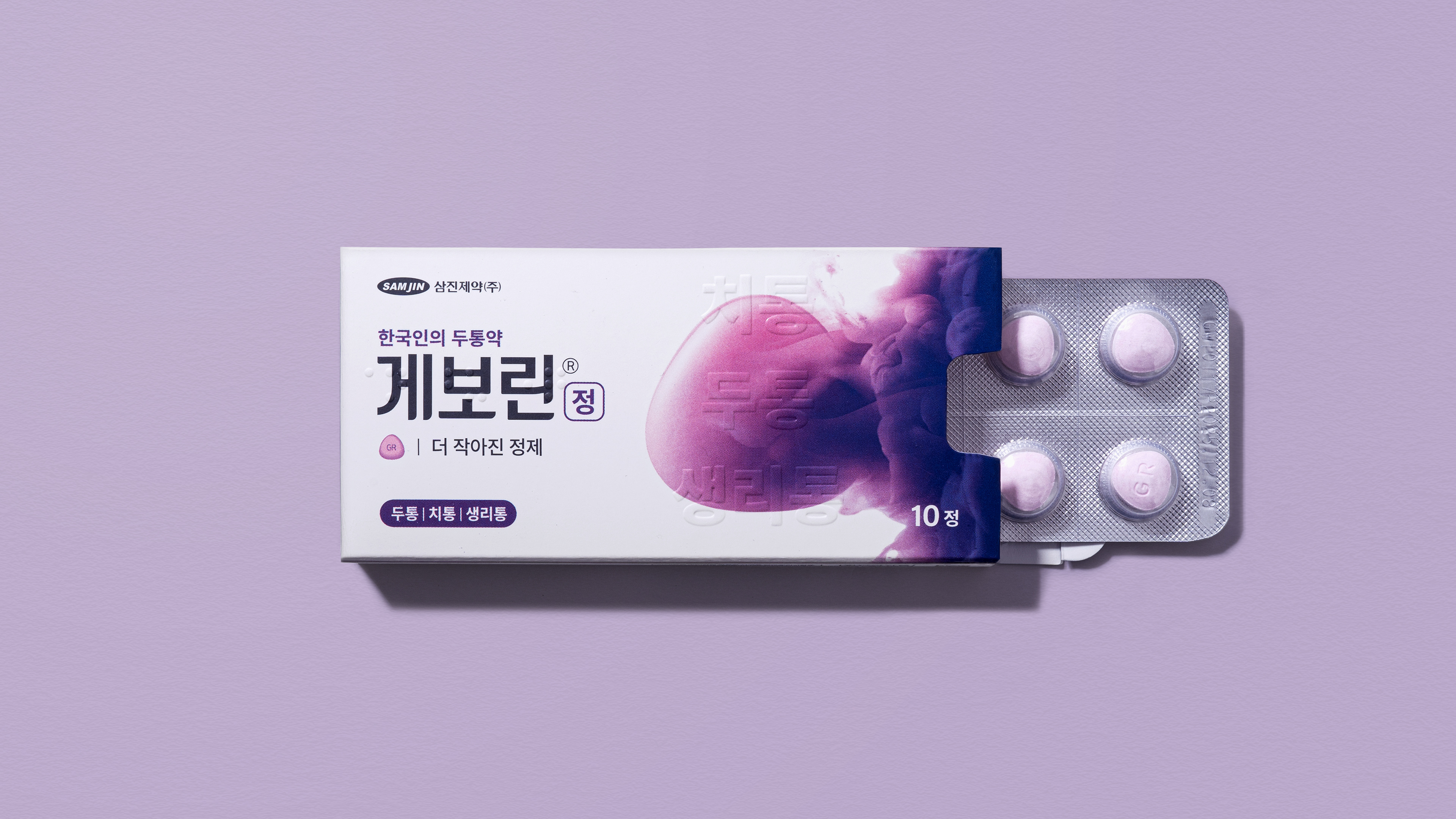
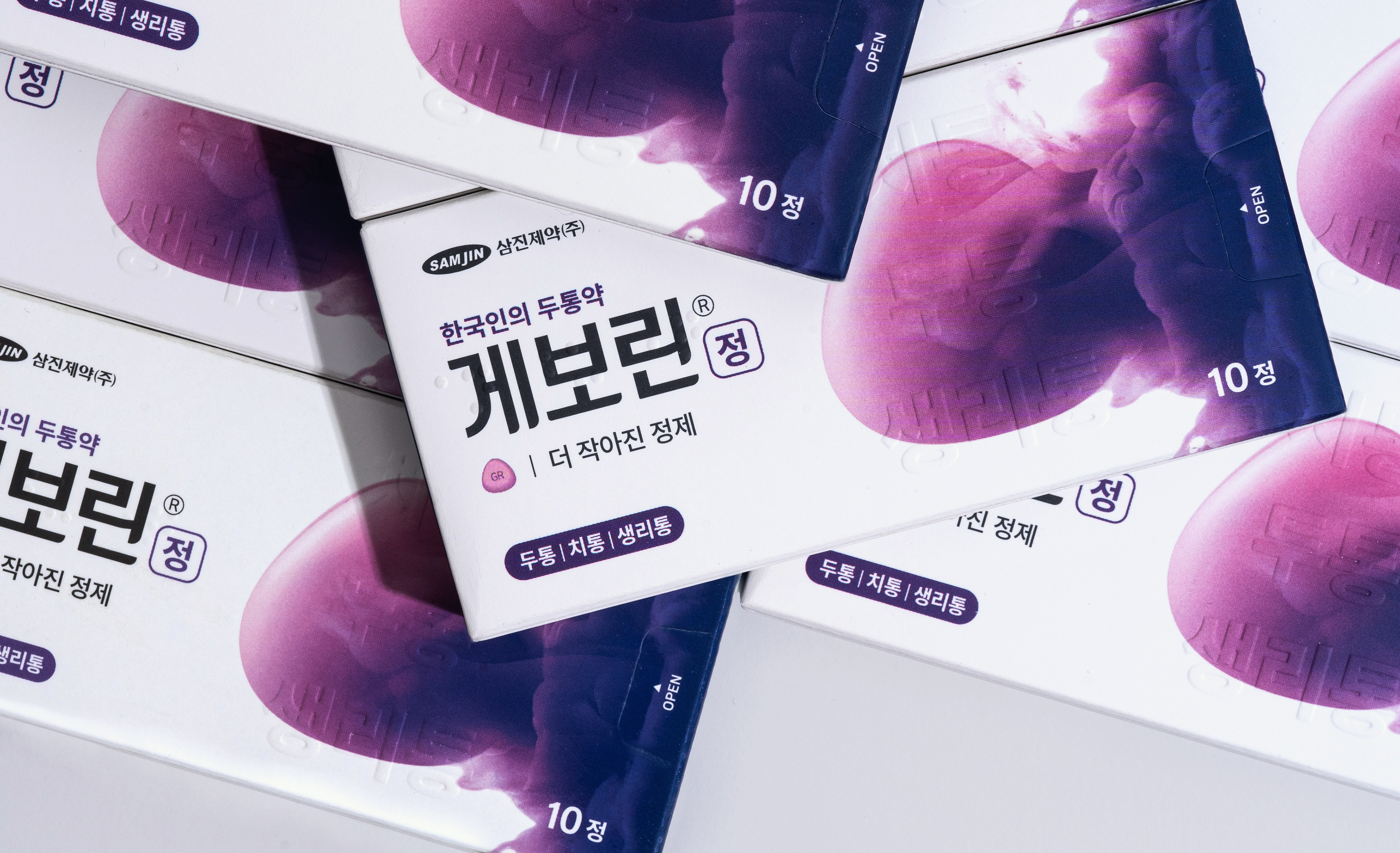
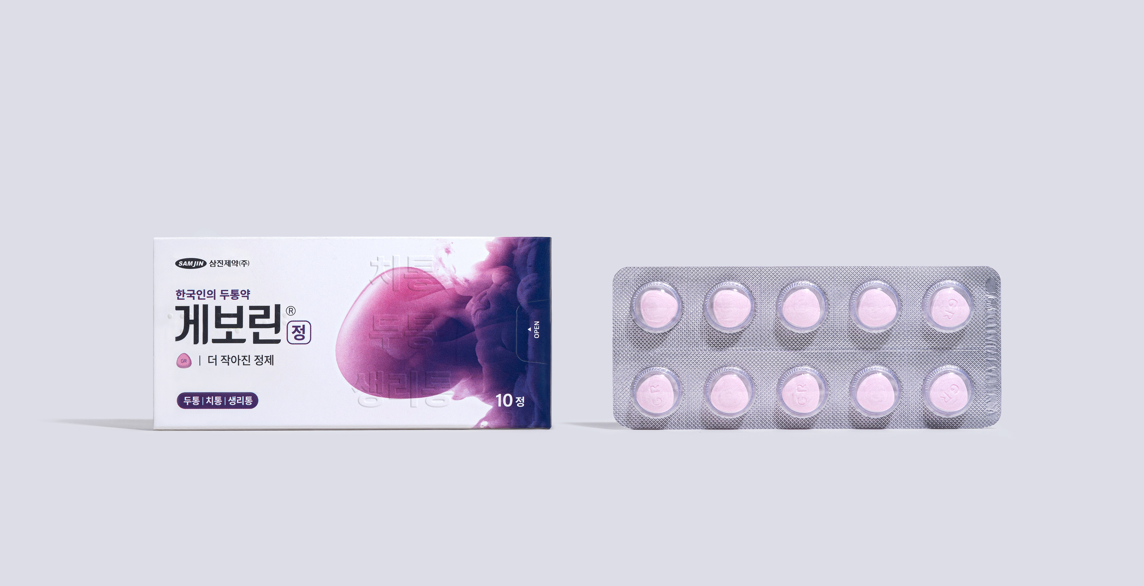
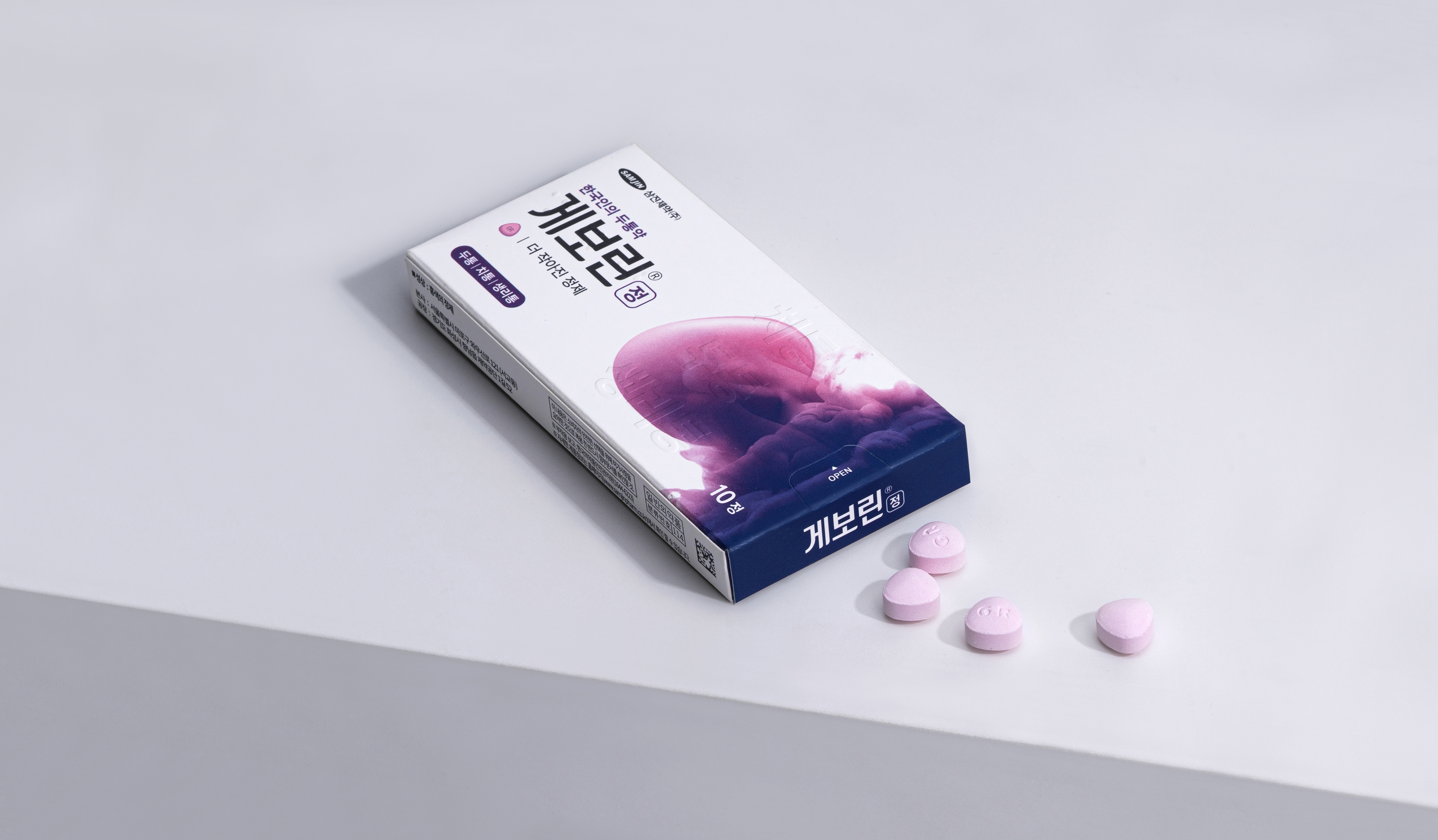
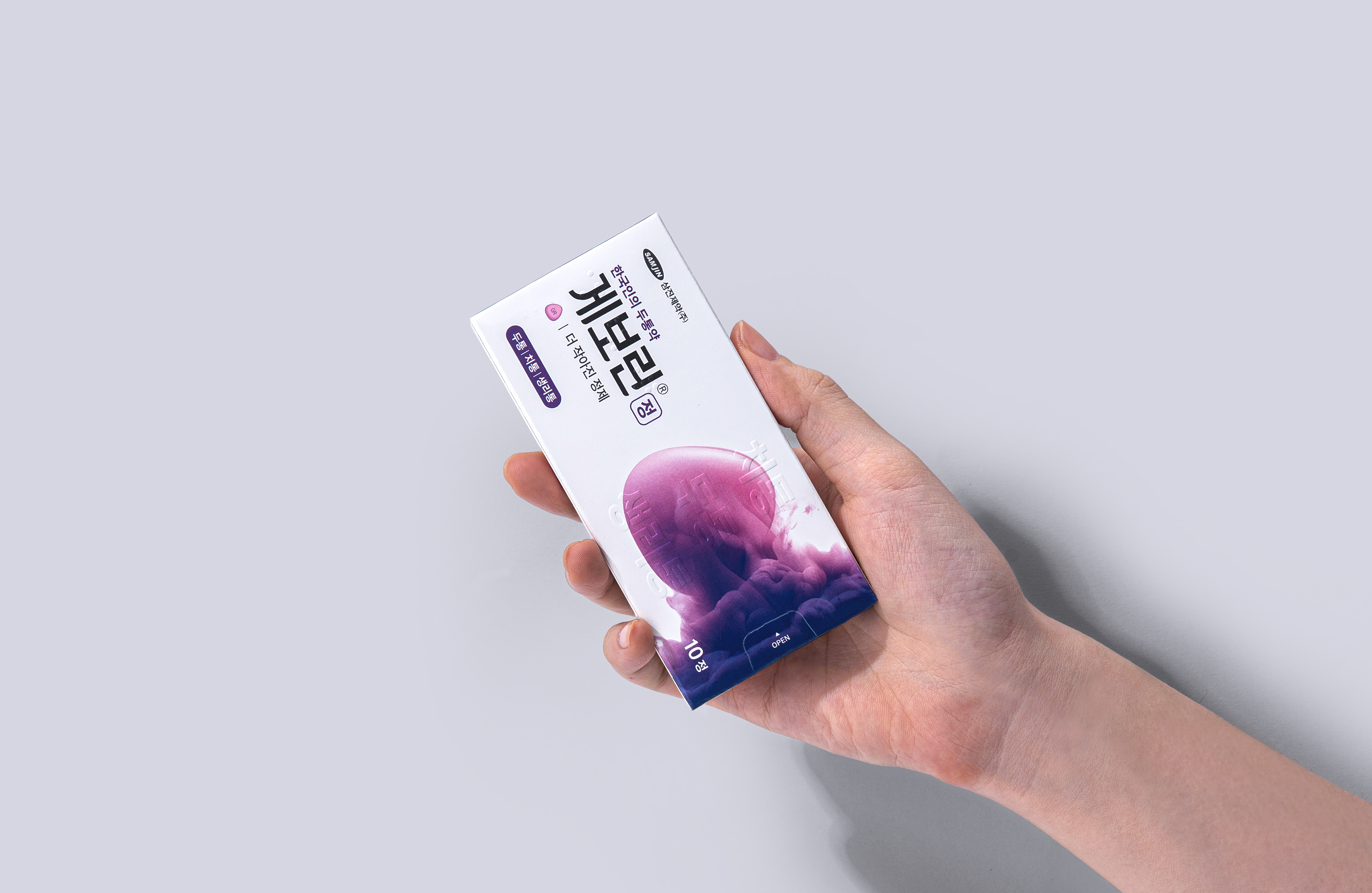
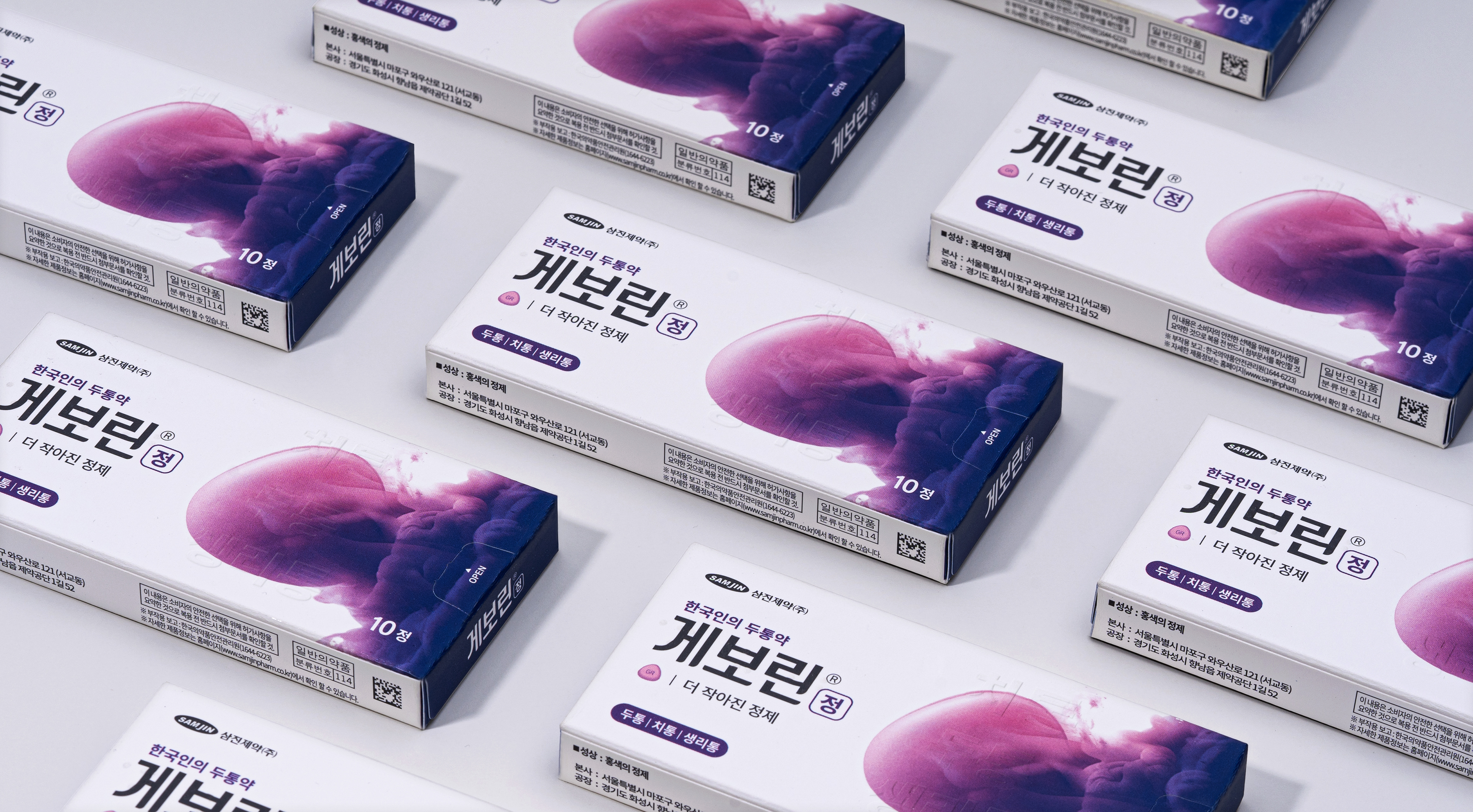
40년이 넘는 시간 동안 많은 사랑을 받은 게보린은 다수의 고객들이 게보린의 정제의 형태와 컬러에 대한 다양한 기억의 정서가 혼합되어 있습니다. 이러한 정제의 형태를 활용해 보다 강력한 브랜드 아이덴티티를 구축하여, 상징성은 강화하고 직관적인 새로운 게보린의 비주얼 모티브를 개발했습니다.
Geworin tab is a brand beloved by Koreans for over 40 years. The form and color of the pill left a mix of diverse memories to customers. We utilized this and built a strong brand identity. As a result, we enhance the symbolism and develop the new intuitive visual motif of Geworin tab.
Brand Logo
기존의 로고에 정립된 게보린 로고 시스템을 통해, 보다 안정감 있는 BI를 제작했습니다. 볼드한 고딕체의 로고 타입은 신뢰적인 이미지를 강화하고, 타입 끝단을 라운드 처리하여 국민 진통제로써의 소비자 친화적 무드를 나타냅니다.
With the previously established logo system of Geworin tab, we made a more stable BI. The logotype in bold gothic emphasized the reliable brand image. Also, the Rounded finish at the end of the typography shows a friendly mood as Korea's favorite pain reliever.
Color Palette
'게보린 퍼플'은 기존 브랜드 컬러인 Purple을 톤을 다운시켜, 안정감 있고 트렌디한 이미지를 담아 게보린의 이미지를 느낄 수 있게 디벨롭 하였습니다. 또한, 그라디언트 컬러를 활용해 스며드는듯한 이미지를 직/간접적으로 표현하여, 약의 빠른 효능을 표현합니다
We developed the brand color, Geworin purple, by decreasing the color tone of the previous brand purple color to make it stable and feel more trendy. In addition, The gradient color directly/ indirectly expresses the permeation of the pill to promote a rapid effect of the product.

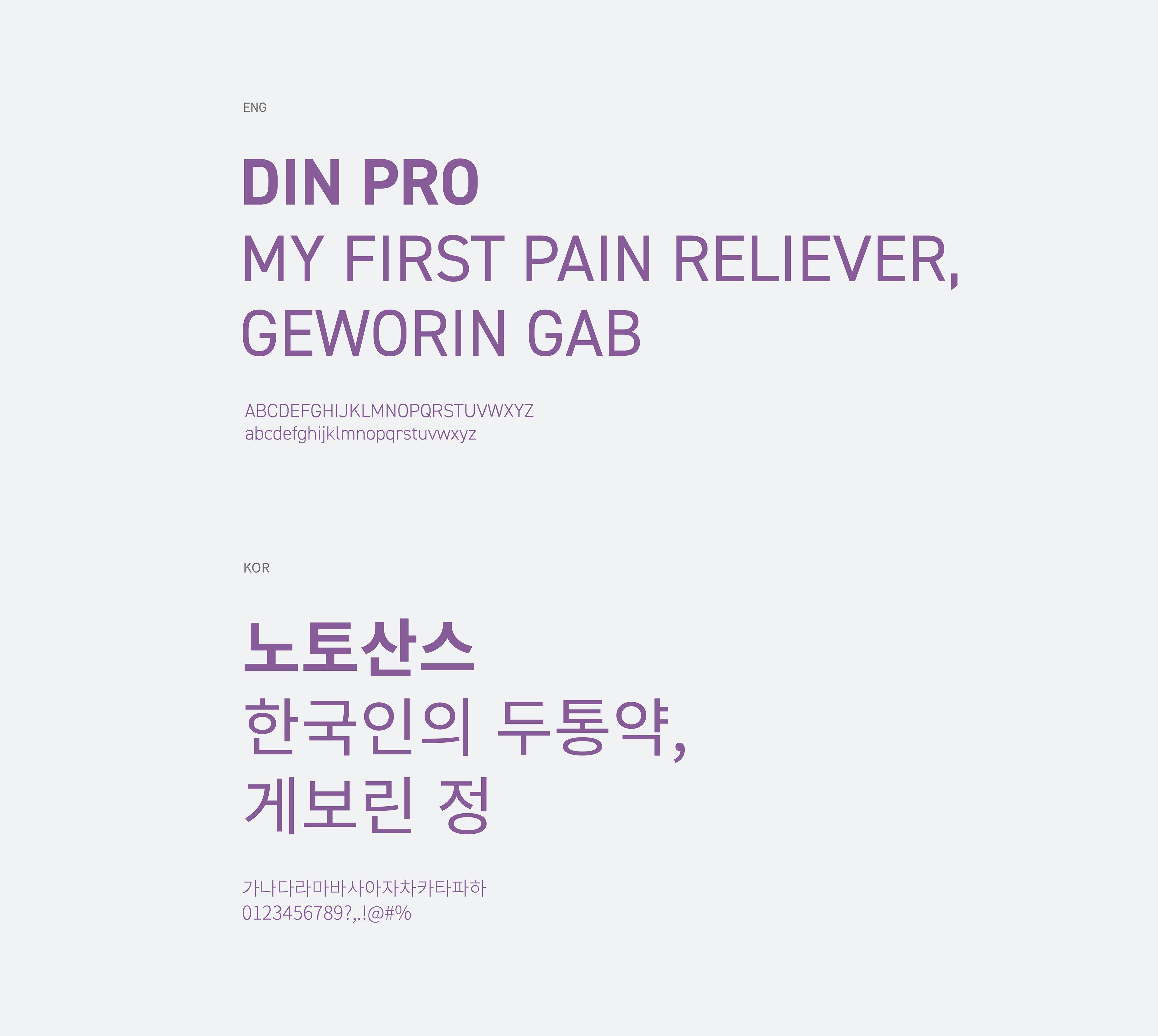
Typography
'게보린 정'의 브랜드 지정서체는 브랜드 로고의 조형적 요소와 유사하면서도, 가독성이 뛰어난 영문 서체 DIN pro 와 한글서체 Noto Sans 서체를 사용하여 일관된 아이덴티티를 전달합니다.
The brand font of the 'Geworin tab' delivers a constant brand identity. It uses Korean NOTO sans and English DIN pro that features high readability and is quite similar to the brand logo in an aesthetic way.
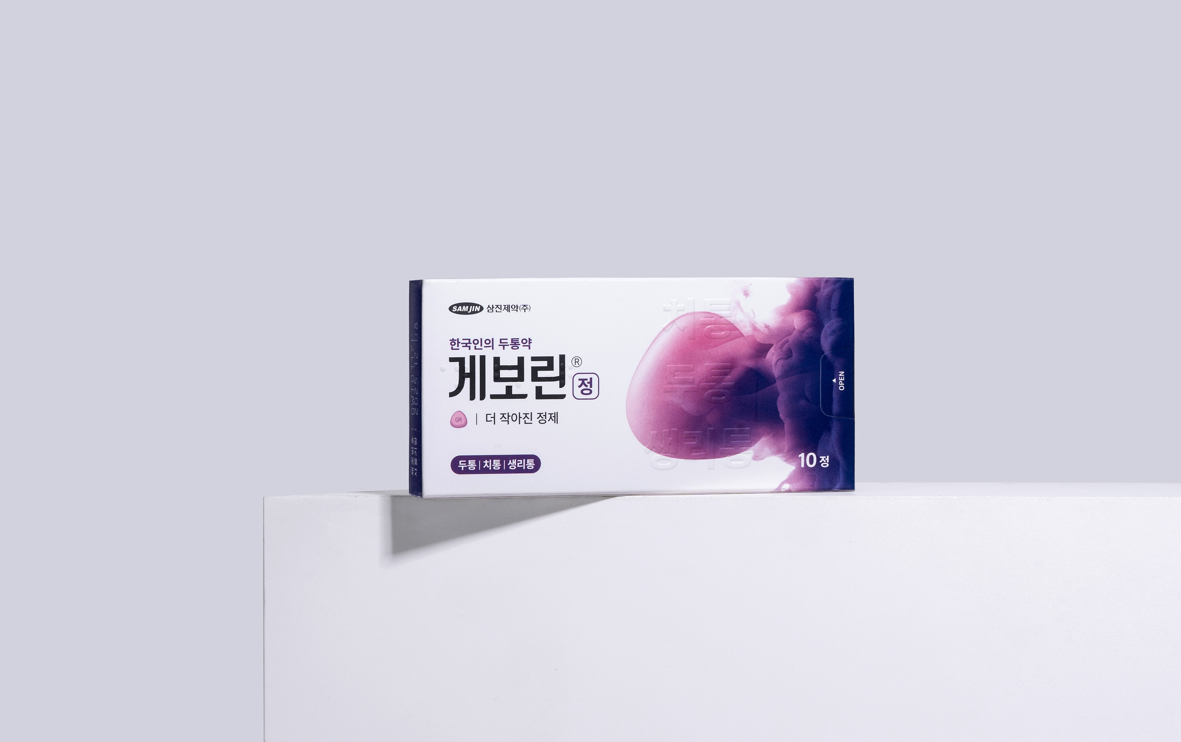
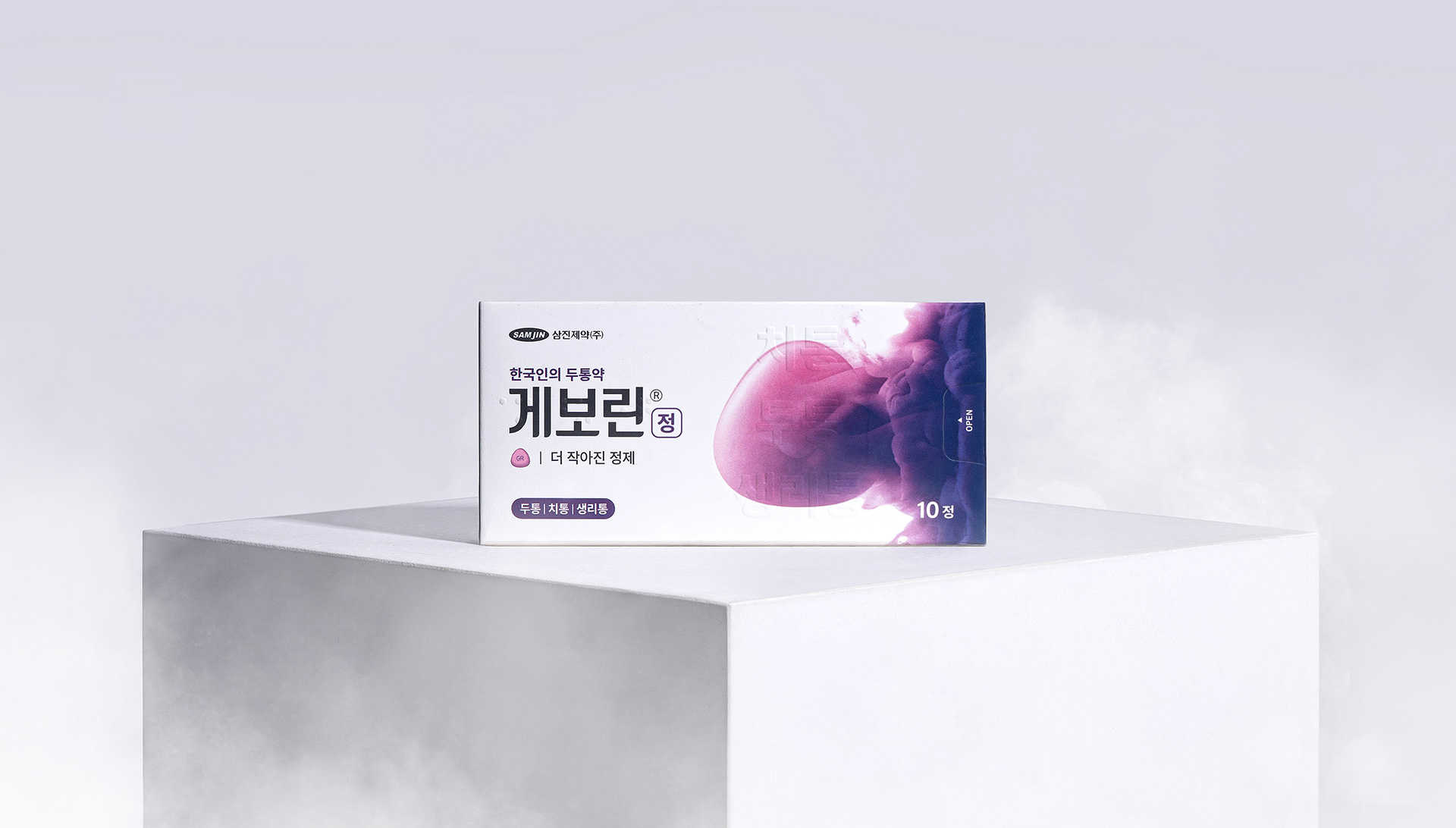
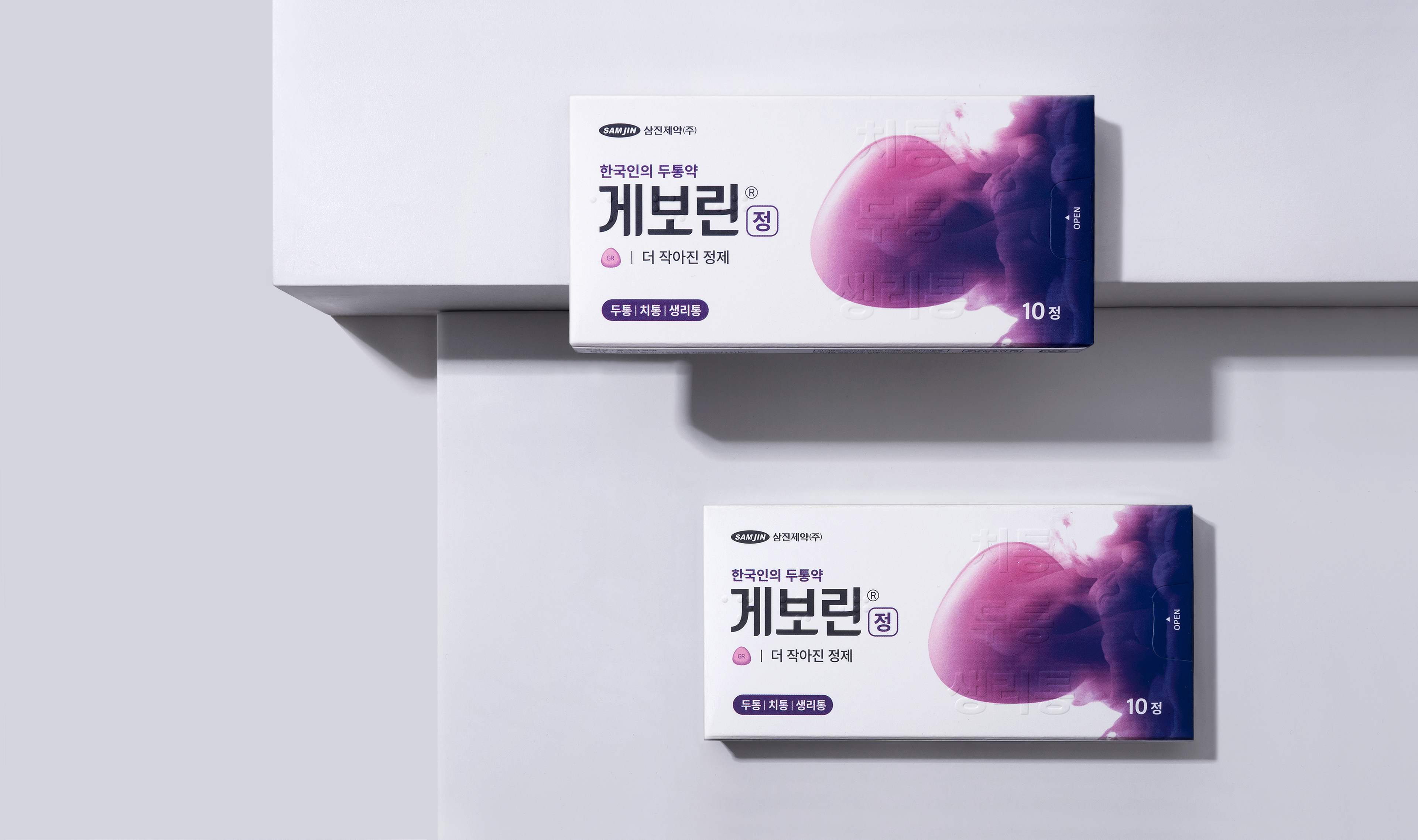
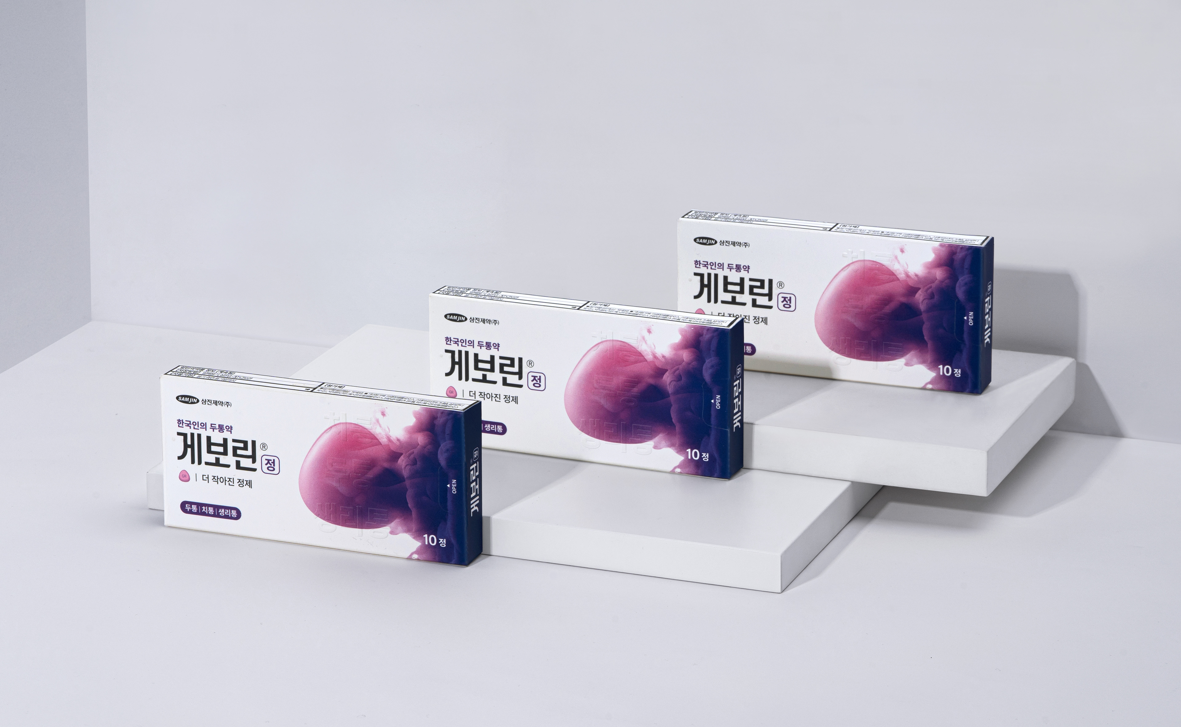
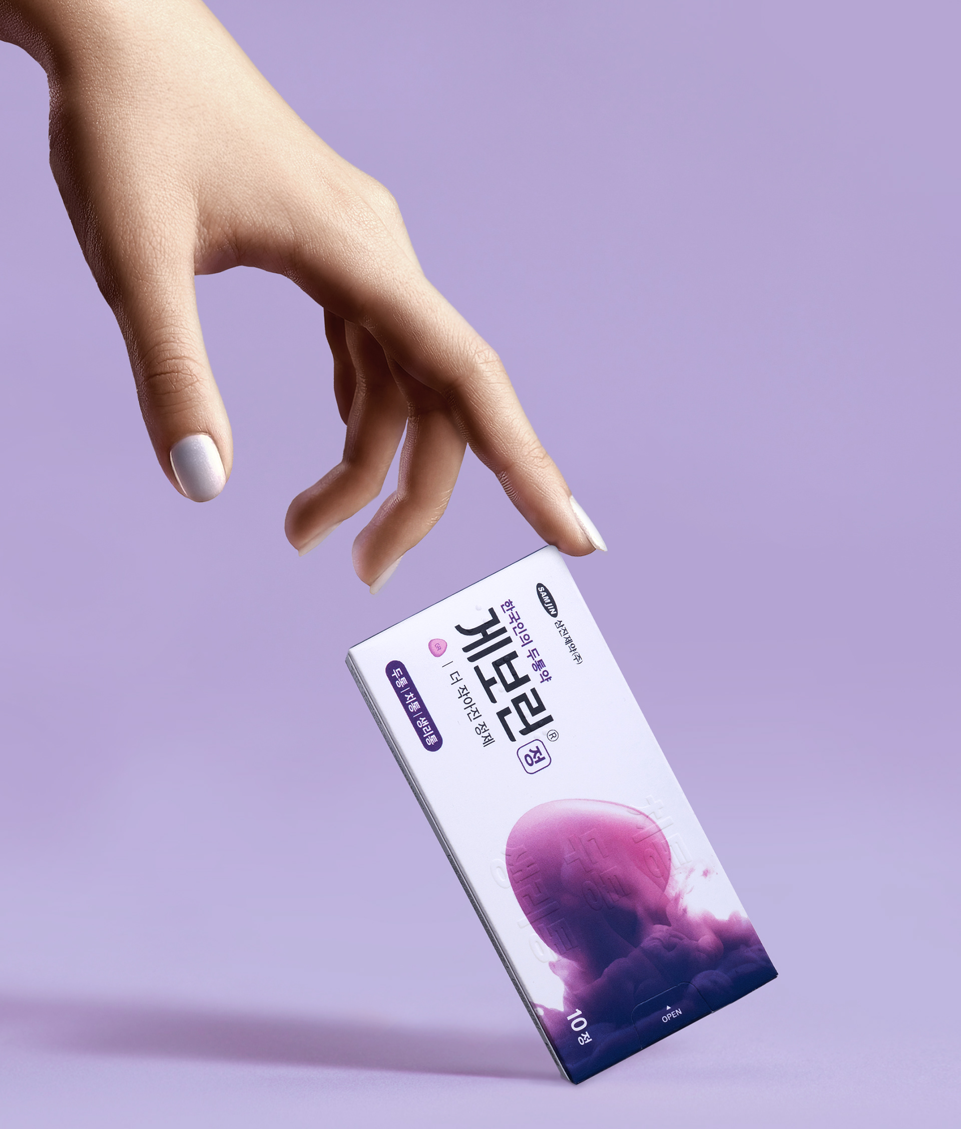
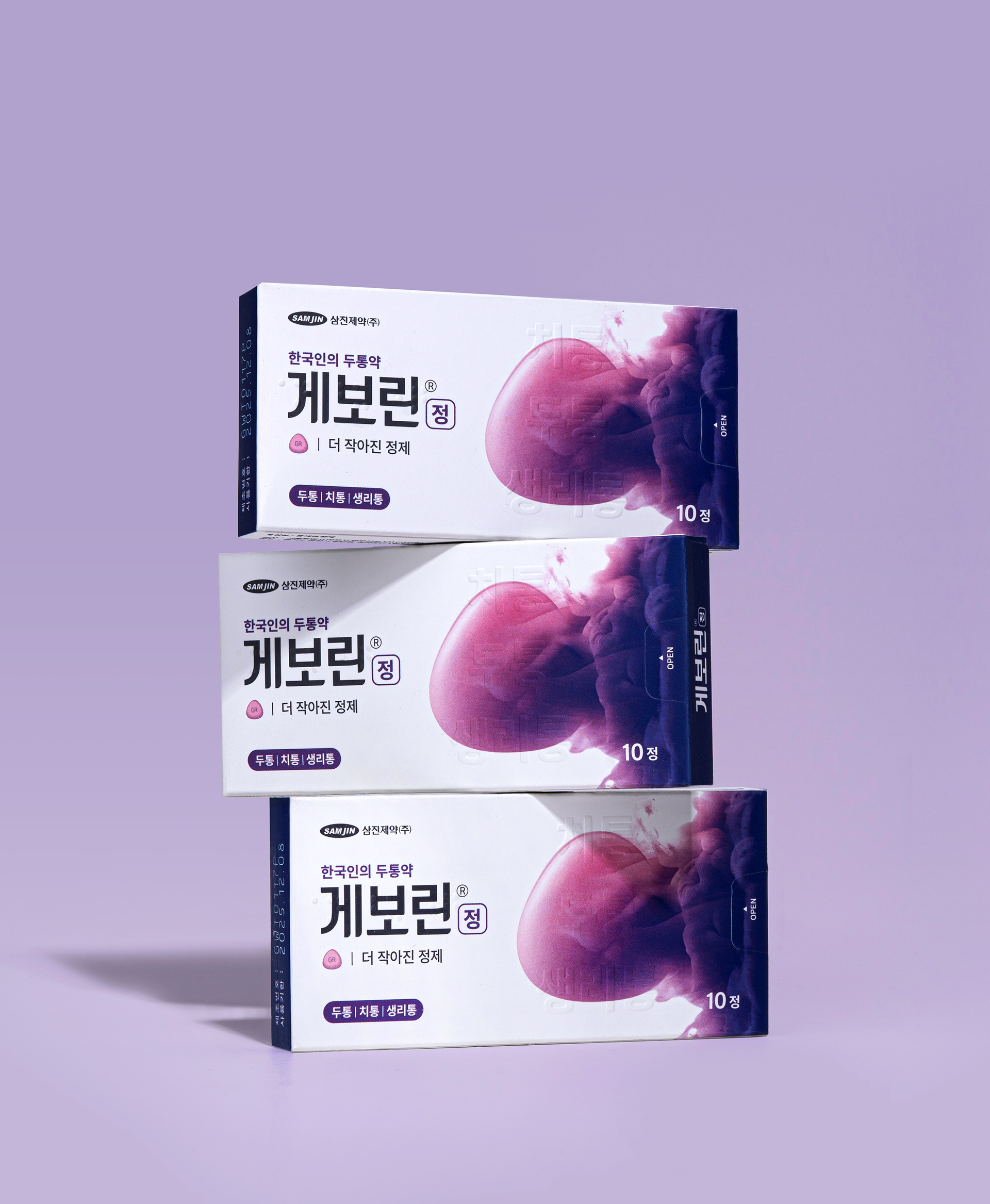
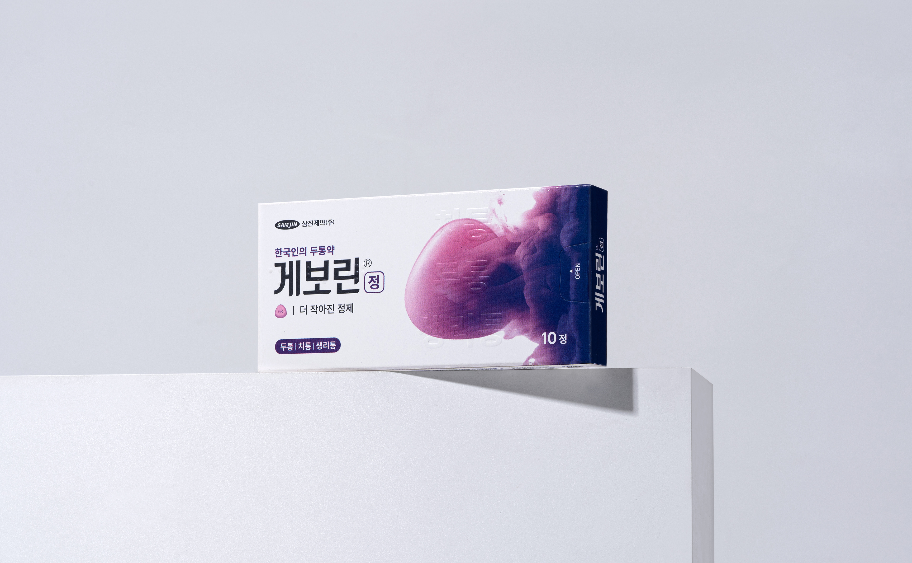
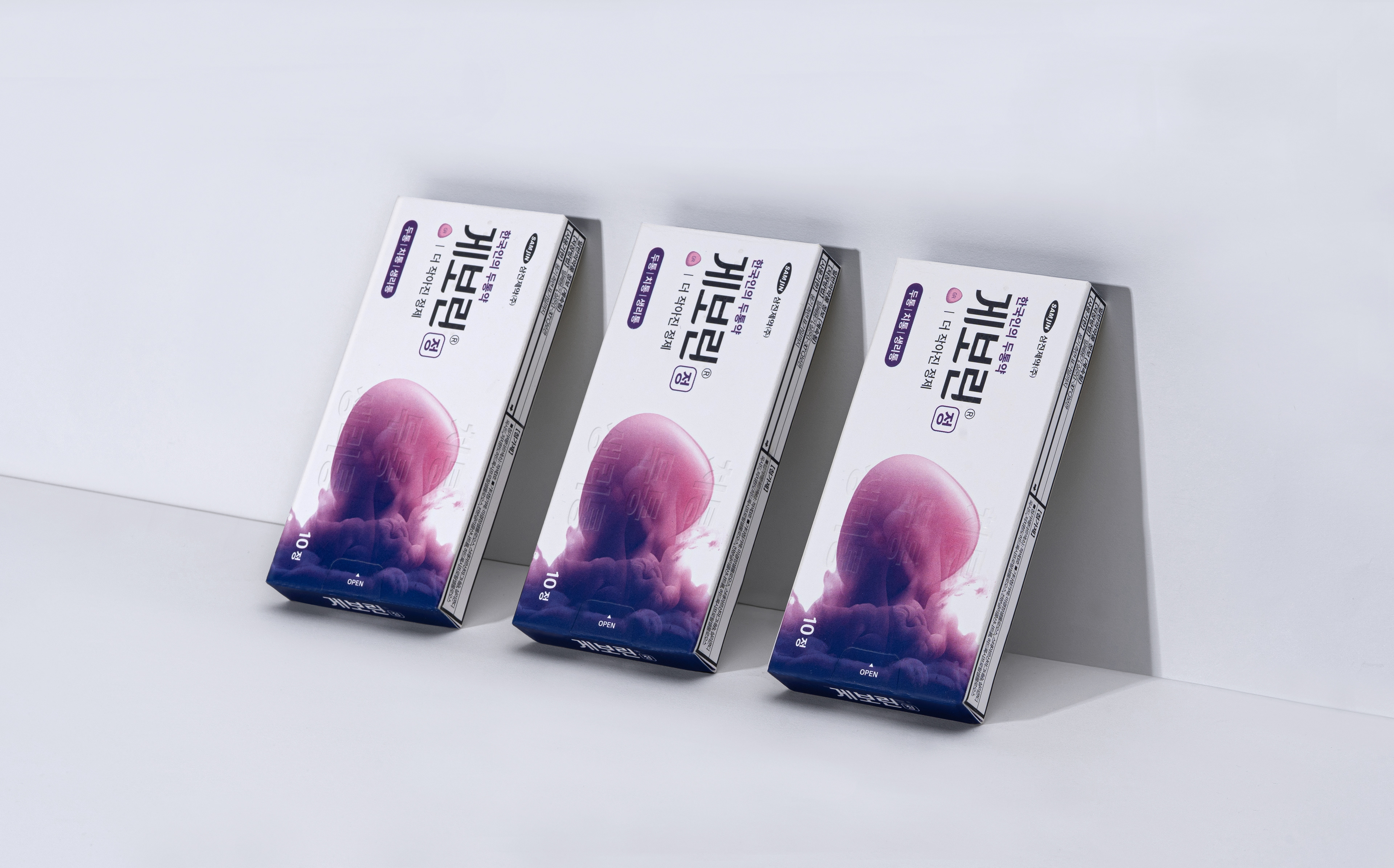
Package Design
패키지 디자인에서는 브랜드 아이덴티티를 담아내면서도 제약 브랜드로써 신뢰성과 전문적인 이미지를 전달하기 위해 그래픽 영역과 커뮤니케이션 영역을 구분하여 정확한 정보을 전달하고자 했습니다. 브랜드 아이덴티티를 녹여낸 그래픽과 브랜드 및 제품 정보를 그리드 시스템을 통해 나눠, 상징성은 강화하고 정보 인지성을 높입니다.
We Separate the graphic and communication design area in the package design. Hence, it delivers the exact information to users while leaving the impression of the reliability as medicine brand and professional image of the brand rather than only a reflection of the brand identity. A grid system strengthens the symbolism and enhances information recognition by separating the brand identity graphic and product & brand information.
© 2024 GRAFY.
GRAFY B/D 2-3F, 350, Dongil-ro, Gwangjin-gu, Seoul, Republic of Korea
contact / info@grafydesign.com / +82 70 8633 7222
-
If you want to see more projects, click on the links below