Project Overview
RE’DAIL is a travel care brand built on the idea of “small, yet complete.”
Rather than reducing full-size products into mini versions, RE’DAIL begins with compact formats such as soap tablets, cleansing powders, and single-use pieces that are designed to be complete products from the start. The rebranding focused on transforming this product strength into a clear brand identity—one that expresses portability, sufficiency, and a seamless care experience across different places and routines.

Project Approach
We started by redefining what “small” means for RE’DAIL. Instead of treating its products as miniatures of full-size cosmetics, we framed smallness as the condensed essence of care: formulas that are small from the start, condensed rather than reduced, and light to carry yet enough to care. This moved the brand’s stage from the bathroom shelf at home to every place beyond it, so the identity could travel naturally with the people who carry it.
Brand Core Value
Three values guide every decision across the brand. Original means each product is designed in its compact form from the beginning, not cut down from something larger. Complete means a single small piece delivers the full care it promises. One Rule means every touchpoint, from logo, color and type to package, follows the same principle, so RE’DAIL builds one consistent impression wherever it appears.

Brand Slogan
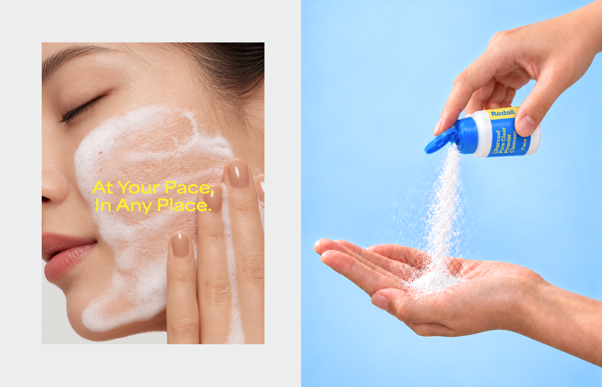
“At Your Pace, In Any Place.” The slogan captures the promise of a care routine that is not bound to one location. Whether at home, on the road or somewhere in between, RE’DAIL lets people keep their own rhythm of care. Short, direct and easy to carry, the line works as both a brand statement and a tagline across packages, campaigns and social content.

Brand Logo
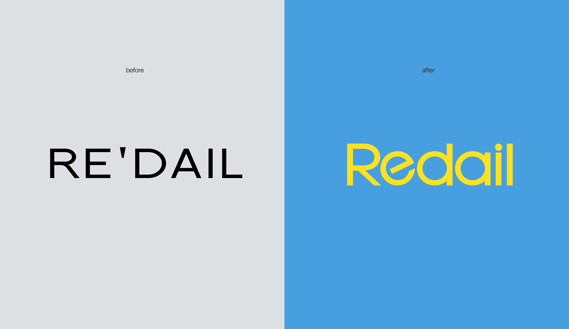
The wordmark was refined into a cleaner, more balanced form, built on a consistent grid with aligned x-height, baseline and stroke weights for stronger legibility at small sizes. Alongside it, a ticket-shaped symbol with side notches holds the “Rdl” monogram, drawing on the language of boarding passes and travel tickets. Together they form a flexible system that reads clearly from a tiny label tab to a full package front.

Brand Color & Typography
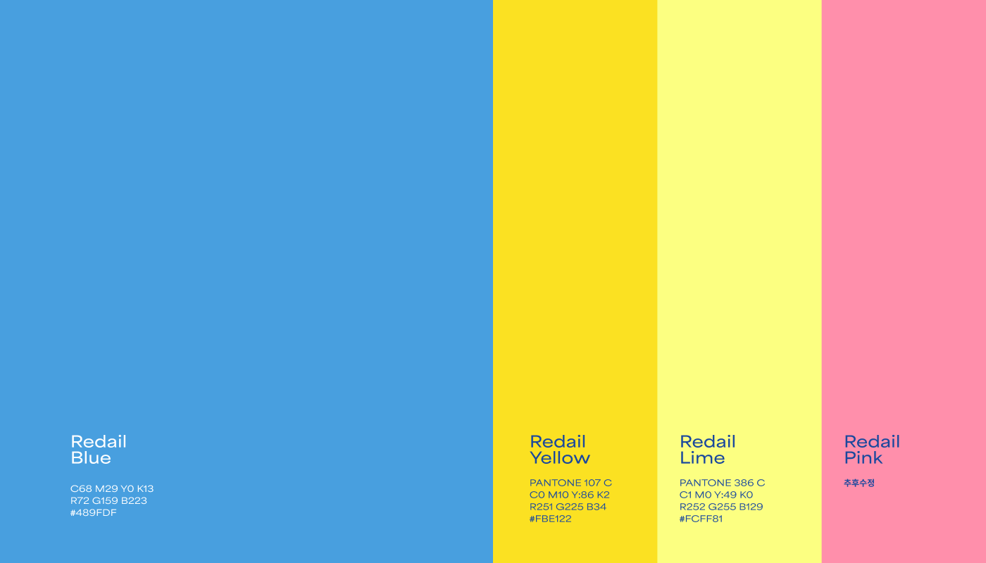
Redail Blue is the primary color, carrying a clear, fresh impression of water and open skies. Redail Lime and Redail Yellow act as vivid accents that add energy and draw the eye on shelves and screens. Area Extended is used for English, its wide, geometric forms giving compact layouts a confident presence, and Pretendard is used for Korean to keep information clear and legible. Both families run from Light to Extrabold to build a clear hierarchy.
Brand Application
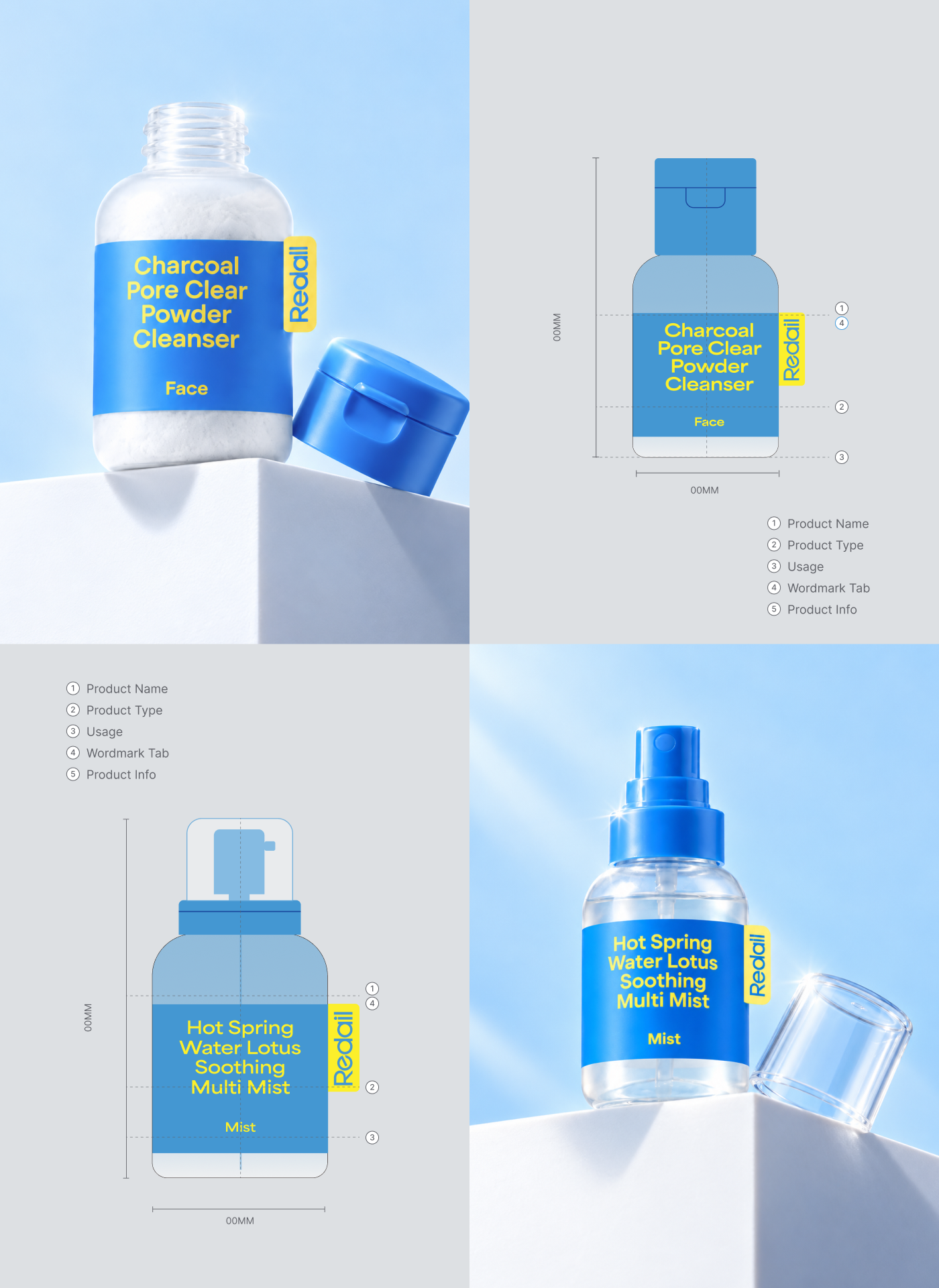
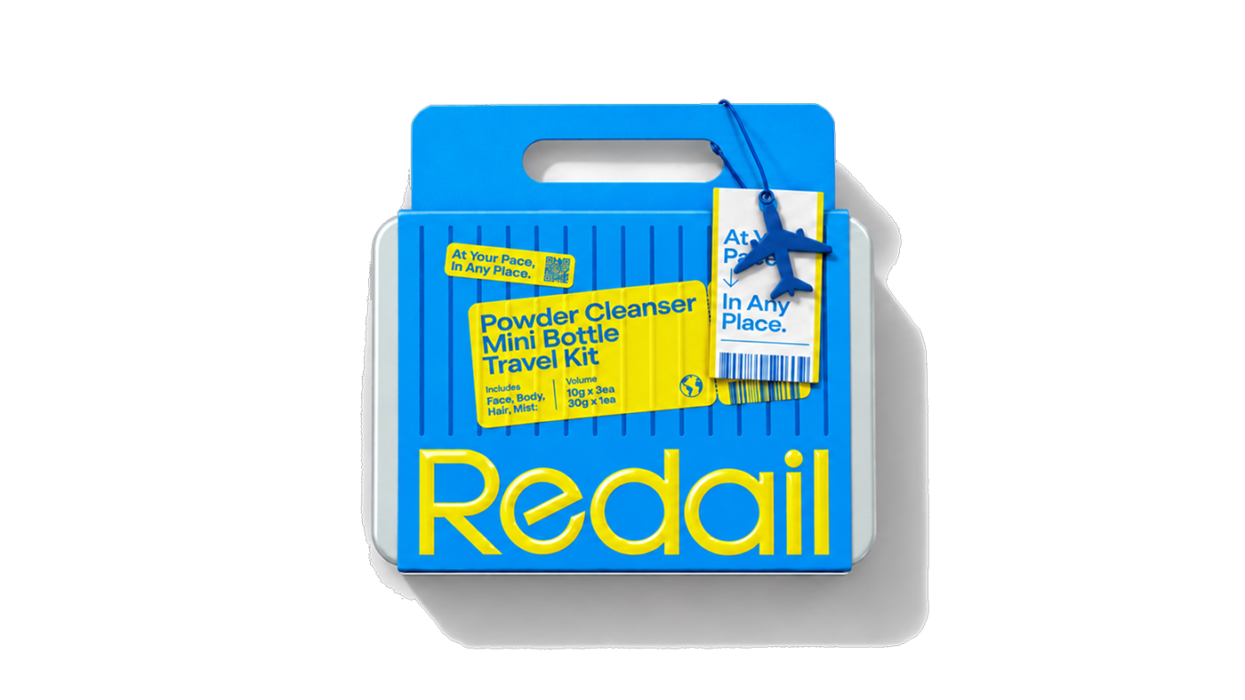
The identity extends across the full travel kit, from the outer box and bottle labels to product information and social content. Packages use Redail Blue as a bold base with the wordmark placed large and clear, while a unified label system keeps product name, type, usage and information in the same order across every product. Applied consistently from package to Instagram stories, the system lets every kit read as one brand, wherever it goes.