Overview
Hand & Malt is one of Korea’s leading craft beer brands, known for combining traditional brewing techniques with innovative branding to connect with consumers. As the domestic craft beer market has grown rapidly, however, a wide range of new brands has entered the space, making competition increasingly intense. At the same time, the expansion of distribution channels has brought more craft beer options into convenience stores and large retailers, making it difficult for brands to stand out through “premium” positioning alone.
In response to this shift, we developed a new direction for Hand & Malt—one that strengthens brand awareness and consumer loyalty by delivering a more distinctive and memorable brand experience unique to Hand & Malt.


Approach
Version 1.0 established a premium image grounded in authenticity, while Version 2.0 expanded consumer touchpoints through a more approachable and trend-driven identity. Now, Hand & Malt is ready for its next leap forward—one that preserves the sincerity of 1.0 while building a more differentiated strategy for today’s market.
To shift from a company-centered brand to a consumer-centered one, we reinforced the strengths of both 1.0 and 2.0, while redefining the shared values developed across Versions 1.0 to 2.5. Based on this foundation, we established a new Brand Personality for Hand & Malt 2.5—one that stays true to the brand’s essence while creating a deeper connection with consumers.

Strategy
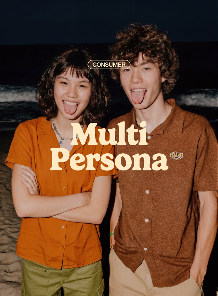
As Korea’s craft beer market continues to grow, consumers are looking beyond beer itself and seeking brand experiences that reflect their lifestyles and individuality. Today’s consumers no longer define themselves through a single identity; instead, they express different personas depending on context, mood, and situation, choosing brands and products accordingly.
In response to this shift, Hand & Malt 2.5 evolves from a craft beer brand into a lifestyle brand that reflects consumers’ identities. By analyzing these layered consumer characteristics and the experiences they seek, we defined Hand & Malt’s renewed brand archetype as “The Visionary Creator.”


Project Goal
Hand & Malt understands today’s consumers not as having a single fixed identity, but as multifaceted individuals whose preferences and behaviors shift depending on context and circumstance. Based on the concept of the “curious craft beer explorer,” the brand aims to position itself as a multi-persona brand that responds to evolving tastes and diverse occasions. Through this approach, Hand & Malt seeks to preserve the essence of craft beer while building deeper connections and long-term relationships with consumers.


CORE VALUE &
PRINCIPLE
Hand & Malt 2.5 preserves the essence of craft beer while delivering an innovative brand experience that reflects evolving consumer trends. Its visual identity is built around three core values—Authenticity, Creativity, and Possibility—which serve as guiding principles for a consistent design system across the brand.
These values are translated into a visual language that expresses an identity rooted in craftsmanship while remaining open to new possibilities.
Concept
Hand & Malt 2.5 is a brand that adapts fluidly to consumers’ lifestyles and tastes. Based on this idea, the design concept was developed around “Taste Persona”—a framework that reflects different emotions, situations, and preferences through the distinct identity of each beer.
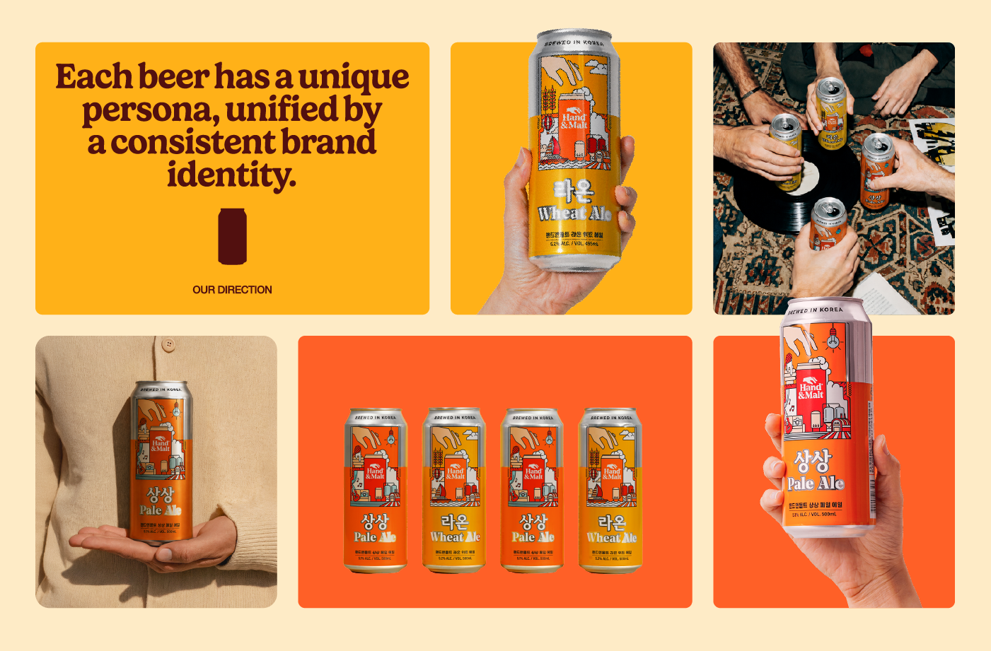
Each product was given its own distinctive character, allowing the brand to express a broader and more dynamic range of personalities while remaining unified under the Hand & Malt identity.

Key Visual
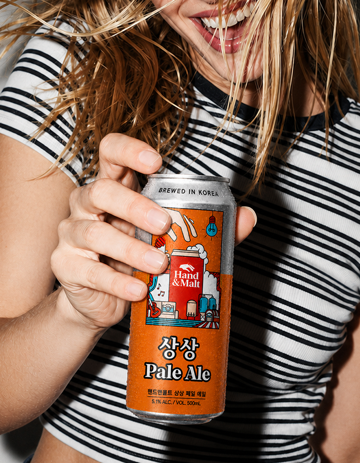
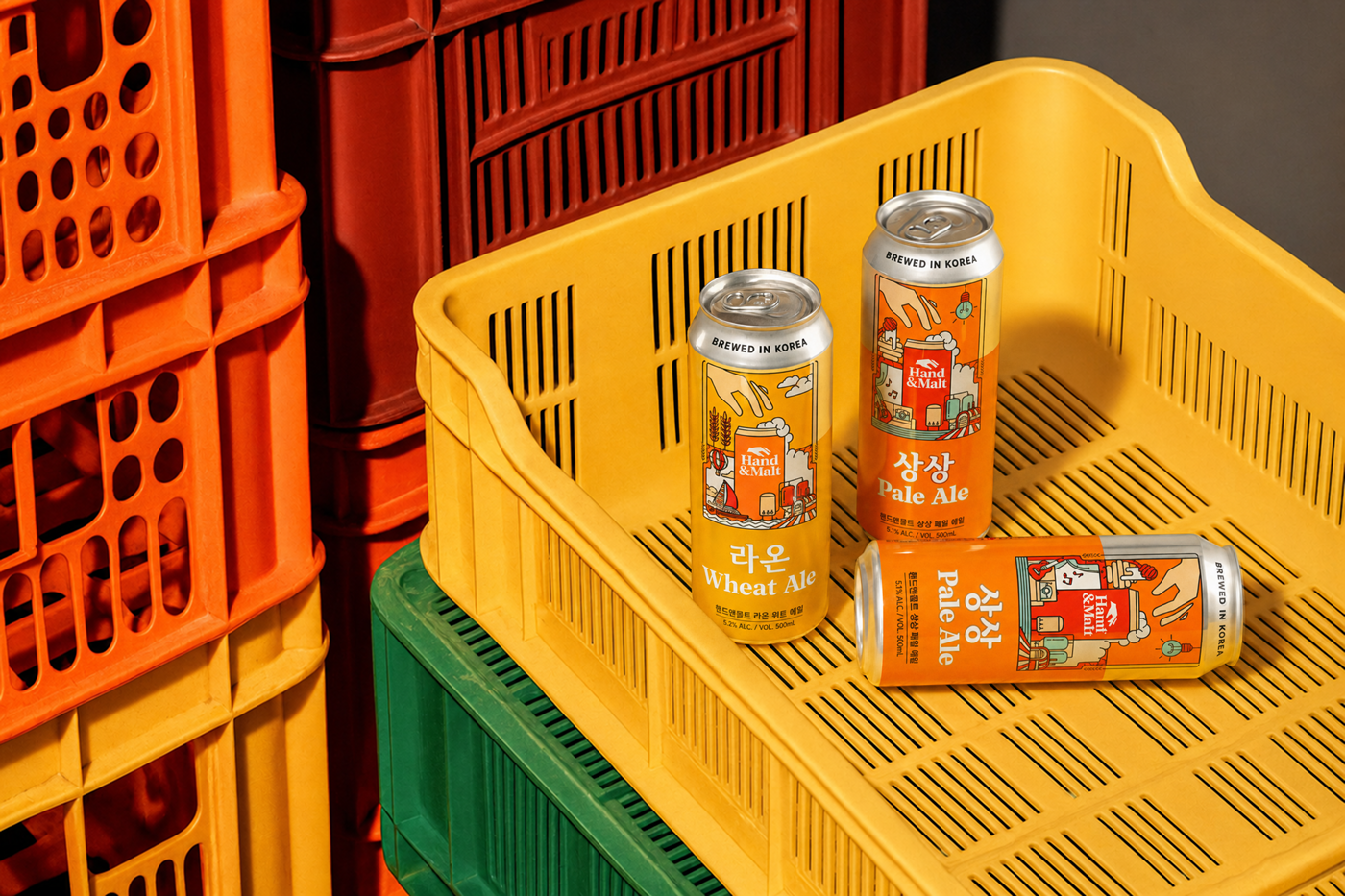
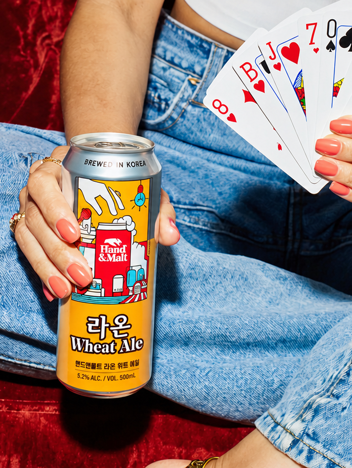
The key visual system was developed to reflect the unique story and personality of each beer through distinctive colors, typography, and graphic elements. Beers such as “Sangsang Pale Ale” and “Raon Wheat Ale” were each assigned their own persona, which was then translated into the visual design.
Rather than presenting the brand as a single fixed image, each product was designed to embody its own distinct personality. This approach allows every beer to deliver a unique brand experience while still maintaining a cohesive overall Hand & Malt brand identity.
Design System
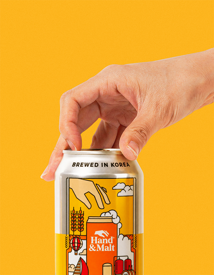
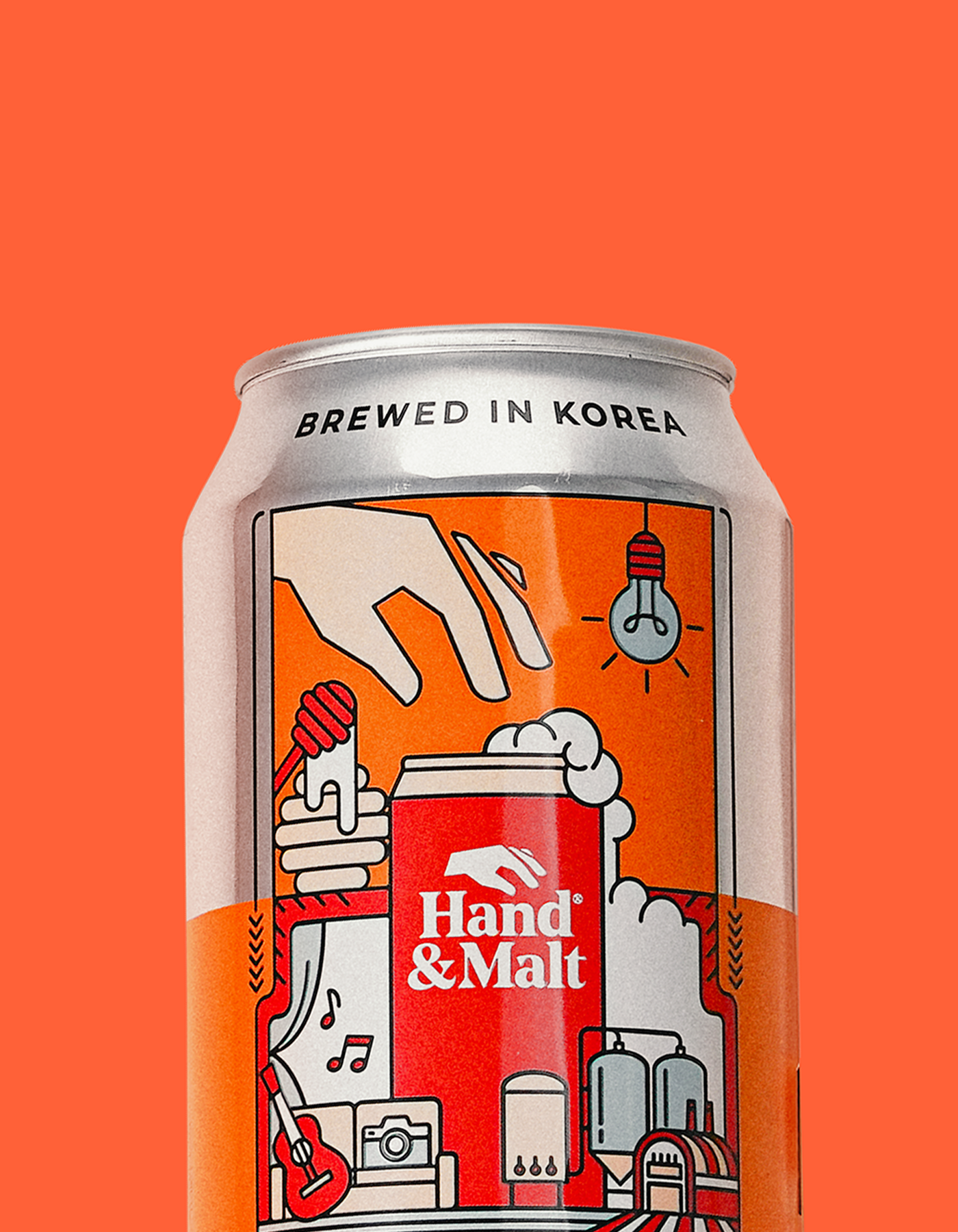
The upper section of the can was left exposed in raw aluminum, emphasizing the materiality of the package itself. On the front, the layout clearly separates the product name area from the illustration area to enhance readability and visual hierarchy.
A hand gesture holding the beer can subtly recalls the Hand & Malt symbol, naturally reinforcing the brand identity. Additional visual elements were used to communicate the brand’s values: the illustrations placed on the lower left and upper right express the brand persona, while the graphic element on the lower right references Hand & Malt’s brewery and craftsmanship.
Color & Typography
The color and typography system was developed around the unique story of each beer, with every visual element reflecting its distinct personality. Products such as “Sangsang Pale Ale” and “Raon Wheat Ale” were designed with their own personas in mind, allowing each beer to express a distinctive tone and character.
This approach enables the brand to move beyond a single, uniform image, giving each product a personality of its own while maintaining a consistent and recognizable Hand & Malt identity across the entire range.