Project Overview
Oprimed provides AI-powered pharmaceutical technologies based on a deep understanding of the pharmaceutical industry and clinical trials. Its solutions reflect individual patient characteristics while aligning with the latest regulatory guidelines. At the core of its technology is Optivis, the world’s second and Korea’s only digital twin system, which digitally replicates biological and physiological characteristics to enable virtual simulations. Based on these strengths, we developed Oprimed’s brand identity and basic visual system around the ideas of overcoming technological limitations and connecting the industry faster and more effectively.

Brand Core
To overcome the complexity, time, and cost limitations of traditional clinical trials, Oprimed positions itself as a company that delivers faster, more accurate, and cost-efficient technologies. This core value is visualized through Optivis, its digital twin technology that digitizes individual medical data, replicates biological and physiological characteristics, and enables simulation in a virtual environment.
Core Value
Oprimed defines itself as a technology leader in the pharmaceutical industry, delivering faster development, greater cost efficiency, and a competitive edge through proactive innovation. Its core values center on speed, leadership, intelligence, and irreplaceable expertise powered by AI, which were translated into key brand keywords and applied throughout the identity system.
Design Motif
Oprimed’s symbol is inspired by the fast-forward icon, visualizing its position as a technology leader that moves faster and stays ahead of competitors. The wordmark incorporates circuit symbols of resistance and connection, representing Oprimed’s ability to overcome technological limitations and connect new possibilities through its unique technology.
Brand Signature
Oprimed’s logo reflects its unique technology and focus on more efficient clinical trials. The wordmark incorporates circuit symbols representing resistance and connection, reflecting the idea of overcoming technological limitations and creating new possibilities. The symbol is inspired by the fast-forward icon, representing Oprimed’s ability to shorten clinical trial timelines and move the industry forward faster.
Color & Typography
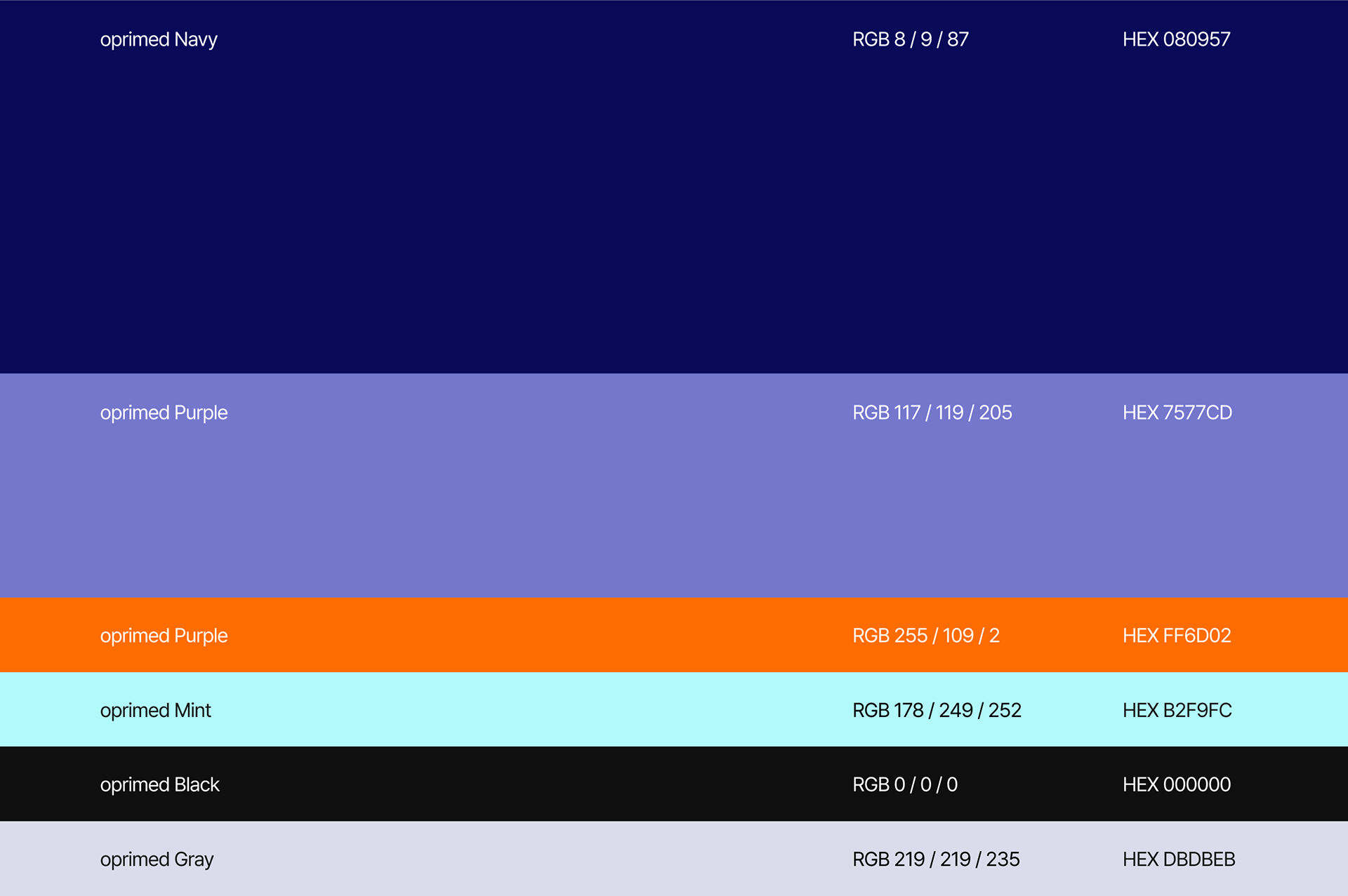
Oprimed’s visual system combines navy and purple to express trust and a technology-driven identity, with orange and mint adding energy and freshness as accent colors. Pretendard and Avant Garde Gothic complement this palette with clear readability and geometric character, creating a modern and distinctive brand expression.
Pictograms
The pictogram system was developed based on the grid structure of Oprimed’s symbol, creating a consistent visual language across the brand. It was applied throughout Oprimed’s office environment to extend the identity into spatial applications.


Key Visual
The key visual draws on Oprimed’s core digital twin technology, using pixel-based graphics to represent how patient information is broken down into data, analyzed, and reconstructed in a virtual environment.

Application Design
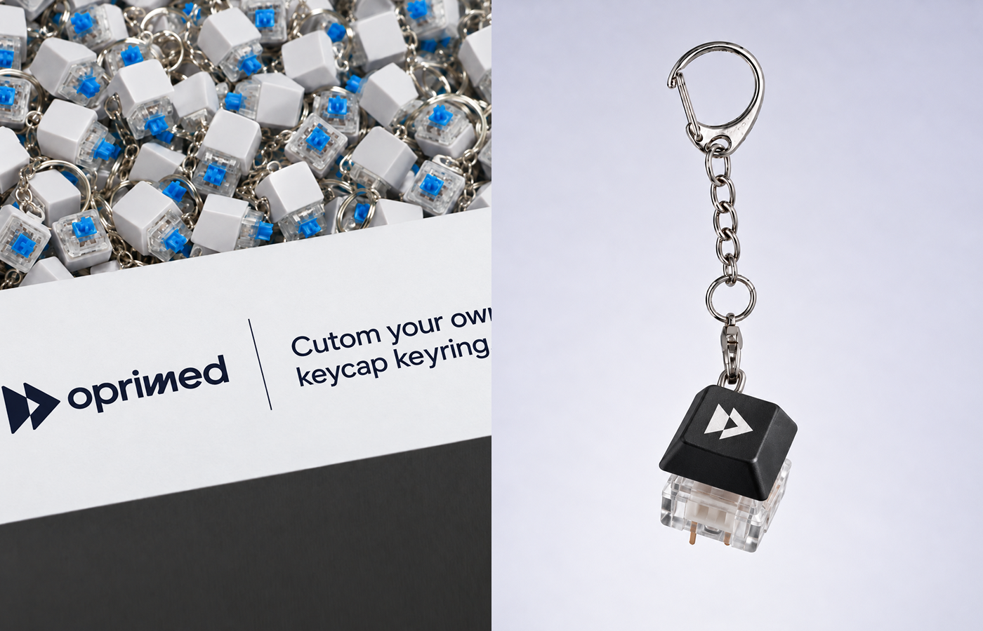
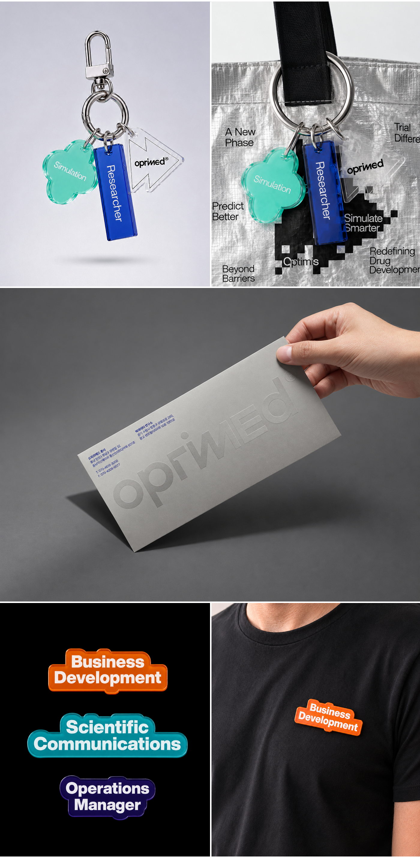
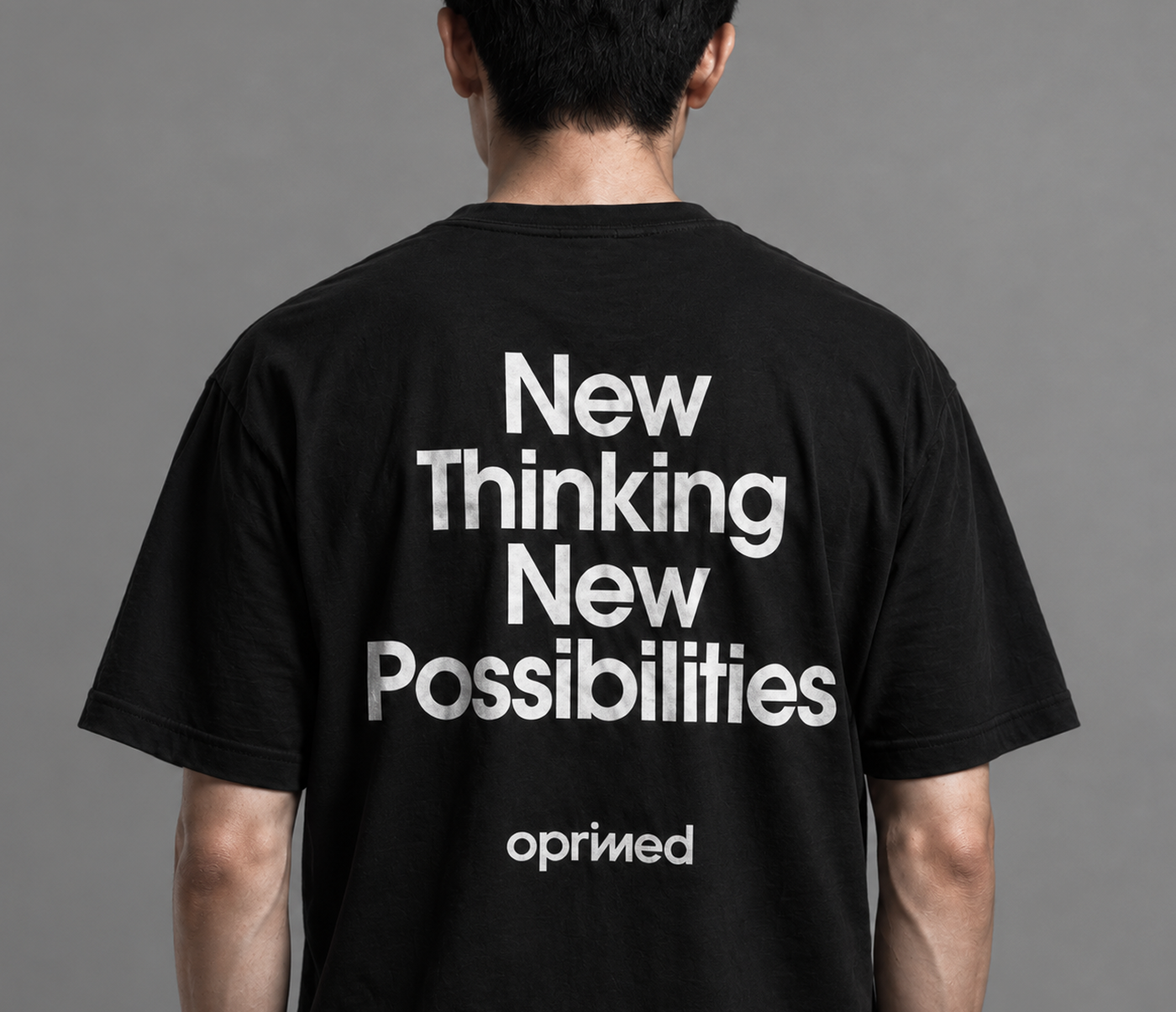
Oprimed’s visual identity system extends across print, merchandise, spatial applications, promotional films, and digital content, creating a consistent and cohesive brand presence across every touchpoint.



AAIC 2026 Booth Design
For AAIC 2026, we designed and directed Oprimed’s booth as an integrated brand experience. The spatial environment, visual communication, and visitor engagement were developed as one cohesive system, translating Oprimed’s identity into a clear and memorable on-site experience. This approach led to measurable results in visitor engagement and brand performance.