Peekaby Brand Identity Development
Client / Ordinary Magic
Services / Strategy, Identity, Product, Package & Application
© 2023 GRAFY.
Project Overview
놀이 자체에 대한 인식을 전환하여 아이와 부모가 모두 공감할 수 있는 '신뢰할 수 있고 긍정적인 가치'를 브랜드 가치로 제안하여 유아 놀이 완구 시장에 새로운 트렌드를 가져올 브랜드가 될 수 있도록 하였습니다. 브랜드 가치를 정립하고, 이를 바탕으로 브랜드에 대한 긍정적인 인지와 브랜드 경험을 직관적으로 전달할 수 있는 브랜드 네임과 슬로건 '피카비'와 '아기의 세상을 탐험하는 시간'을 개발했습니다. 또한 브랜드 이미지와 연관된 비주얼 에셋을 활용하여 효과적인 놀이완구 브랜드이자 육아 서포터로서의 브랜드 경험을 디자인했습니다.
Shifting the cognition of the play itself, We proposed a 'trustworthy and positive value' that both a child and parent could appreciate for the brand that will bring a new trend in the child playtoy market. We established the brand value, and from the basis of this, the brand name and slogan, 'Peekaby' and 'Time to explore baby's world, were developed to intuitively deliver positive cognition to the brand and the brand experience. In addition, We designed the brand experience as an effective playtoy brand and parenting supporter by utilizing visual assets related to the brand image.
Brand Story
출산 후 2년은 육아에 있어 힘든 시기입니다. 이 시기에는 출산과 육아에 많은 노동력, 신체적, 심리적 자원이 투입되며, 이러한 자원은 가족의 양육의 질과 효능감을 높이는 데 기여합니다. 저희는 이제 막 출산하고 육아를 시작한 분들에게 신뢰할 수 있고 도움이 되는 서포터가 되겠다는 사명감으로 피카비를 브랜드화했습니다. 아이에게 기쁨과 놀라운 놀이로 가득한 날들. '피카부'와 '아기'를 합성한 브랜드명 피카비는 브랜드 미션을 담고 있습니다: 부모가 아이와 함께 놀이에 참여함으로써 평범한 일상에 놀라운 놀라움을 더하고, 그 놀이를 평범하게 여기는 아이들에게 즐거움을 선사합니다.
Two years after childbirth is a challenging period in parenting. A lot of labor, physical, and psychological resources will be put into this period of maternity and parenting, and those resources contribute to the increase of parenting quality and efficacy of a family. We branded Peekaby with a mission to be a trustworthy and helpful supporter for those who just now gave birth, and are in parenting. Days are full of Joy and surprising plays to children. The brand name, Peekaby, is a mixture of 'Peeka-a-boo' and 'baby', and it presents a brand mission: Add marvelous surprises in mundane days to children who will find the play ordinary by making parents join it with children.
Brand Value & Slogan
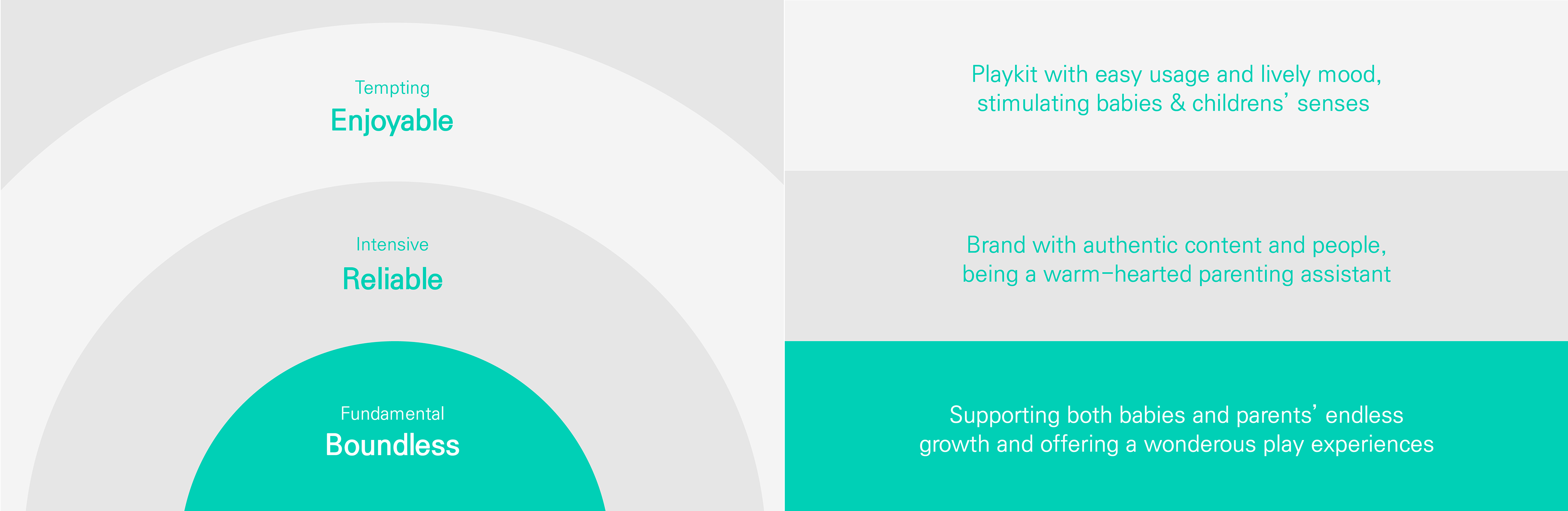
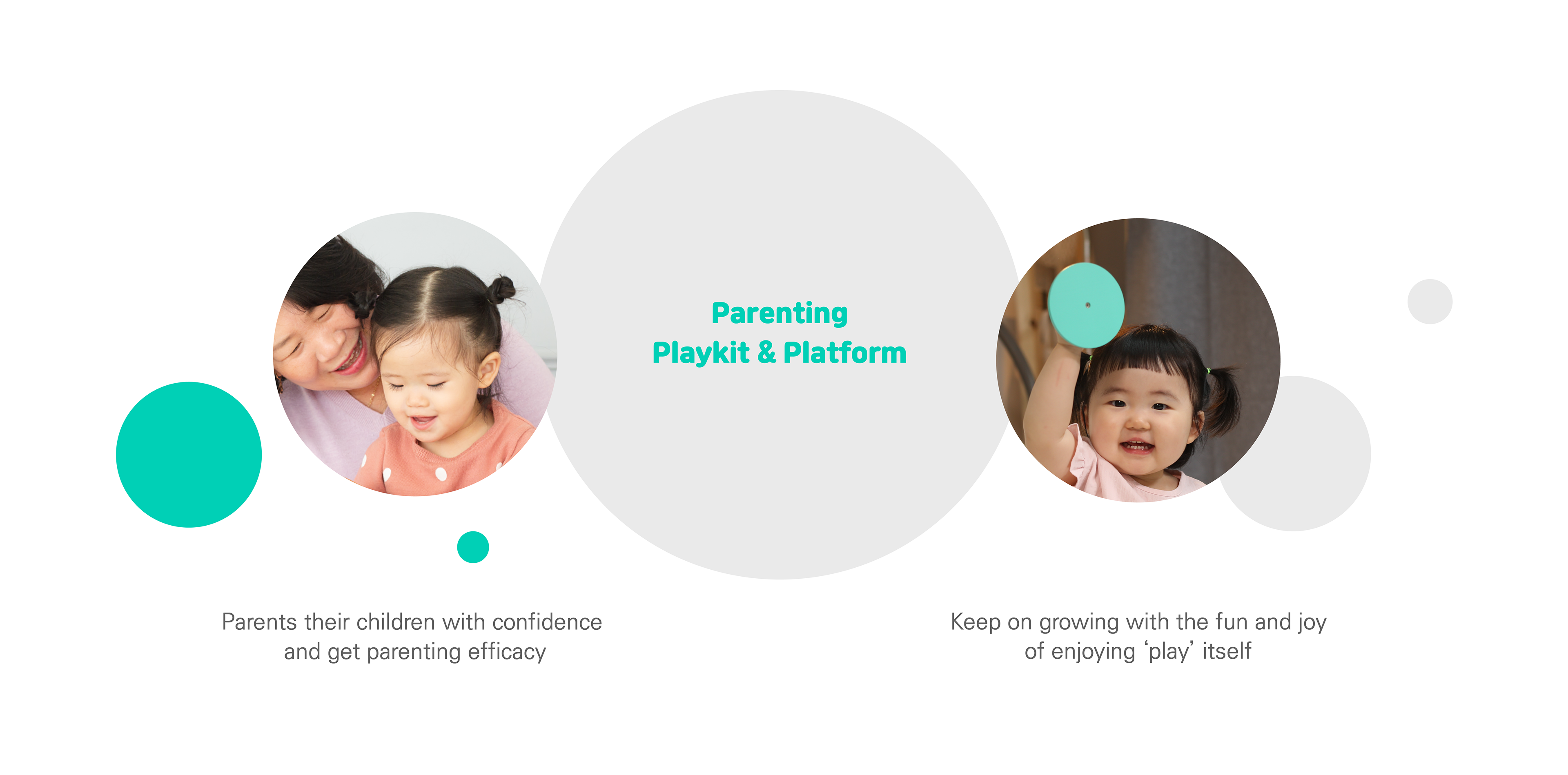
아이와 부모 모두의 성장에 도움을 주는 육아 서비스 플랫폼이자 놀이 키트인 피카비는 아이에게는 놀이 자체를 즐기는 즐거움을, 부모에게는 육아에 대한 자신감과 효능감을 선물합니다. 부모의 육아 참여를 독려하는 서비스 콘텐츠에 착안해 '아이의 세상을 탐험하는 시간'이라는 슬로건을 개발했습니다. 피카비의 핵심 브랜드 가치는 세 가지 키워드로 표현됩니다: '경계 없는', '믿을 수 있는', '즐거운'. 이를 전방위적 브랜드 경험으로 확장하여 변함없고 차별화된 브랜드 이미지를 구축했습니다.
As a parenting service platform and play kit which gives aid to growth both of child and parent, Peekaby presents the joy of enjoying the play itself to children and confidence and efficacy in childrearing to a parent. We developed the slogan ' TIME TO EXPLORE CHILDREN'S WORLD' based on the content of the service that encourages parents to take part in raising children. The core brand value of Peekaby represents by three keywords: 'Boundless, 'Reliable, and 'Enjoyable.' We made them construct an invariant and distinctive brand image by expanding them to the omnidirectional brand experience.
Design Principle
피카비의 디자인 원칙은 '유연하고 미니멀, 선명하고 생동감, 친근하고 사려 깊음'입니다. 이는 브랜드의 핵심 가치인 무한함, 즐거움, 신뢰에서 파생된 것입니다. 이러한 원칙은 제품 디자인부터 브랜드 적용에 이르기까지 시각적 표현에 적용되는 일관된 브랜드 아이덴티티를 만듭니다.
Peekaby's design principles are 'Flexible and Minimal, Vivid and Lively, Friendly and Thoughtful.' Those are derived from the established brand's core values: infinity, joy, and trust. They create a consistent brand identity that applies to the visual expression from product design to brand application.
Key Visual
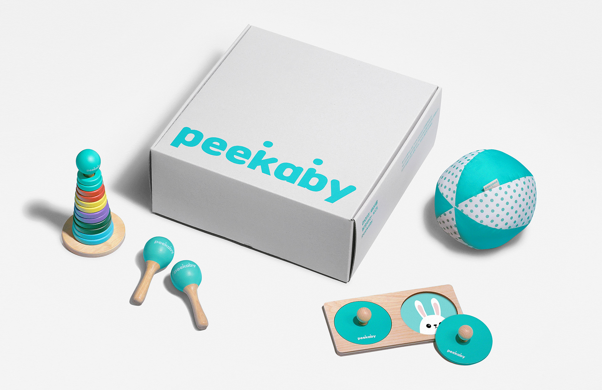
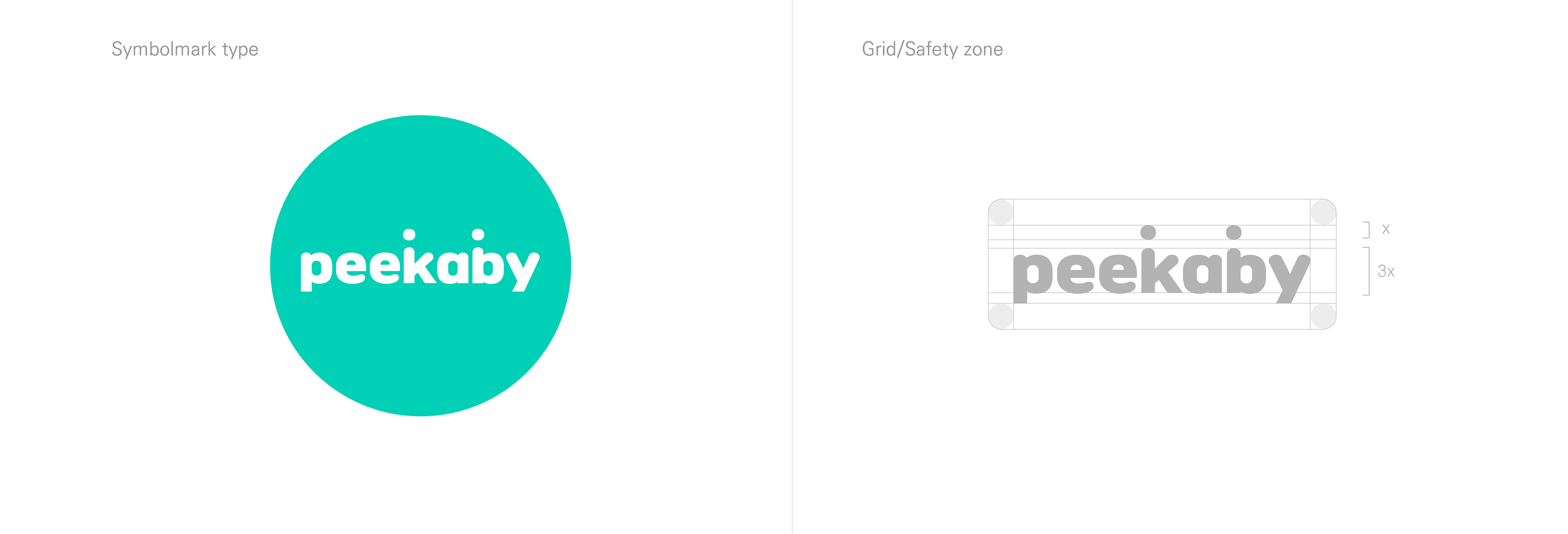
월령별로 적합한 장난감을 맞춤 제작하는 놀이 키트 브랜드 피카비는 다양한 디자인과 컬러의 제품과 패키지에 유연하게 적용할 수 있는 브랜드 로고와 비주얼 에셋이 필요했습니다. 이에 플랫폼 자체를 상징하는 원형 모티브와 아이들에게 무한한 즐거움을 선사하는 공을 활용해 로고 심볼을 디자인하고, 다양한 콘텐츠를 적용하여 브랜드의 핵심 그래픽 모티브로 확장했습니다.
Peekaby, a play kit brand that tailors a suitable toy for each monthly period, needed the brand logo and visual assets that flexibly apply to their products and packages with different designs and colors. To address this, We utilized a circle motif that symbolizes a platform itself or a ball that brings infinite joy to children, for designing a logo symbol, and further expanding it as the core graphic motif of the brand by applying various contents.
Brand Identity Design
튀어 오르는 공을 연상시키는 원 모티브를 알파벳 K와 B에 적용하여 브랜드 특유의 경쾌한 분위기를 표현하고, 굵은 고딕 서체의 끝을 둥글게 처리하여 친근하고 쉽게 다가갈 수 있는 이미지를 형성했습니다.
We applied a circle motif that reminds a bouncing ball to a letter K and B to express the brand's distinct cheerful mood, and we also rounded the end of a bold Gothic font to form its images which are friendly and easily accessible.
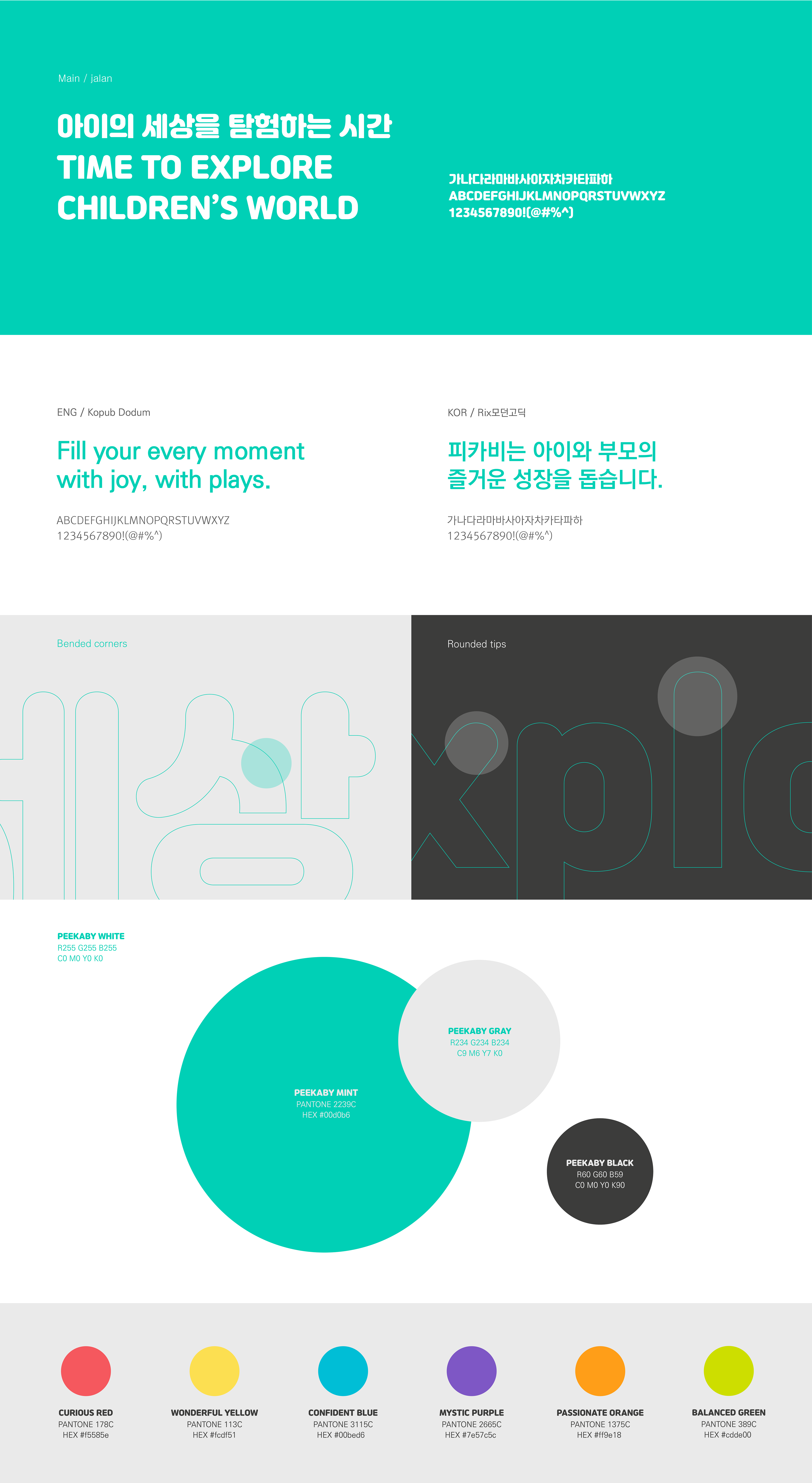
Typeface & Color System
안정적이면서도 경쾌한 분위기를 전달하기 위해 메인 로고와 유사한 미적 레이아웃을 가진 잘난 폰트를 메인 서체로 사용했습니다. 브랜드에 일관된 인상을 전달하기 위해 메인 텍스트 폰트로는 KoPub 도툼체와 릭스 모던 고딕체를 선정하여 적용했습니다. 또한, 어린이 연령대별 맞춤형 놀이 키트인 제품을 고려해 월별 키 컬러를 지정하고 해당 제품 및 콘텐츠에 적용했습니다.
We used Jalnan font as the main font since it has a similar aesthetic layout to the main logo to deliver a stable yet upbeat mood. KoPub Dotum and Rix Modern Gothic are selected and applied as the main text font to deliver a consistent impression to the brand. Also, We designated key colors for each month and applied them to the corresponding products and contents with a consideration of the product that is a tailored play kit for each age group of children.
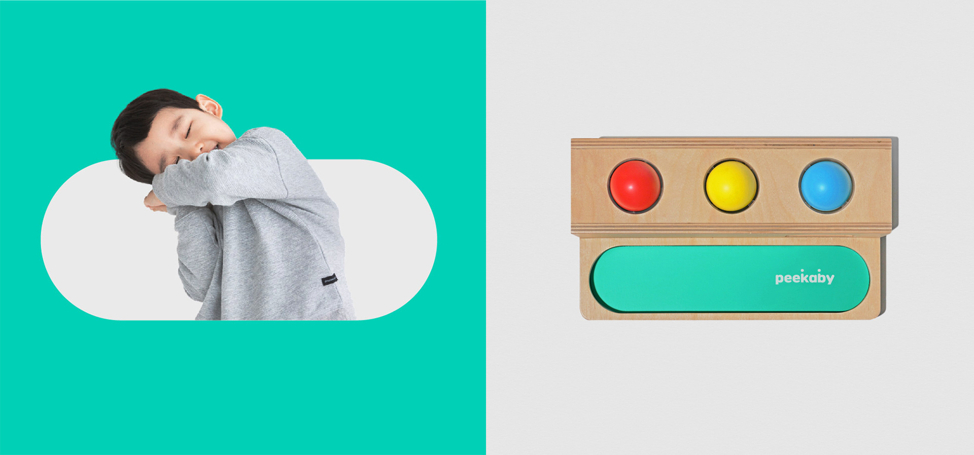
Graphic Motif & Pattern
피카비는 전 연령을 위한 맞춤형 플레이키트 브랜드로서 다양한 디자인과 컬러로 제품과 패키지에 유연하게 적용할 수 있는 브랜드 로고와 비주얼 에셋이 필요했습니다. 플랫폼 자체와 끝없는 재미를 상징하는 원을 모티브로 로고 심볼을 제작하고, 이를 다양한 콘텐츠에 적용할 수 있는 핵심 그래픽 모티브로 확장했습니다.
As a brand of personalized playkits for every age, Picabee needed a brand logo and visual assets that could be flexibly adapted to products and packaging with different designs and colors. We created a logo symbol using the circle motif, which represents the platform itself and endless fun, and expanded it into a core graphic motif that could be applied to a variety of content.


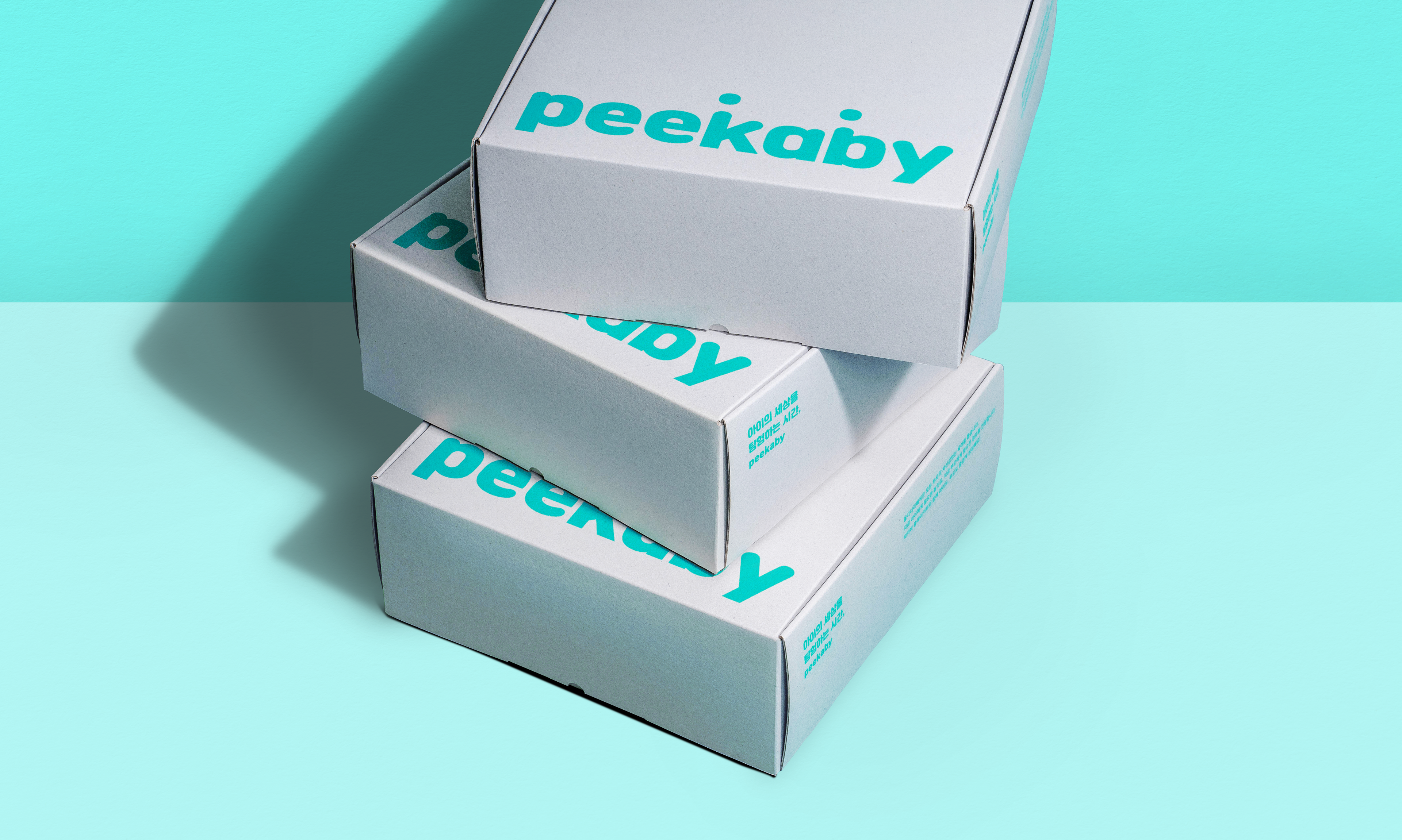
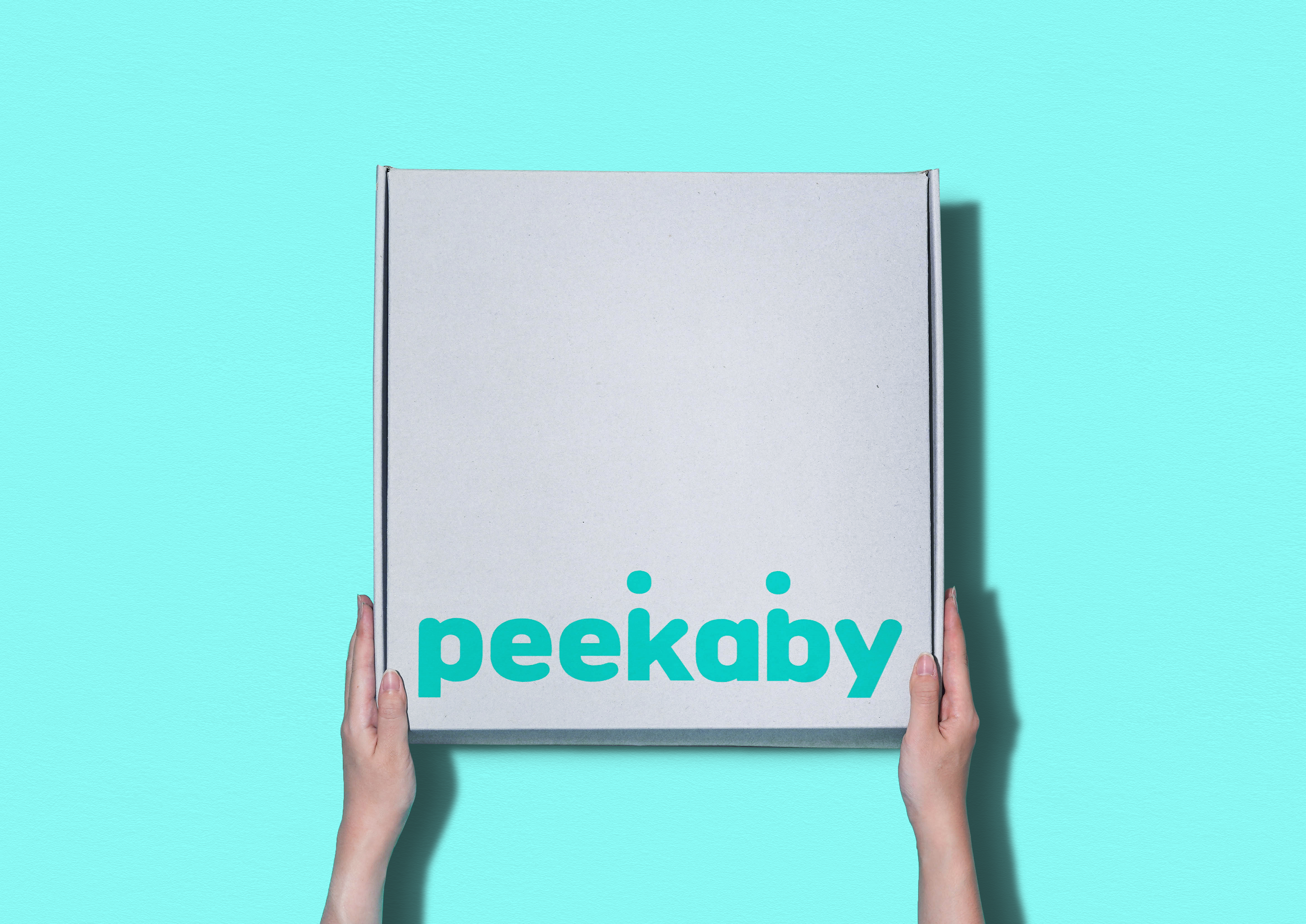
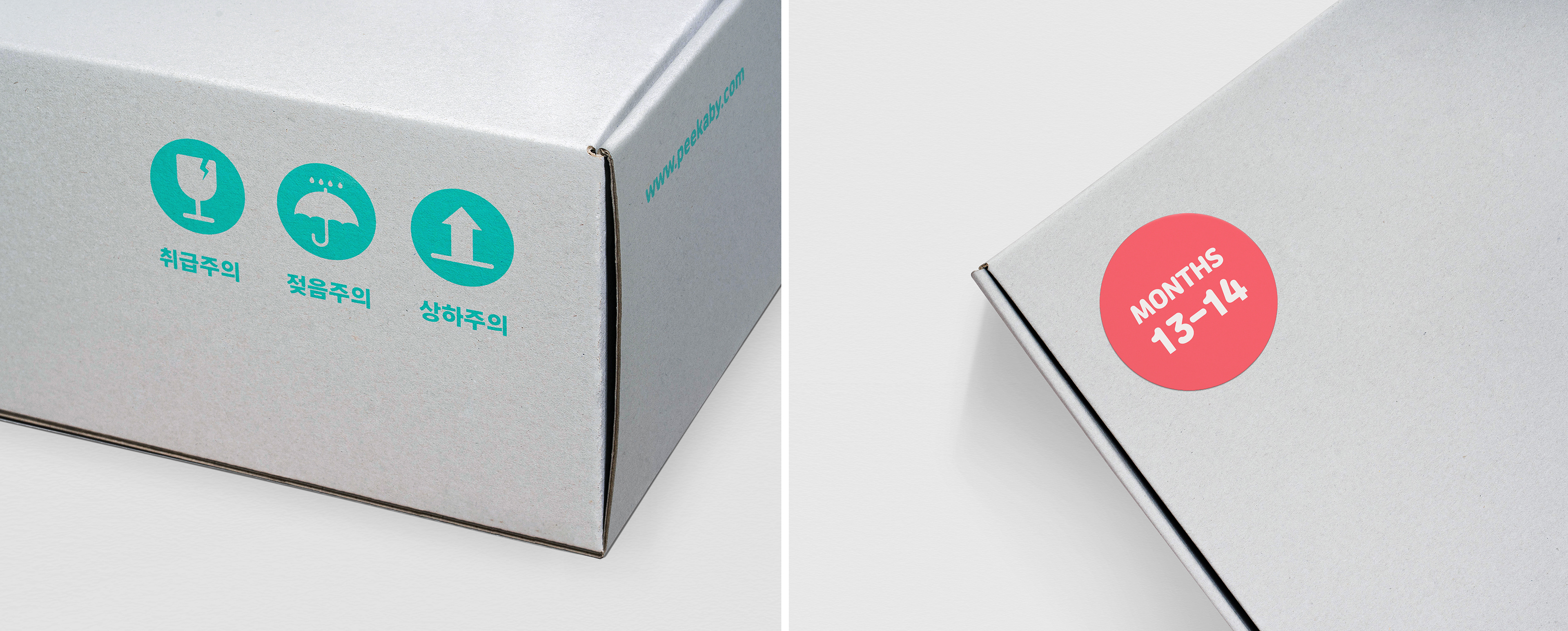
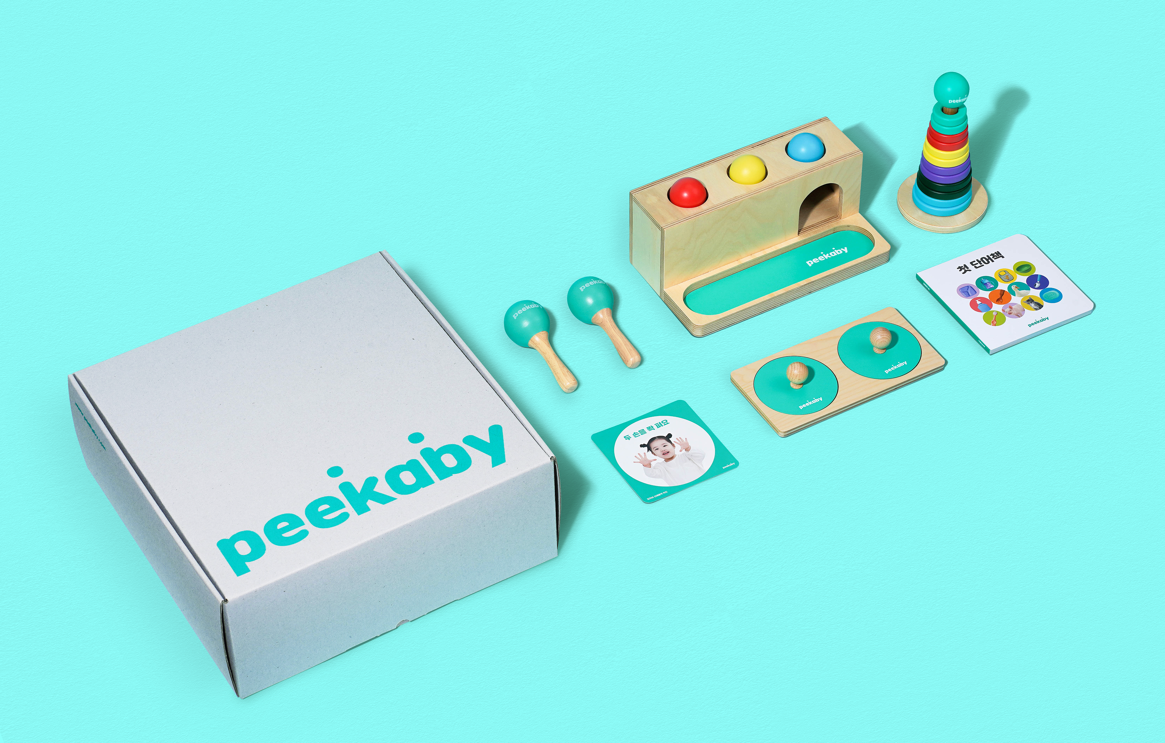
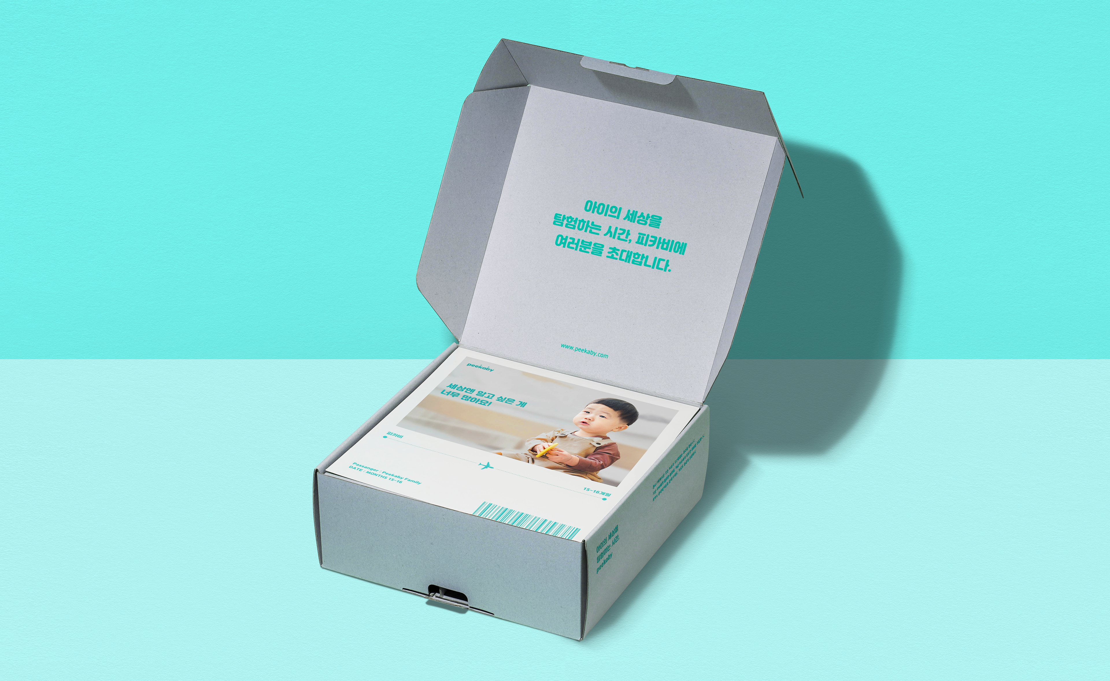
Delivery box Package Design
피카비는 아이의 연령에 따라 큐레이션된 적합한 콘텐츠로 아이에게 맞는 장난감과 놀잇감을 언박싱하는 즐거움을 제공합니다. 구독 서비스가 주요 콘텐츠인 만큼 다양한 제품 라인에 자연스럽게 적용될 수 있도록 무채색 박스를 기본으로 피카비 로고와 심플한 레터링으로 패키지 박스를 디자인하여 연령대별 인지도를 높이고자 했습니다.
Peekaby provides joy in unboxing and play toys suited to the children with suitable content curated according to their age. As the subscription service of this is the main content, We wanted to enhance the age group recognition by designing a package box in a simple letter with the Peekaby logo based on an achromatic box to be naturally applied to all the various product lines.
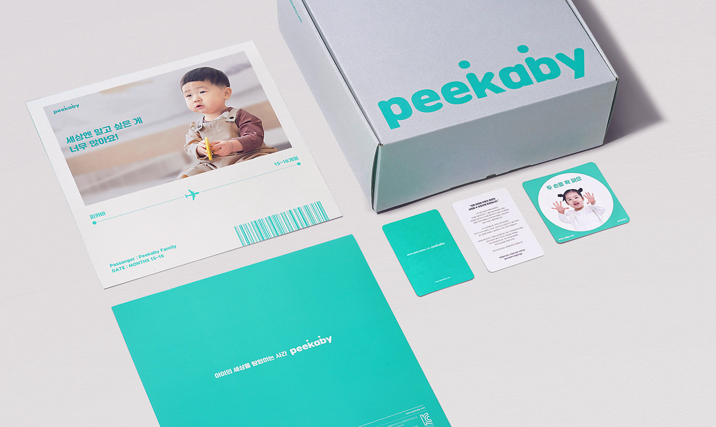

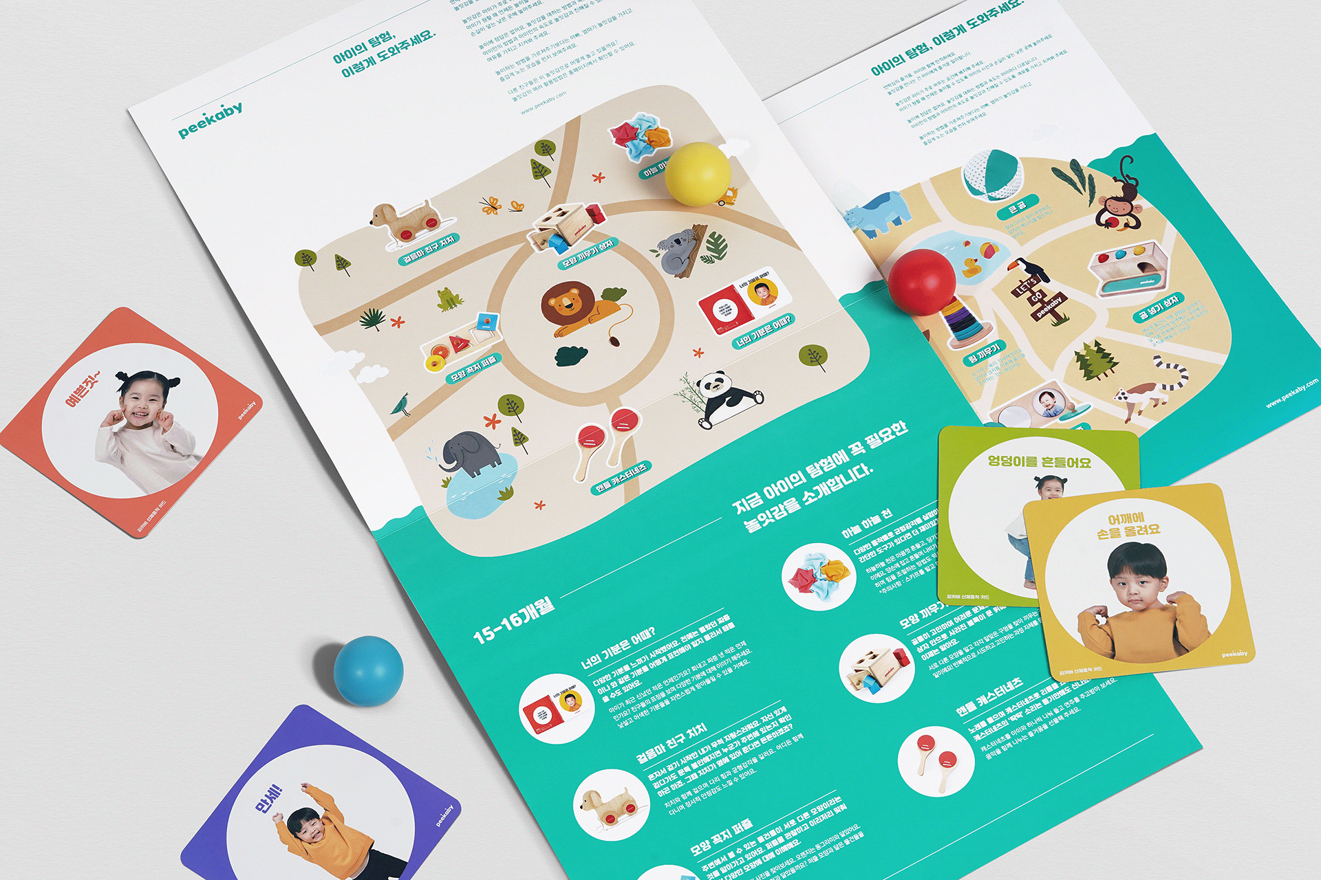
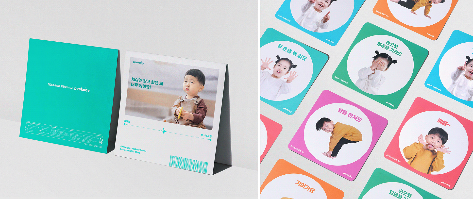
Guide & Welcome Card
사용자가 놀이 키트를 체험하기 전에 Peekaby는 제품을 소개하고 사용법을 알려주는 유용한 가이드를 제공합니다. 이 가이드는 어디서나 쉽게 볼 수 있도록 벽에 걸 수 있도록 제작된 리플렛 템플릿입니다. 아이에게는 지도를 보며 탐험하는 듯한 시각적 흥미를, 부모에게는 유익한 읽을거리와 정보를 제공합니다.
Before the user tries the play kit, Peekaby provides a helpful guide to introduce products and teach how to use them. This guide is a leaflet template made to hang on the wall to be accessible anywhere. It provides visual interest to a child as if exploring with an indication on a map, and valuable reading and information to parents.

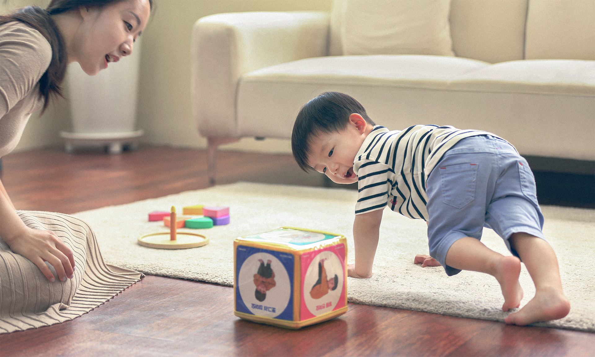

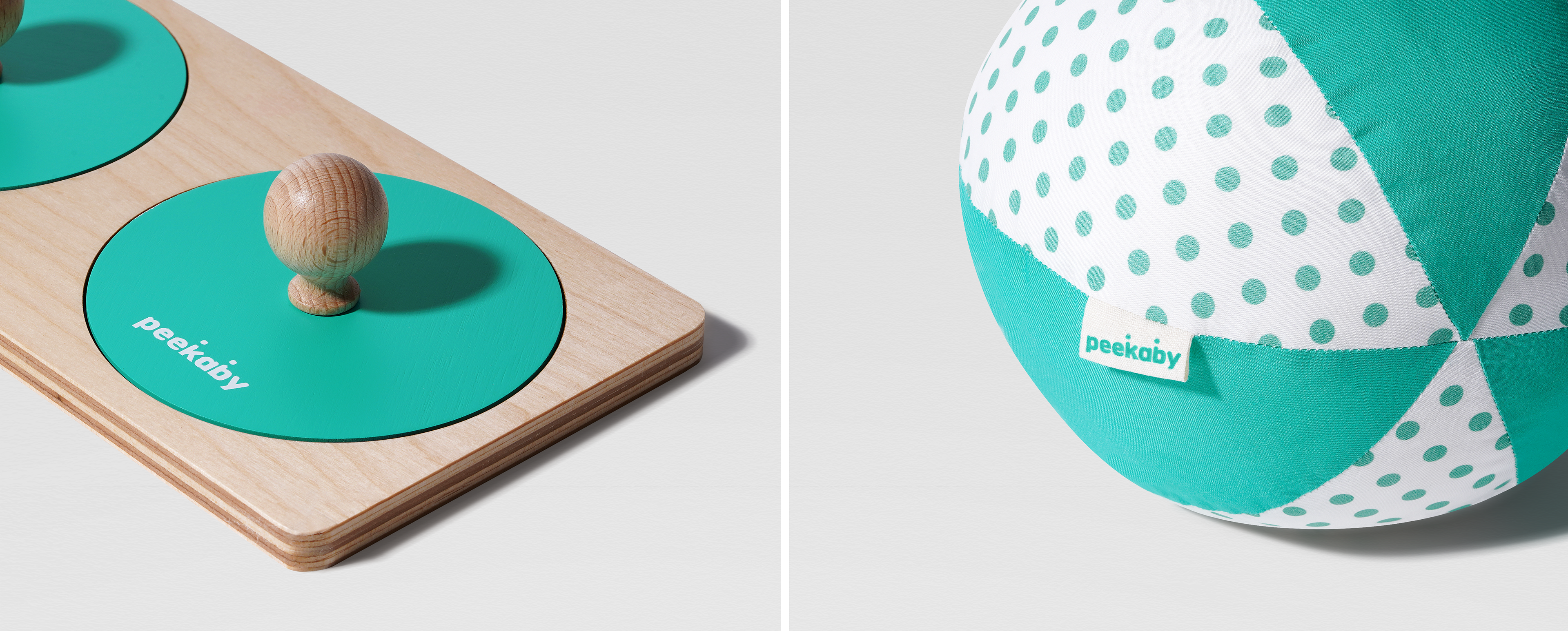
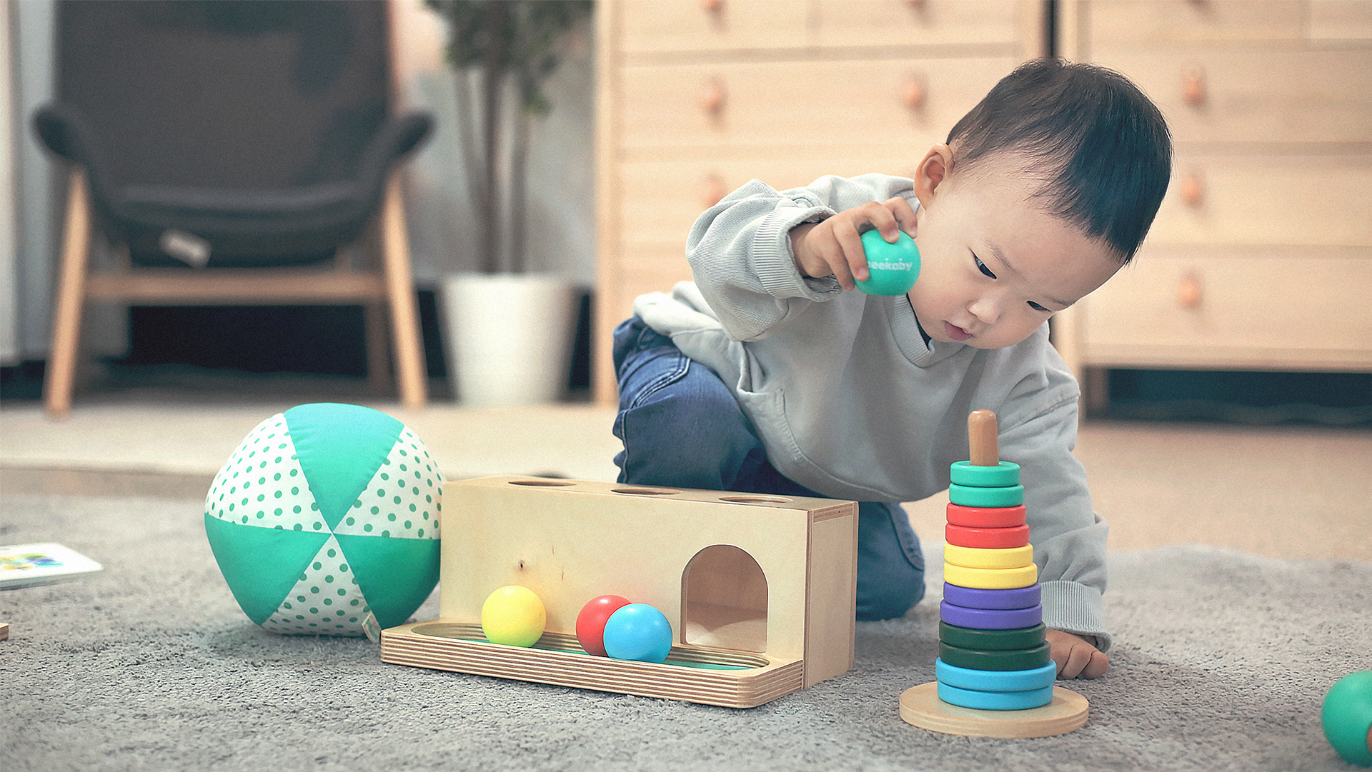
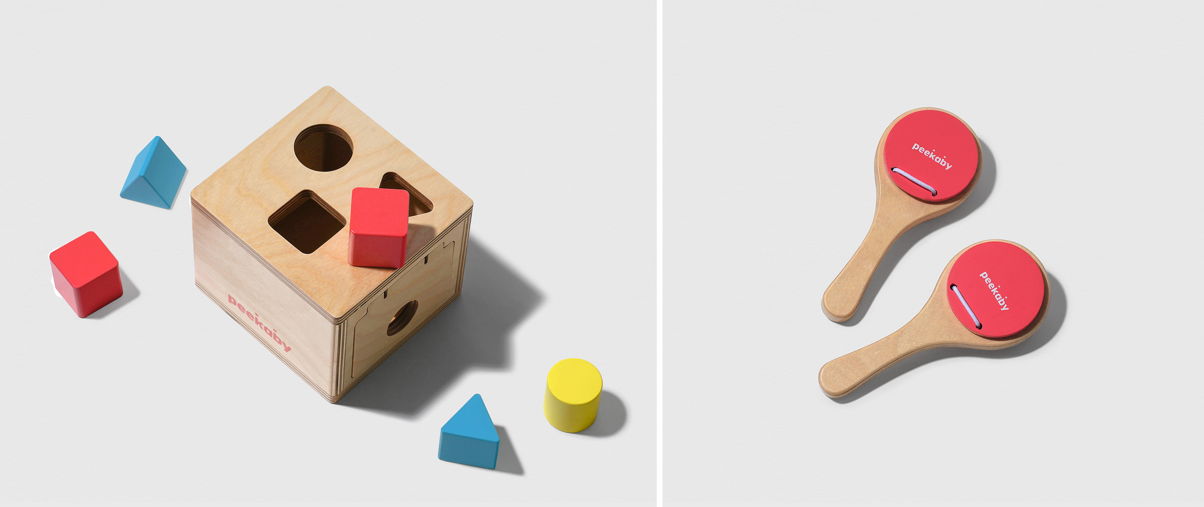
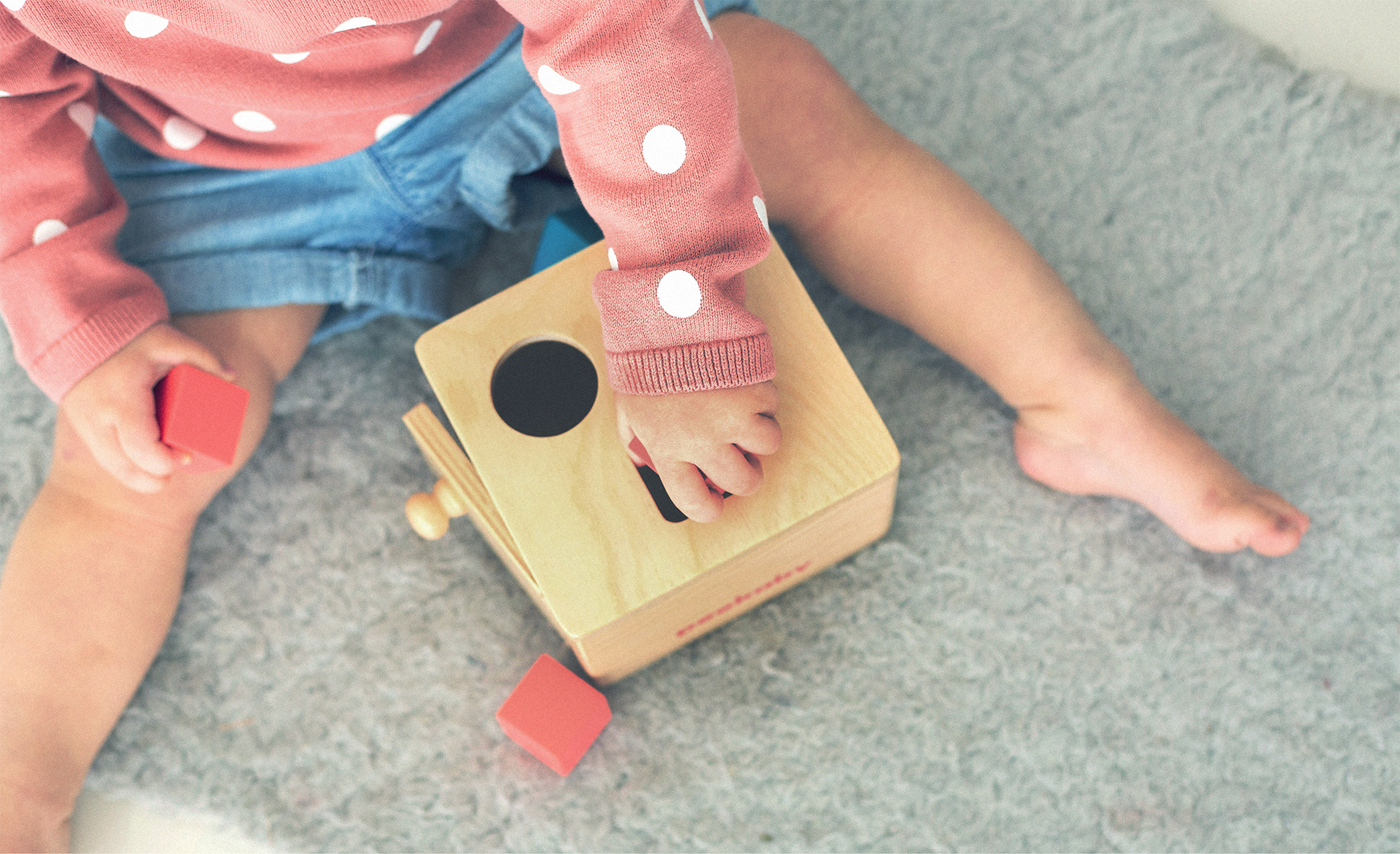
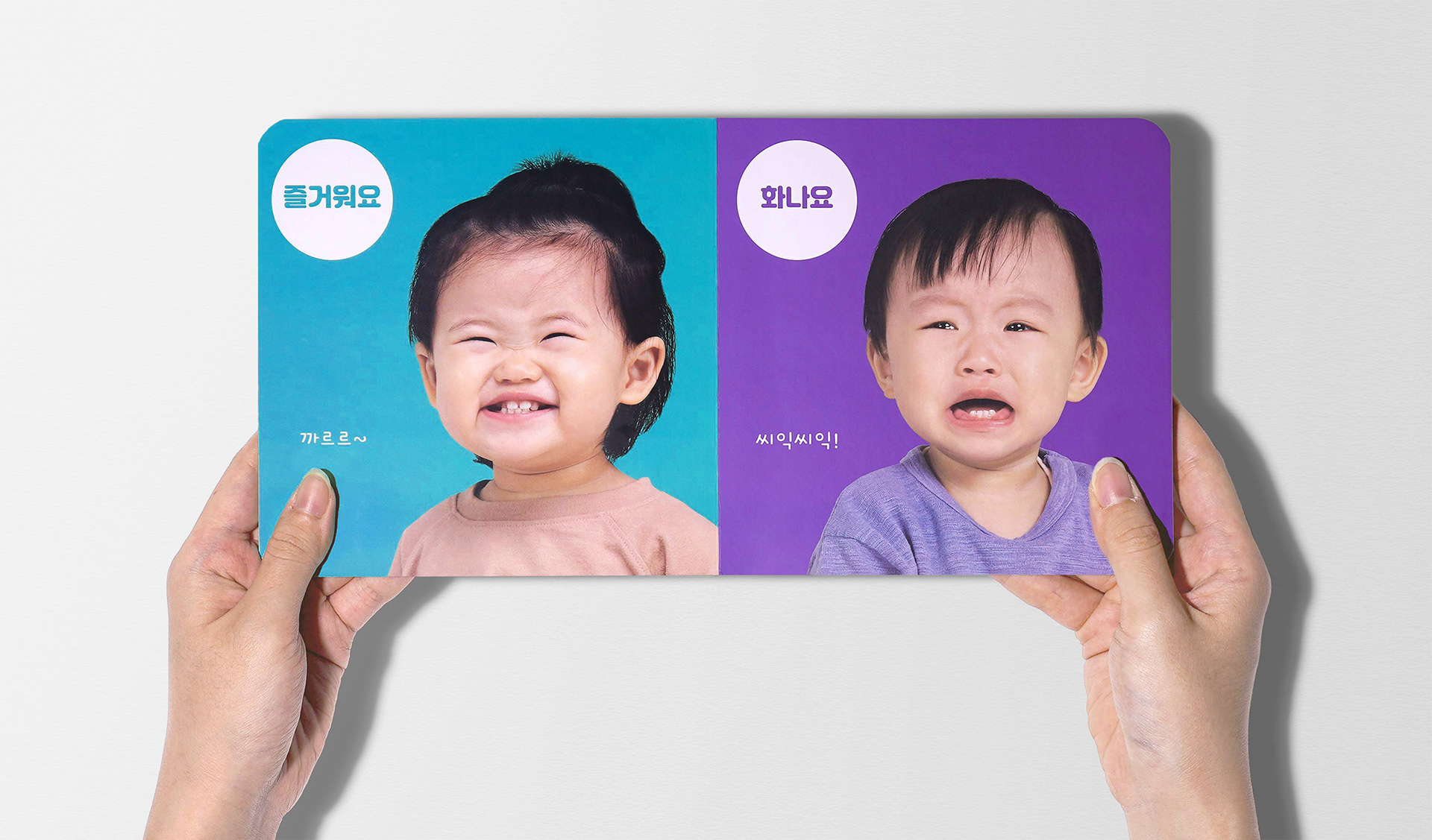
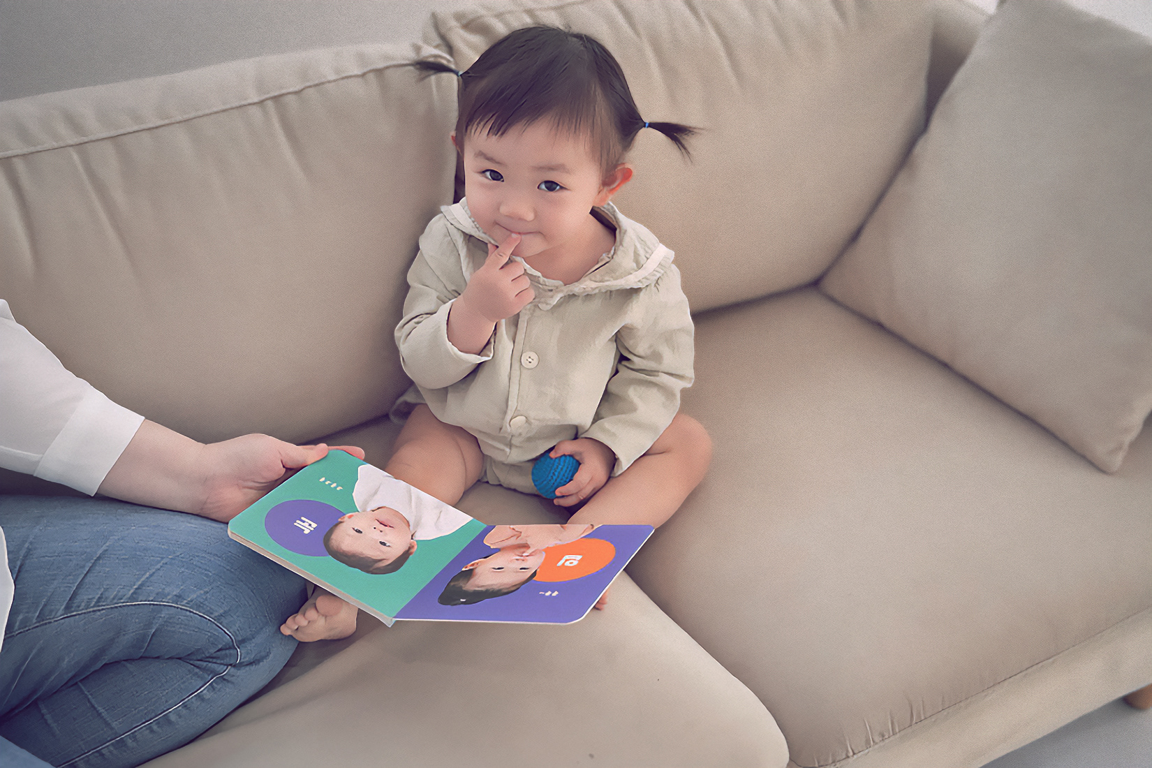
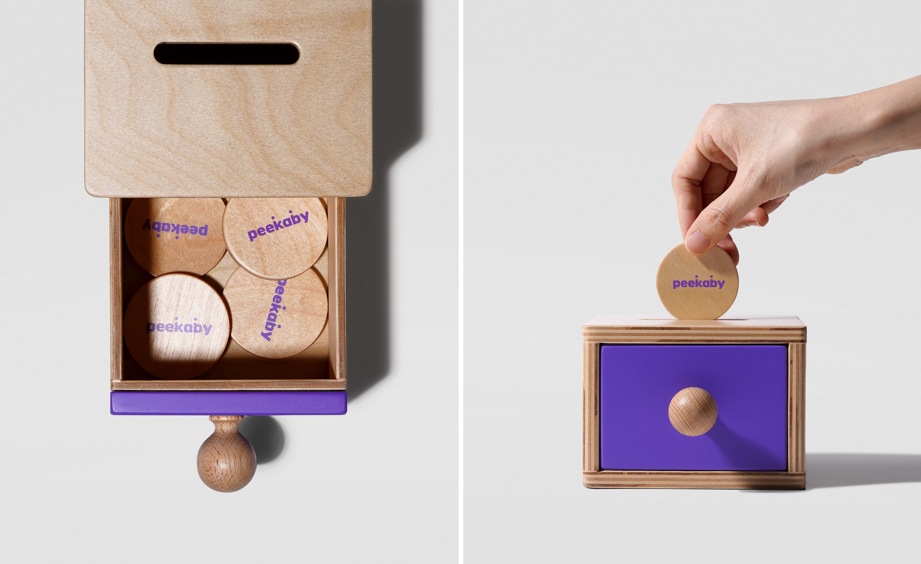
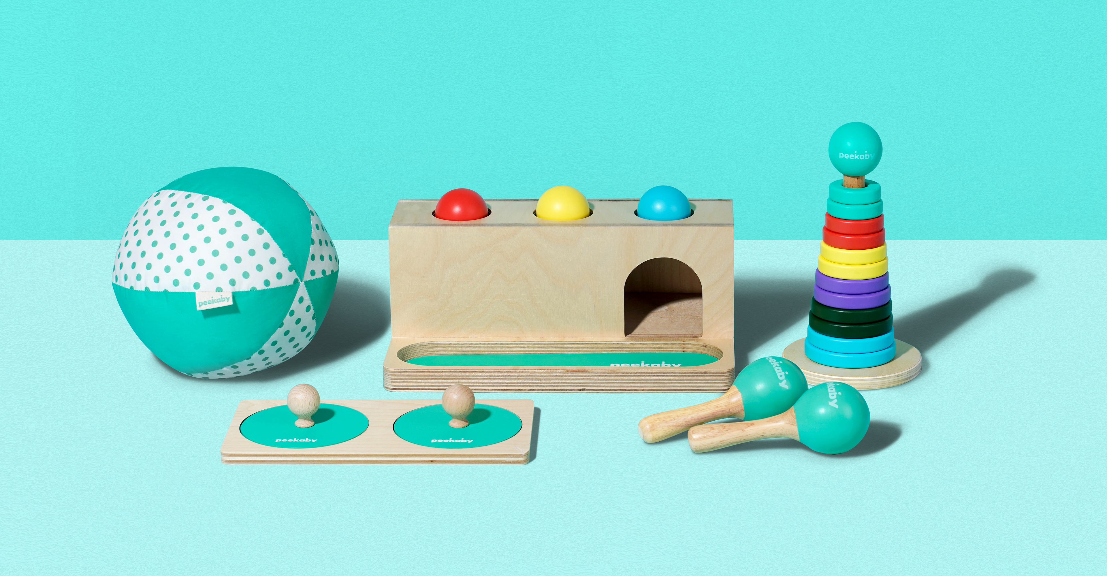
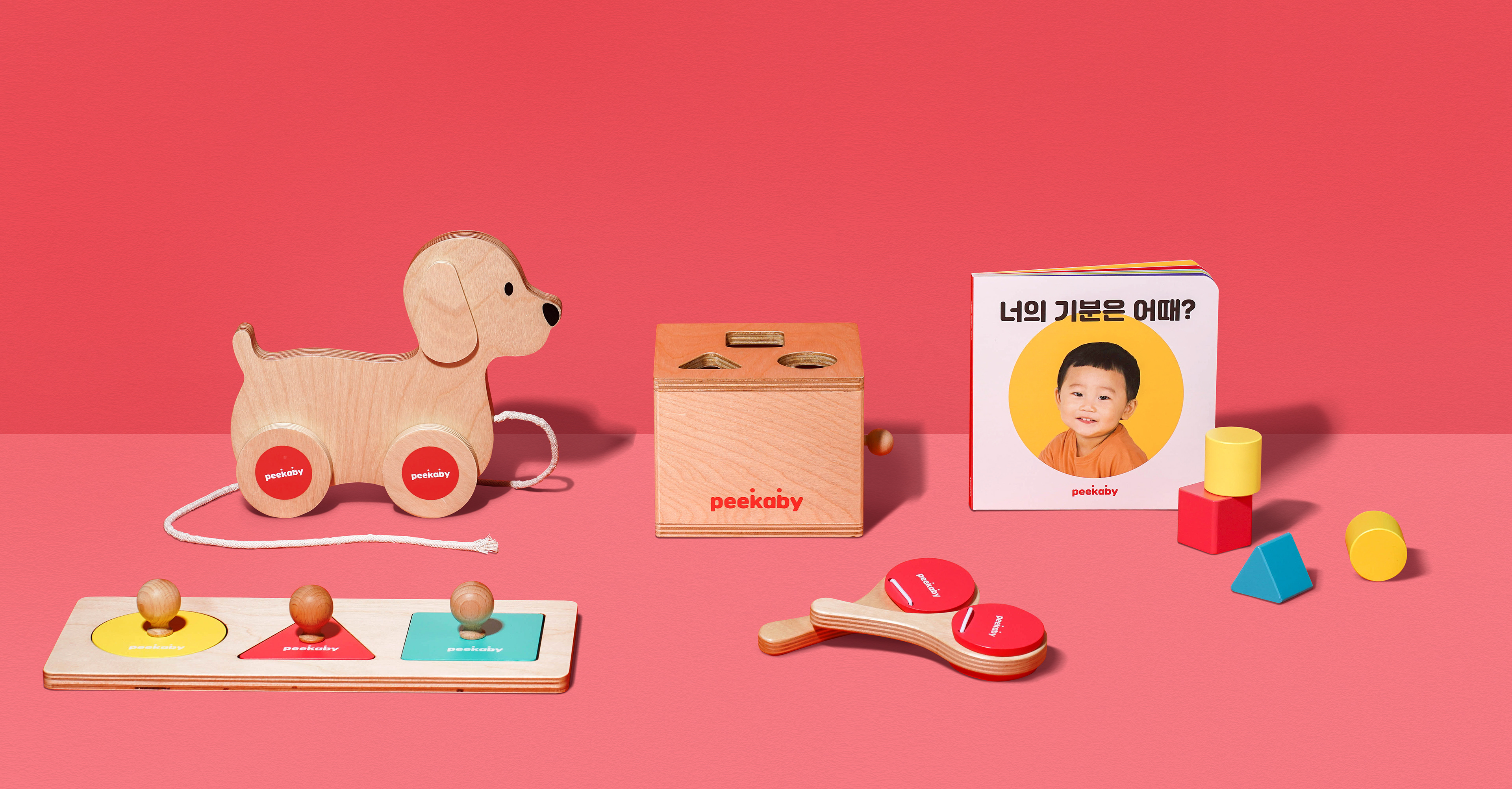
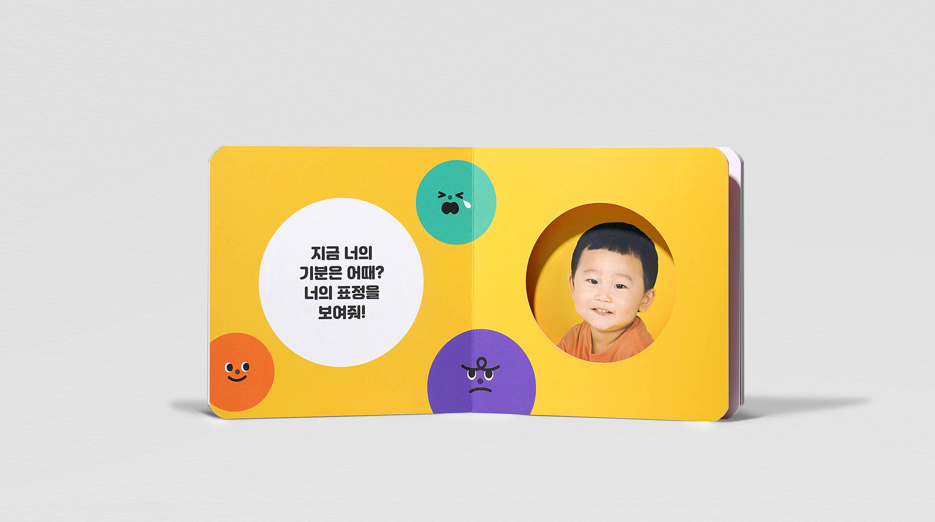
Toy design & Board book
피카비는 0~24개월 영아의 성장 단계별로 신체, 정서, 감각, 인지, 사회성 등 아이의 모든 영역을 골고루 자극하는 놀이 키트를 제공하여 아이와 부모 모두의 유쾌한 성장을 돕는 브랜드입니다. 이를 위해 월별 놀이 키트에 키 컬러를 적용하고 천연 원목을 사용해 안전성과 내구성을 강화하는 등 브랜드와 제품의 체계적 구조를 확립해 원칙을 세웠습니다.
For each stage of growth for infants who are 0 to 24 months old, Peekaby is a brand that helps the jolly growth of both children and parents by providing necessary play kits that thoroughly stimulate children's all parts of physical, emotional, sensational, cognitive, and social domains. For this, we made principles for the brand and product by establishing the brand's systemic structure with key color applications to each month's play kits and enhancing safety and durability by using natural wood.


© 2024 GRAFY.
GRAFY B/D 2-3F, 350, Dongil-ro, Gwangjin-gu, Seoul, Republic of Korea
contact / info@grafydesign.com / +82 70 8633 7222
-
If you want to see more projects, click on the links below